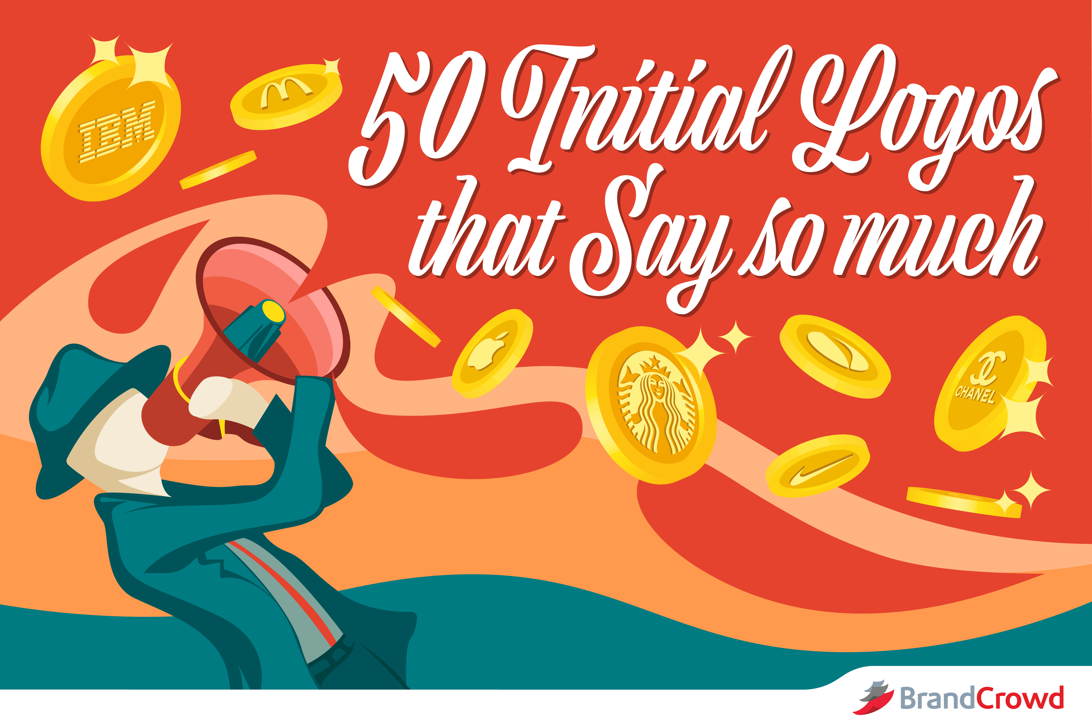
50 Initial Logos That Say So Much
With initial logos, you can do so much for your branding. These logos let you pepper in more of your brand identity in the design.
By doing so, you’re adding visual weight to your logo using relevant elements that help audiences recall your identity. It’s a more holistic approach to communicating who and what your brand is about.
Companies with really long or simply hard to remember names may use this for their advantage. Initial logos are the perfect vessel for that. Initialisms or acronyms are mnemonic devices that help people remember something, too.
We’ve itemized some of the reasons why companies love them. Let’s cut to the chase and talk about its two different types.
They are called lettermark and monogram. Although they both use letters as the logo’s focal point, these two are different. Lettermark logos are plain and simple in terms of type. While monograms use stylish overlapping of letters to create a complex looking design.
Text-based logos are often found in these industries:
- Enterprise
- Tech
- Beauty
- Wedding
5 Initial Logos From Big Brands
Clear and packed with style are two of the many words you can use to describe text-based logos. This is what makes these leading companies use their logos with pride regardless of industry.
Logo history will give you a long list of companies that use their initials as insignia. But today, we’re going to list only five of them to keep it brief.
Related: Famous Initial Logo Designs
Experts say that acronym logos are highly recommendable especially for companies that have a solid presence in the industry. It definitely can be said that established companies use these logos for their timelessness.
NASA
The agency’s logo is full of symbolic depth. Famously known as the meatball logo, the three colors of this insignia represent extraterrestrial bodies (blue), space travel (white), and aeronautics (red).
Chanel
The fashion logo’s interlocking C design debuted in 1925. Designer Coco Chanel’s symbol remains unchanged since. This logo is versatile and can go on any product the brand puts out. From earrings to swimsuits, the Chanel logo carries the brand so well.
Giorgio Armani
The symbol laid on the right-facing eagle is associated with luxury and excellence. Giorgio Armani’s fashion logo dominates the beauty industry as well. The brand’s color choice reflects the company’s knack for elegance.
GE
This is a great example of a monogram. The combination of the G and E creates an intriguing shape. GE has been through a couple of rebrands. This logo started out as a cursive type until they eventually decided to put it in a round shape. The monogram remained the same since 1900.
IBM
The International Business Machines (IBM) initial logo uses a strong serif font embellished with clean stripes. It uses a cool blue color which is a dominant color in the field of technology. Designer Paul Rand said that the eye-catching stripes symbolized dynamic progress.
Enterprise
SmallBizGenius found in a study that 72% of the top brand names are made of either acronym or made-up words. This fact makes us believe that acronym logos may just be the best place for you to display your business name with. The following logos let you display brevity without sacrificing impact.
Let’s look at a few of them today for inspiration.
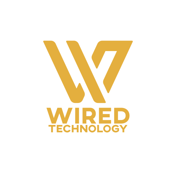
Golden Stylish Letter W by DanikBrt
Often, business organizations are created by more than one person. This results in company names that combine initials of the founders’ last names. That’s why business acronyms can be seen anywhere. It may be hard to stand out in an industry full of acronyms, but this is totally avoidable.
Blue WM Business Monogram by SimplePixelSL
Stripe M Tech by LogoBrainstorm
People mistake letter design logos as boring because they’re just made up of letters. How could that be possibly interesting? Well, for starters you can use the letters in your company name to create an original figure that will keep you from looking like a cliche.
When doing this, make sure you have the right font for your brand. Fonts are the foundation of any text-based logo.
A handy tip to keep in mind when you create your own logo is knowing the difference between serif and san serif fonts. Serif fonts have details at the end of every stroke that resembles a tail. They are perceived as serious which works great for brands that want to look technical.
On the other hand, sans serif fonts do not have these extra elements. Their clean structure works well for fun, laid-back brands due to its approachable appearance.
Pink Gradient Letter H by neostudio
Tech
The perfect brand mark gives businesses the capability to communicate their competence, value, and identity. It is conventional for technology logos to lean towards flat and sleek design. People love this trend because it is adaptive and increases readability.
Great examples of tech companies that put their initials in logos are HP, Facebook, EA and more.
Even if your business is centered towards computing, hardware, or other tech-related activities, you can take a look at these versatile symbols that will inspire your own logo.
Blue M Circle by SimplePixelSL
Flat design concepts appear to be very clear cut and refined. If your brand doesn’t relate to that, you can easily add depth and personality to your logo by adding more colors. One way you can do this without looking tacky is by using gradients or the gradual blending of one color to another.
Gradients provide contrast and because of this, it won’t be easy to lose sight of your logo even when placed in cluttered backgrounds or mock-ups. This is why gradient is such a popular trend in design.
Cloud Search Lettermark by SimplePixelSL
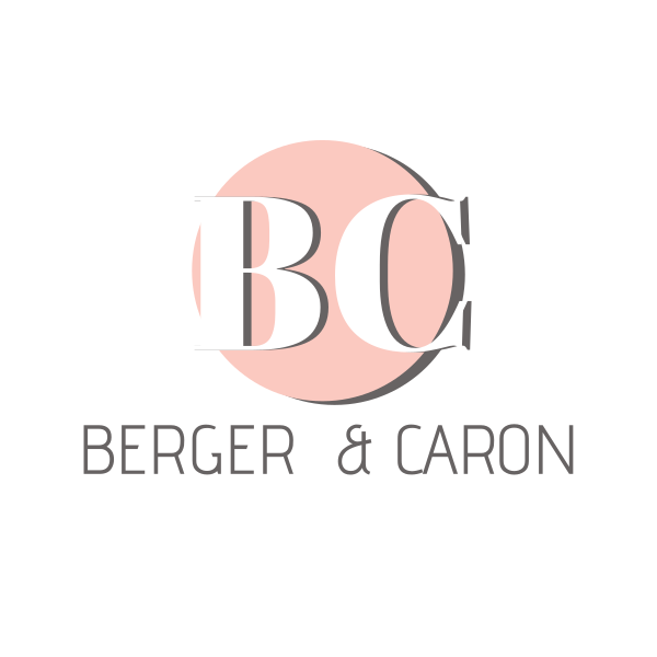
Beauty
The best beauty companies have logos that tell their stories perfectly. Beauty logos aren’t afraid to be visually impactful. Monograms are good for creating charming logos. Combined letters create stunning silhouettes that look great on packaging, flyers, digital platforms, and more.
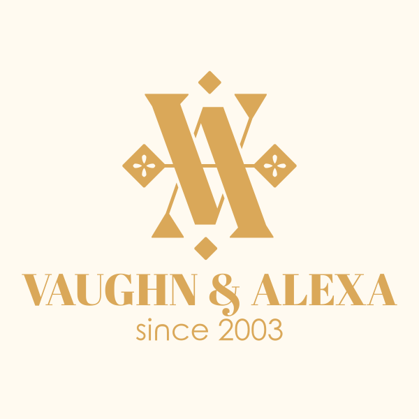
Luxurious Monogram VA by radkedesign
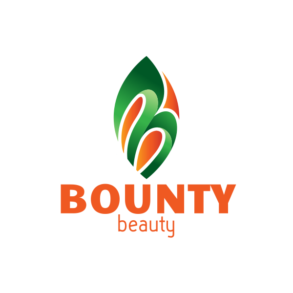
Abstract Lead Letter B by realdreams
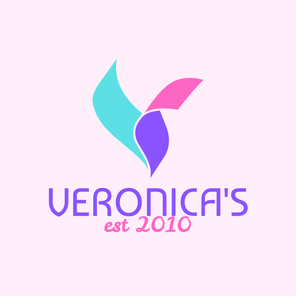
Beauty and Wellness Letter V by Logobrainstorm
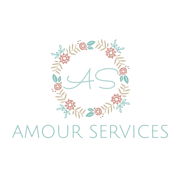
You’ll notice a lot of initial logos in a round shape. Circles are naturally great for framing typography. The shape also symbolizes qualities that are fit for beauty brands. People perceive brands with round logos as feminine, approachable, and more attuned to their needs.
Feminine Instagram Wreath by ZDesign
Gold Detailed Lettermark by BrandCrowd
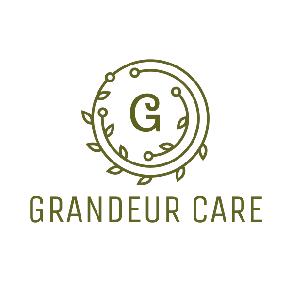
Green Laurel Wreath by podvoodoo13
Stylish Floral Lettermark by JimjemR
Most of these logos are also encircled by a wreath which alludes to nature. This is because beauty products and services now lean into the organic market. Brands now do this because consumers have grown warier of chemicals over the years.
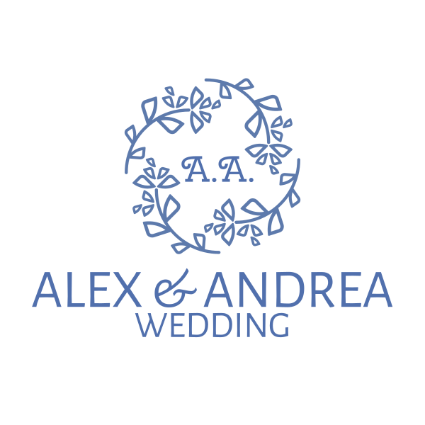
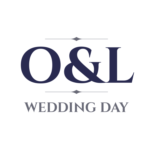
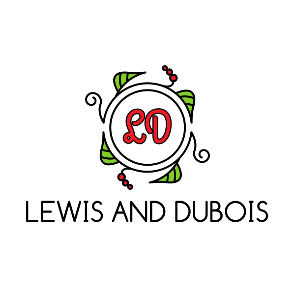
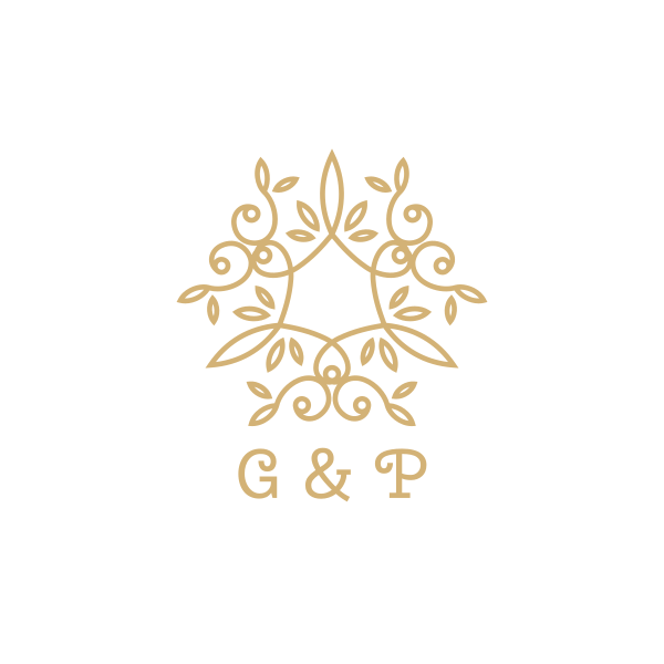
Wedding
Marriage logo galleries are packed with designs featuring the initials of the bride and groom to be. Wedding logos is one of the many ways that let couples visually communicate their union. These couple logos get put on everything that leads up to their big day and possibly, afterward as well. You can find this on their invitations, souvenirs, and more.
Call it cheesy, call it cute, but one thing is for sure: it’s popular because it works.
Blue Wreath Lettermark by mareena
Delicate Luxury Serif Font by BrandCrowd
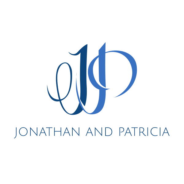
Elegant J and P by sonjapopova
Elegant Letter O by BrandCrowd
Fresh Wreath Lettermark by fishdesigns61025
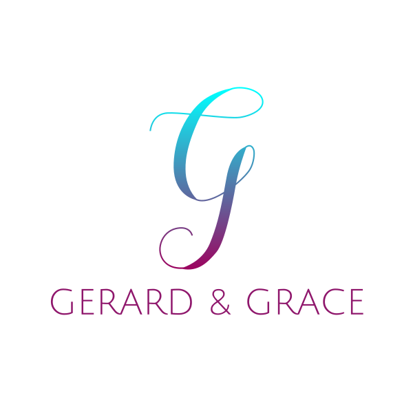
Gradient G Script FT by eightyLOGOS
These logos aren’t just for couples. They are also great for brands that offer services for wedding events such as photography, planning, and more.
However, there is a difference between couple logos and wedding services logos. Couple logos tend to be curvier, artsy, and a little harder to read. Service provider companies, on the other hand, have design elements that are much easier to read because brands put a heavy emphasis on being easily recalled.
Conclusion
Brevity is the soul of wit—that’s what these logos are all about.
Brands think that they are increasing their odds of being recognized by dumping incoherent design concepts into one logo. The truth is that they are only straying farther away from recognition.
Functional logo design is all about clear and strategic visual communication. As long as you use the elements of design wisely, you will end up with a logo that represents your brand’s professionalism, credibility, and effectiveness.
Head on over to our gallery of initial logos for more logos that symbolize brands with smart and concise visuals.