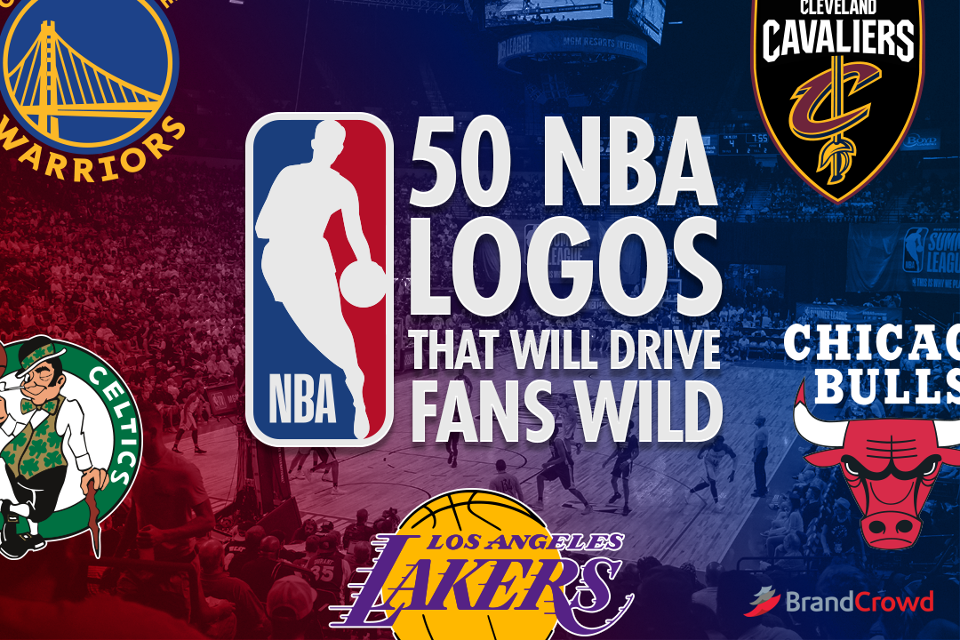
50 NBA Logos That Will Drive Fans Wild
A good team knows how important it is to put their best foot forward in everything they do. Everything. Including branding.
Art seems like a far off aspect when it comes to teamwork, but that’s the exact opposite. Having a good logo that encapsulates team spirit is one way to become more confident. Plus it can help your team gather more fans by having a symbol they can connect to.
Right now, we see three different logo themes that work for various sports leagues. Their versatility and impact make their popularity no surprise to us. Regardless if you’re a team of real-life players or NBA 2k20 gamers, you will love the NBA logos you’ll see in these sections:
But before we start, let’s study take a quick look at the celebrated logos in the association.
Famous NBA Logos
The NBA has 30 teams coming from both the east and west conferences. Each team has a vivid logo that represents its roots and story. Looking at all 30 almost feels like you’re staring at a rainbow.
Out of the teams, we’ve picked out the five top-ranked logos in the game.
Boston Celtics
Anyone can point this clover-specked logo from the crowd. Today’s Celtics logo is an ode to its first green clover logo. It makes use of a clear cut illustration and a readable sans serif font for the team name.
The laid-back character you see spinning a ball with ease has been on the logo since the 1950s. It has only ever gone minor revisions throughout the years.
Golden State Warriors
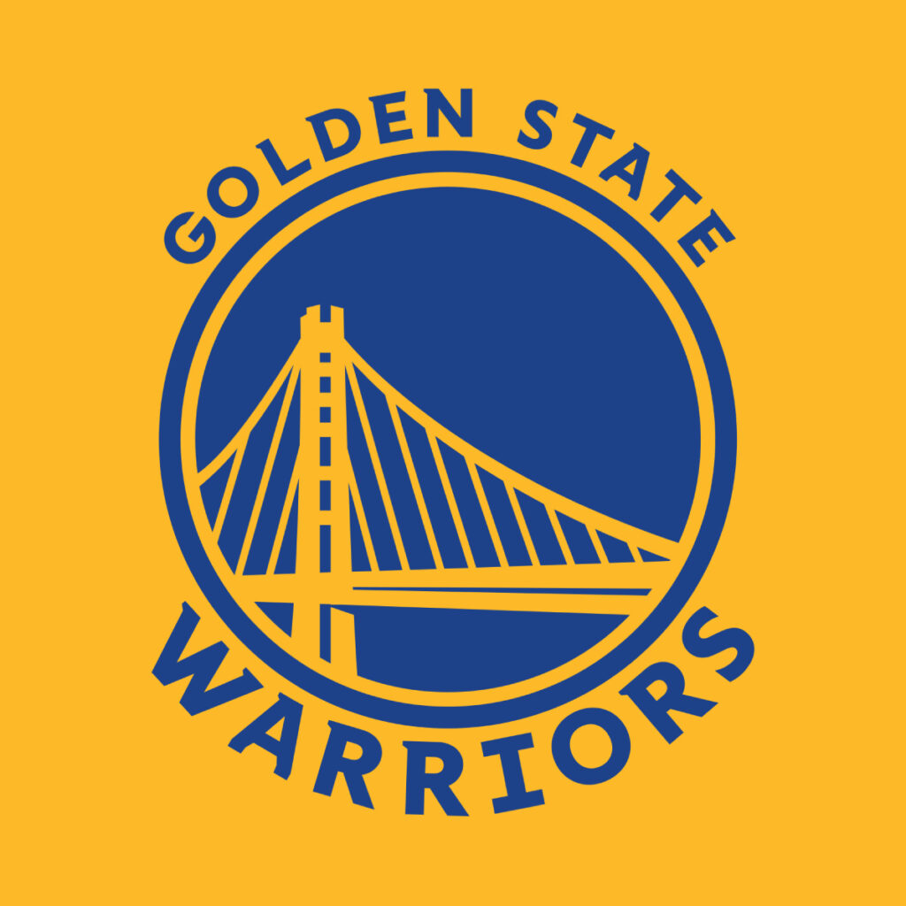
Featuring San Francisco’s most loved Bay Bridge, the logo represents the team to the tiniest detail. The colors of this eye-catching logo are even called “Warriors Royal Blue” and “California Golden Yellow”.
It has always been a bright insignia for the team. Only now, the logo is more blue than yellow, unlike its previous versions.
Chicago Bulls
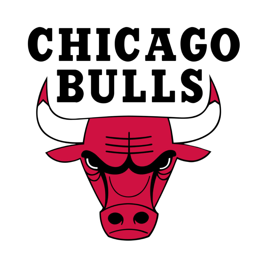
Animal insignias are great for any team that wants to appear domineering. Chicago Bulls doubles down on the aggression with the stark shade of red. What this logo does exceptionally well is making use of the illustration to frame the team name.
Los Angeles Lakers
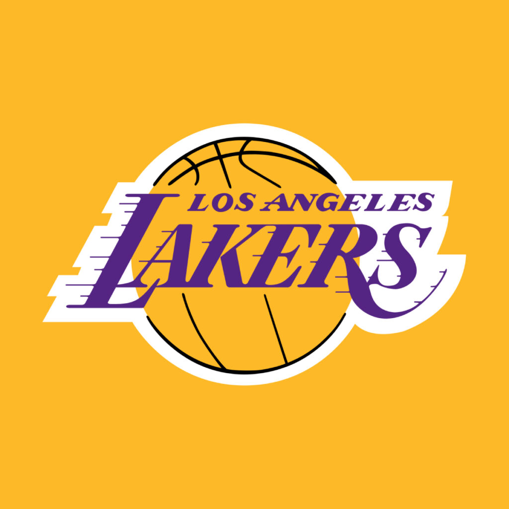
The Lakers logo is proof that you don’t need to have super elaborate details in your logo to make it good. They kept it simple and that was enough to create an iconic work of art. The motion in the Lakers typography is what really gives character to the whole concept.
Cleveland Cavaliers

This black crest logo is characterized by the upright sword piercing through the letter C. It has gone through multiple changes in the past. Although the Cavaliers logo has been through rebrands for the better. You wouldn’t even expect what it looked like in the 70s.
Round
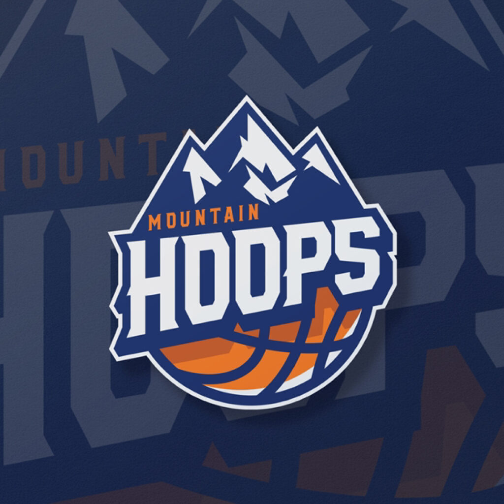
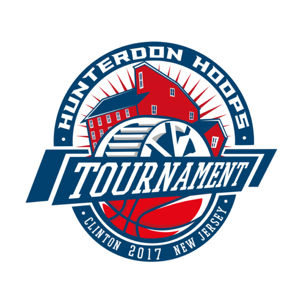
Now that you’ve seen the designs that drove the industry, get ready to dribble along with these round logos.
So, why should you go for this logo? People use a round logo for the symbol it holds.
The circle has long been regarded as a symbol of togetherness and versatility.
Besides, the shape allows for an adaptive design that won’t get overlooked even when placed on different backgrounds.
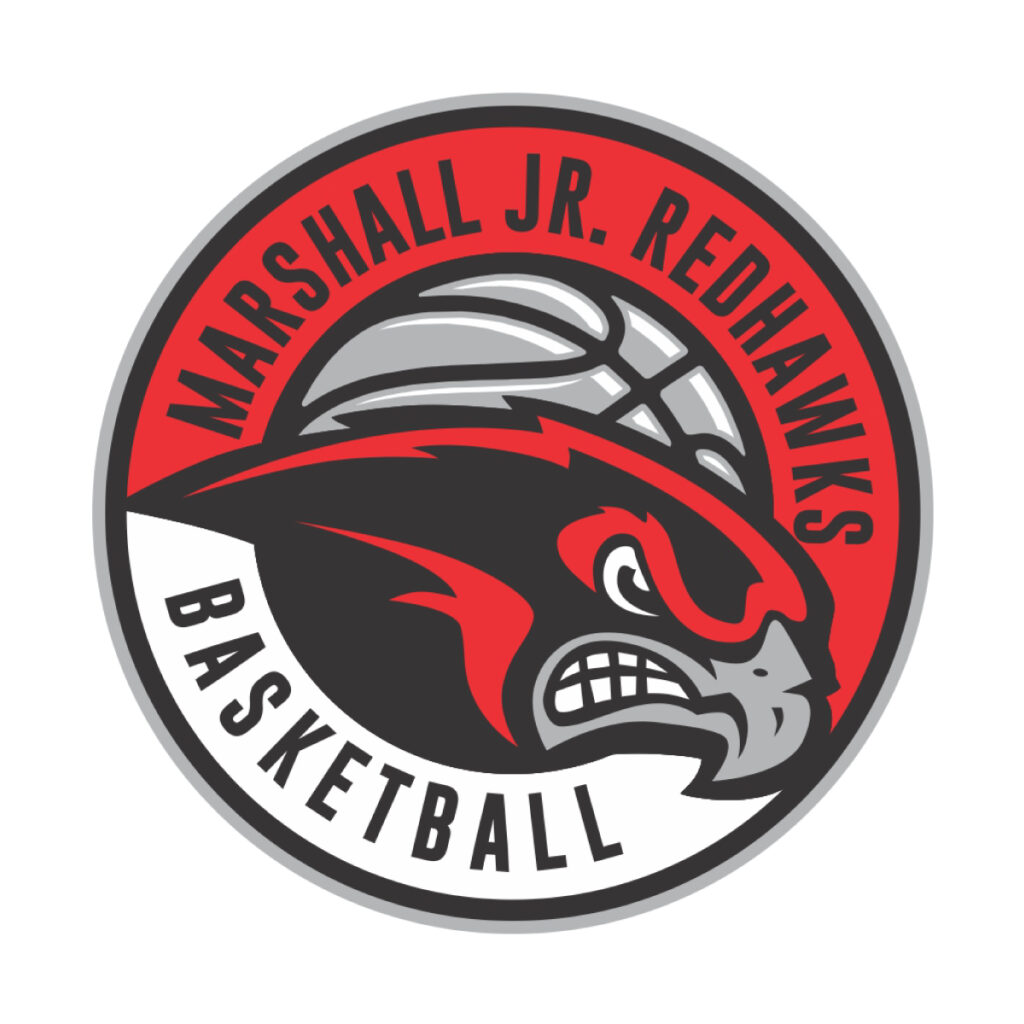
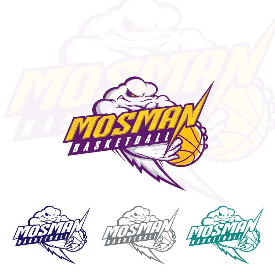
Marshall Jr Redhawks Basketball by Gigih Rudya
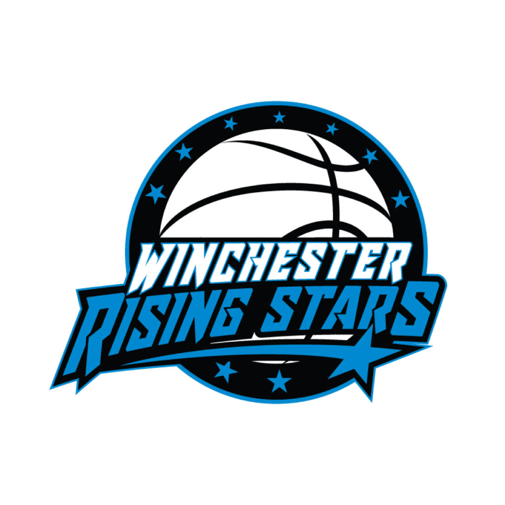
Winchester Rising Stars by Kreative Fingers
Not to mention, the shape makes up 20% of the logos all around the world. Some of the brands that have rounded logos are Google and Pepsi. For basketball, it’s Golden State Warriors and Toronto Raptors.
The NBA also has a rule that a team must feature a basketball in its first or secondary logo. Now, of course, you don’t have to do the same if you’re looking to play for leisure, but it could be a nice challenge for your team to comply with professional rules. Circle logos easily adapt to the shape of this required design element.
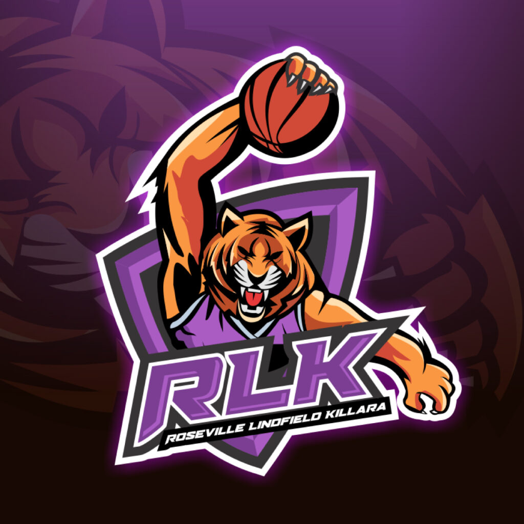
Animal
For design, creatures have long played a great symbolic role. They can represent folklore, history, and places they are endemic to.
Sports teams often do this to represent local flora and fauna. A good example of this is the Kashima Antlers which is a football team in Japan. The city’s culture involves raising deer as they are associated with religion. The team chose to brand their group in a way that honors their culture.
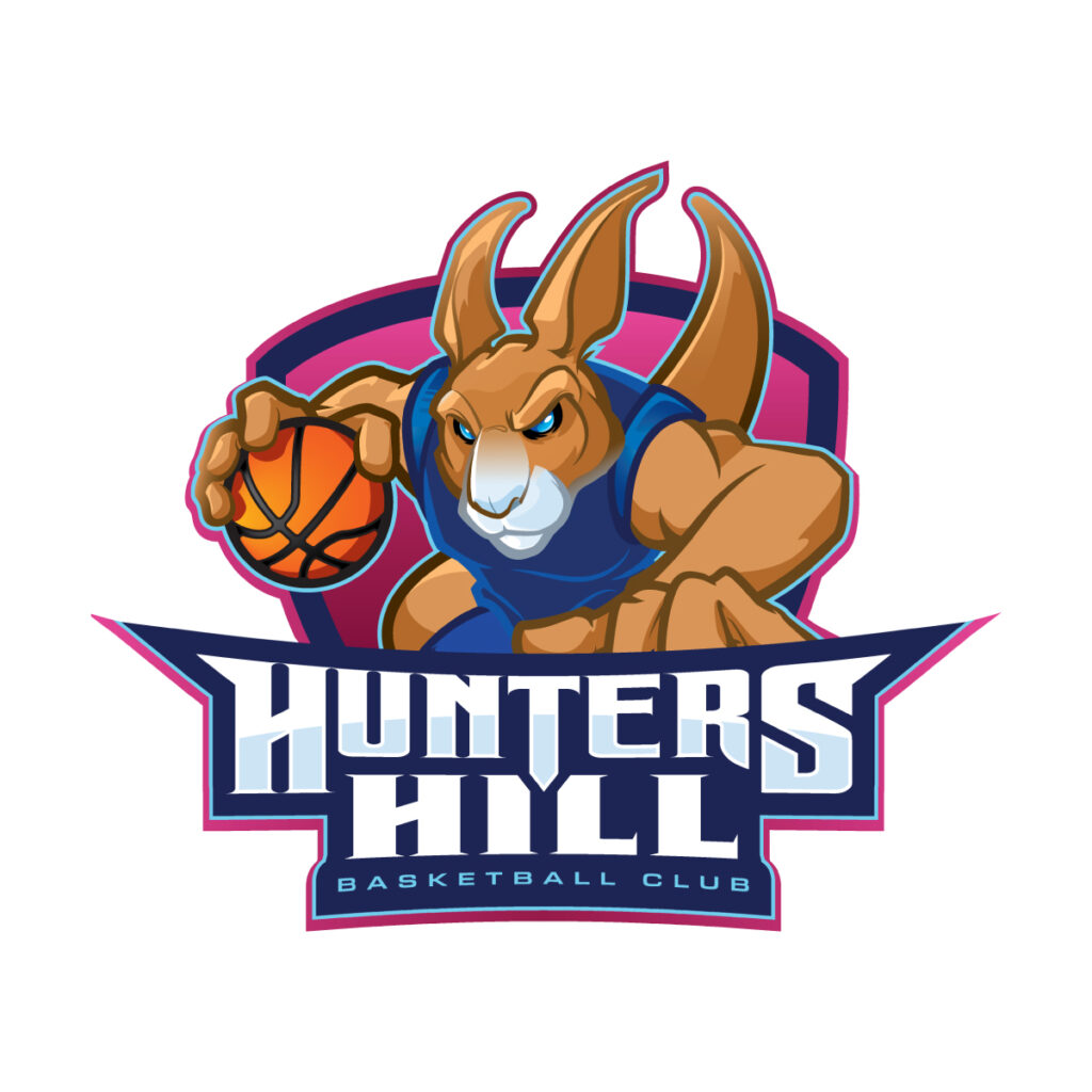
Hunters Hill by Gabriel T. Marques
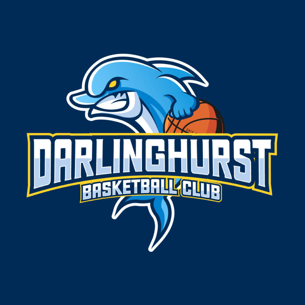
Darlinghurst Basketball Club by enriquecoello_24
Hunter Hill Basketball Club by Dream Logo Design
The same rings true for Chicago Bulls. It got its name from the famed Chicago Stockyard back when their first homecourt resided near the farm. These cattle were popular for their headstrong temperament.
Having an animal logo seems simple, but it lets teams tell their story in a unique way.
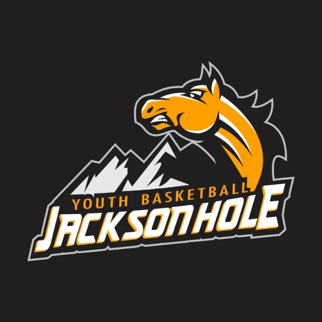
Youth Basketball Jacksonhole by r-toha
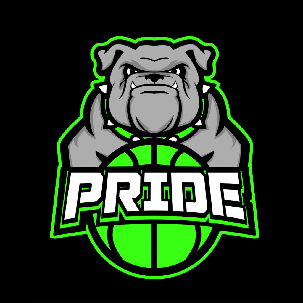
Pride Basketball by Michael Condello
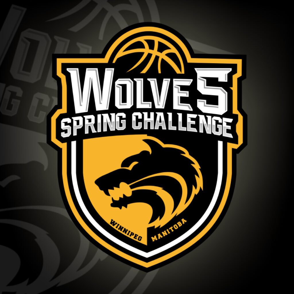
Wolves Spring Challenge Basketball Tournament by kokoriko
One way to approach logo creation is by collaborating with members. Your team can pick an animal that you and your supporters can relate to based on any criteria. This is a way for you to borrow well-known qualities from animals to characterize your sports brand style.
Text-based
Text-based logos are used by big teams with Houston Rockets being an example. Their logo looks like a capital letter R taking off. This is a fun reference to the NASA Manned Spacecraft Center located in the state.
There are two types of text-based logos. They are called wordmark and lettermark logos.
Lettermark or initial logos are logos that use select letters of a brand name as the logo design concept. On the other hand, wordmark logos feature the full name of a brand.
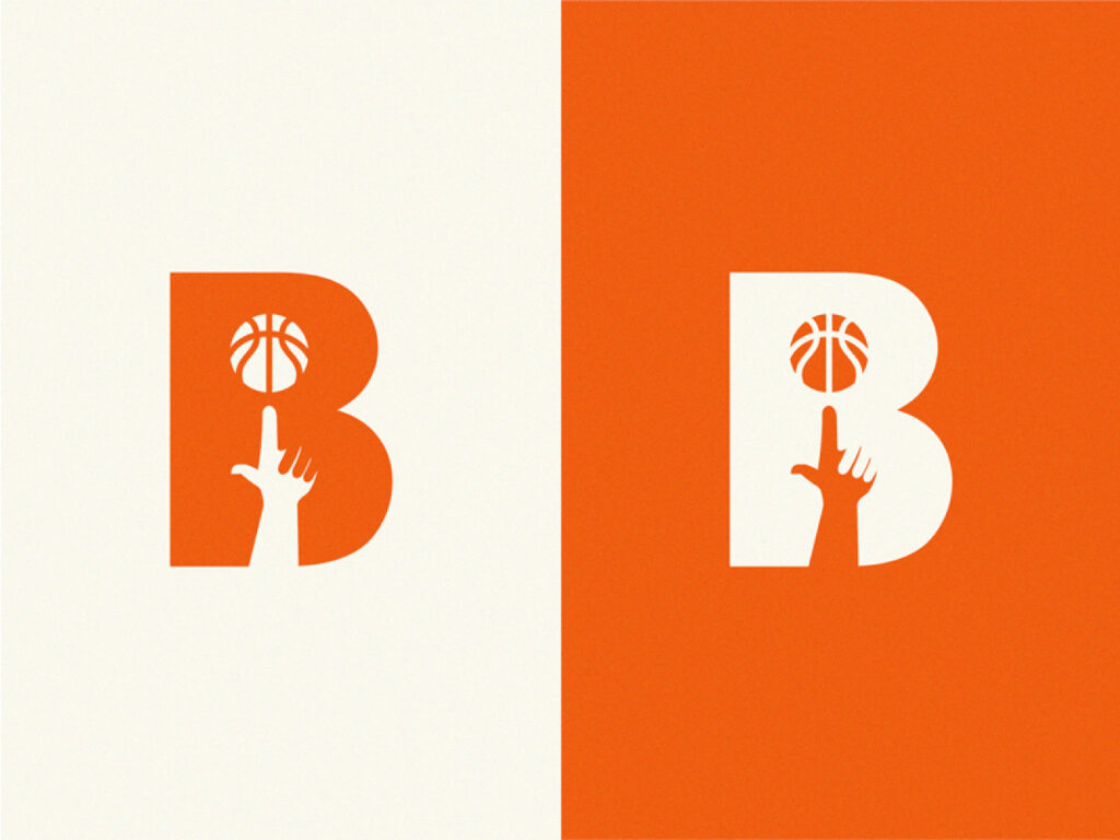
Basketball letter B by Yuri Kartashev
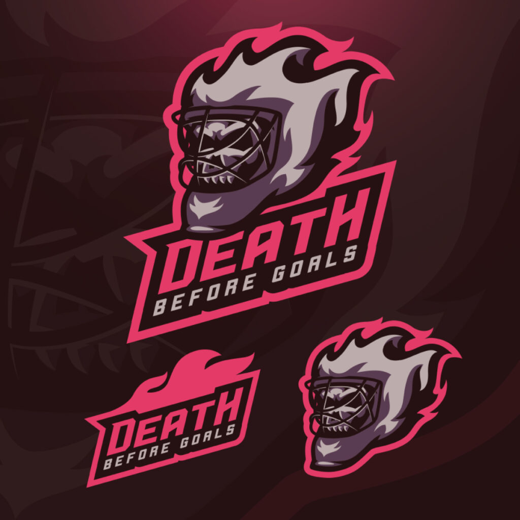
Death Before Goals by abmcolors

Makati Skyscrapers Identity Design by KPH
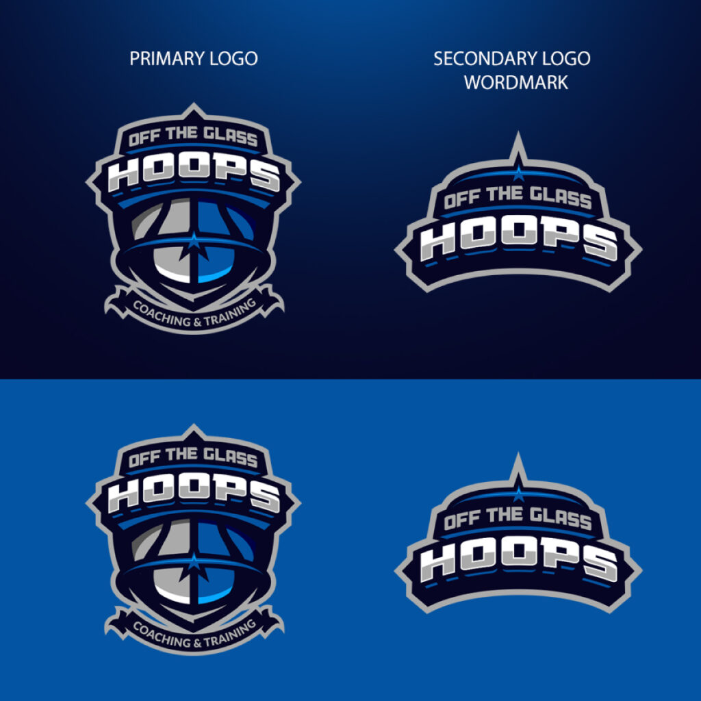
Off the Glass Hoops by abmcolors
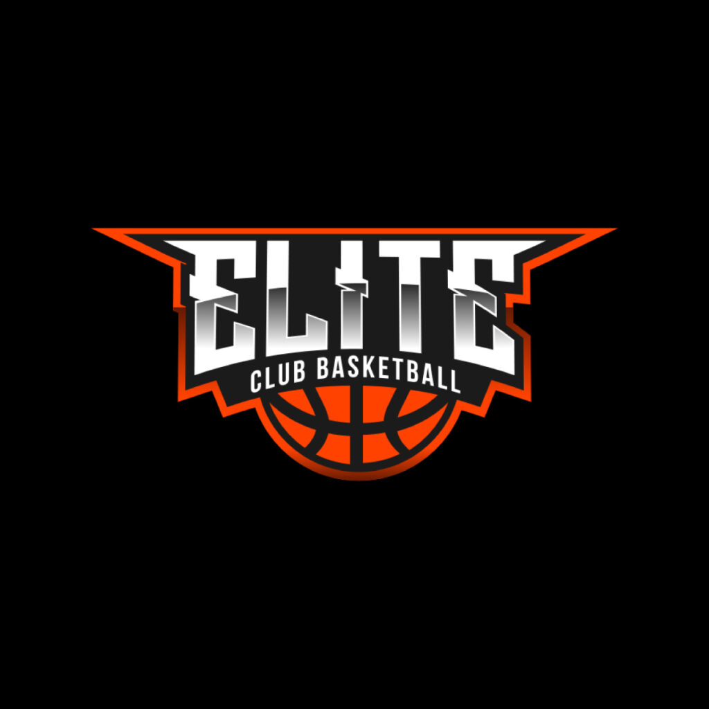
Elite Club Basketball by Alleria.Designz
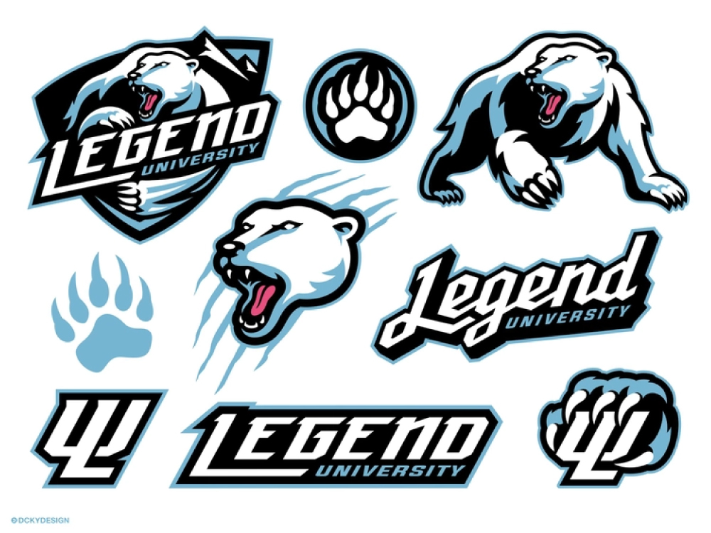
Legend University Polar Bear by Dckydesign_
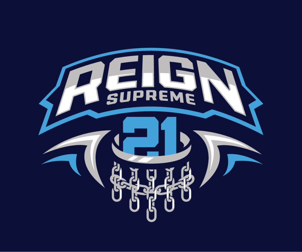
Reign Supreme 21 by Onse Officials
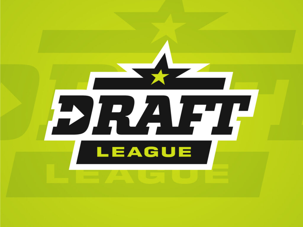
Draft League by Ziligen Design Studio
Typography lets you channel creativity with simplified elements. However, some may have trouble pulling off an initial logo because they are not sure how to add more to the design concept.
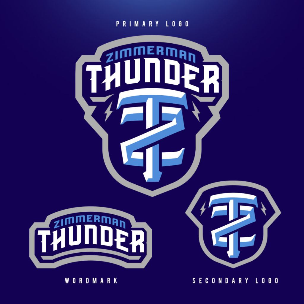
Zimmerman Thunder by abmcolors
San Diego Armada Basketball Primary Logo by Greg Hahn

Wolves Spring Challenge by abmcolors
Temecula Eagles Logo by Greg Hahn
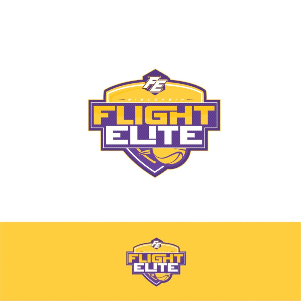
Wisconsin Flight Elite LLC by alok bhopatkar
What you can do to solve this problem is to add colors that create a strong contrast. This easily transforms text-based logos.
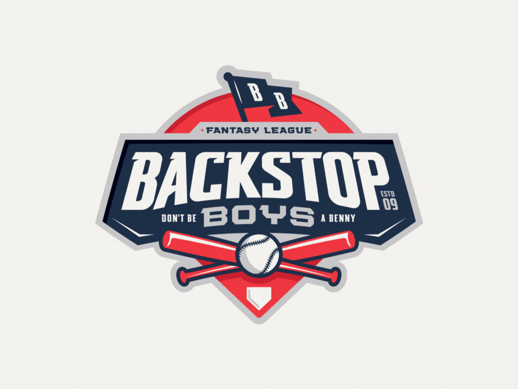
Backstop Boys Fantasy League by Matt Dawson
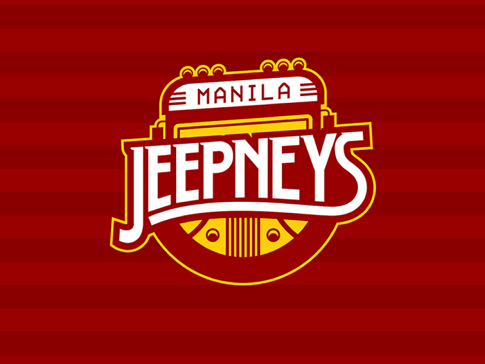
Manila Jeepneys identity concept by KPH
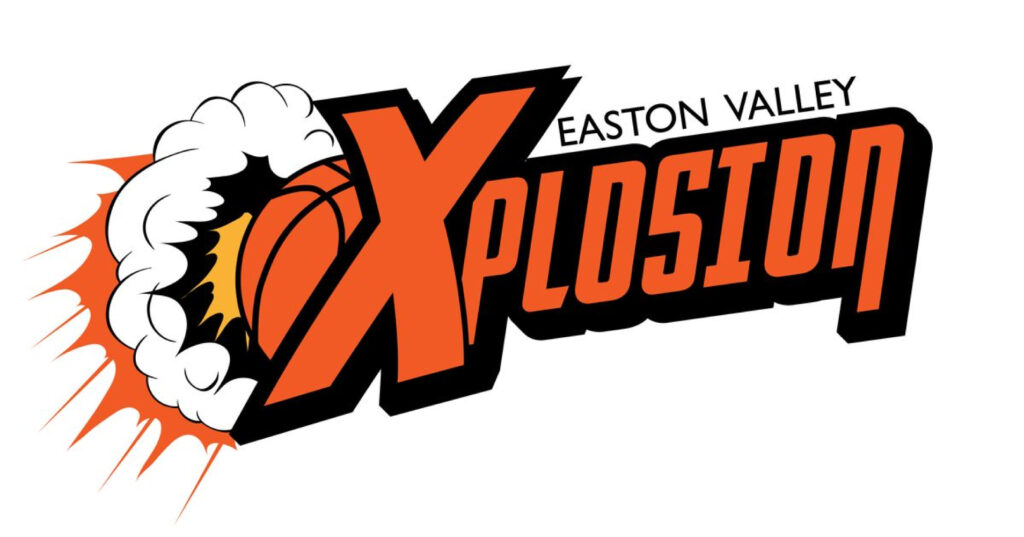
Easton Valley Xplosion by Shaun
Commonly used colors sports logos are usually red and blue. These colors are often associated with patriotism and team spirit as well. Your team could use this as a way to fuel the team spirit for both the members and fans.
For teams that want to take the unbeaten path, going for the color brown can help you stand out from the crowd. You won’t have to worry about audiences having a hard time trying to differentiate you from another team since it isn’t used often.
Nearing Overtime
Getting a fitting logo is not a trivial thing. A team is more than just scores, rebounds, and other play statistics. It is the product of hard work and dedication to the sport.
The perfect NBA logo design should also be versatile for both online and offline campaigns an organization may plan to take on. When done right, sports branding can solidify your team’s story and industry voice.
It’s possible to differentiate yourself from competitors and amp up fan loyalty with a basketball logo.
We have more for you to check out in our NBA logo gallery. You can claim it by typing your team name or go the extra mile and customize it further using our logo maker.
