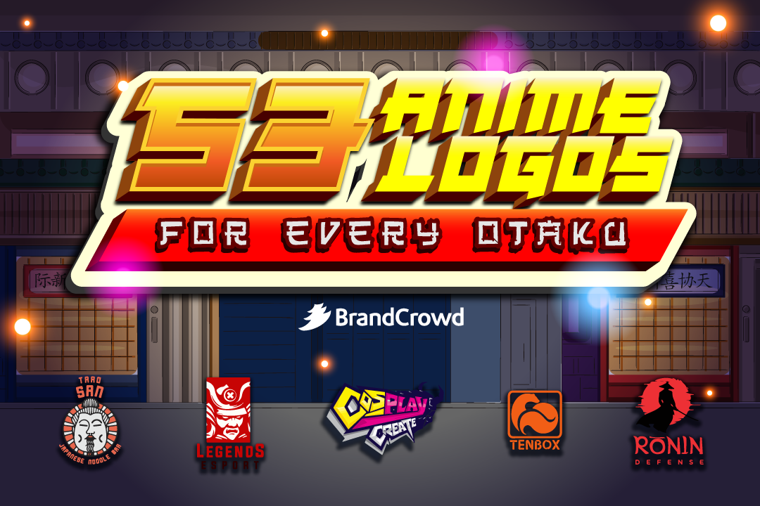
53 Anime Logos for Every Otaku
Anime is an art form that offers a fresh take on design. You’ll see a lot of anime logos with subtle lines, colors, and bug-eyed characters. This adaptive art style adds a creative layer to logos. It goes well with online stores, gaming content, streaming platforms, and discord communities.
To help you find the perfect anime logo template, we prepared a design roundup to inspire you. This list has the following designs:
You can use this drawing style to help establish your brand and reach more audiences. The right logo will help you express your identity and make people familiar with what you have to offer.
Plus, it can also help you cultivate brand consistency and use it on collaterals like business cards and social media posts.
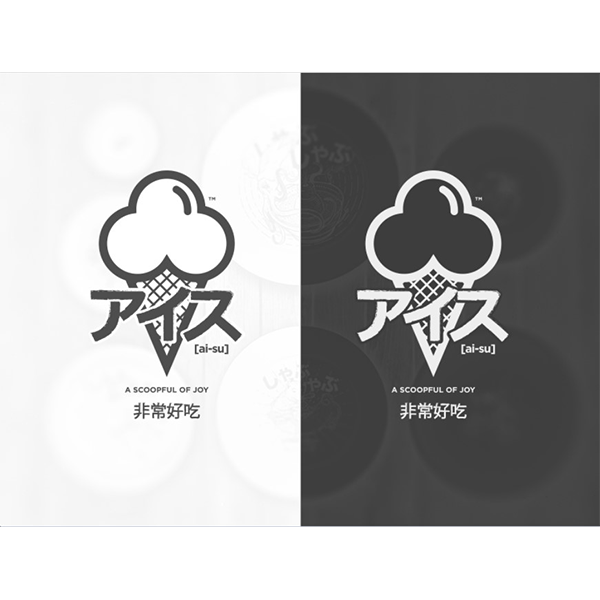
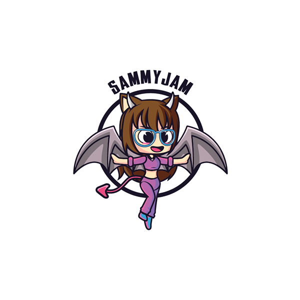
Kawaii logos
Who doesn’t like cute designs? No one. Both kids and adults like this design. Adorable characters with endearing features elicit a positive response. This art style is characterized by soft colors and round-shaped characters.
It’s almost as if you want to stand as a parent of these characters. That’s why this chibi-style helps you create a remarkable logo design.
You can try using designs featuring adorable characters such as cats, red pandas. Food is also a viable subject for kawaii logos like mochi or even characters inspired by popular shows like Pokemon.
The key to creating cute characters is the anatomical proportion. Ideally, the baby characters have big heads and significantly smaller bodies. You want to apply this with your avatar or mascot logo.
Goichi Sushi House by Lucas Fields
Legend Inn Myoko by Nuwansachi
Letter A Logo Mark | Animeal Logo Design by Robiul Islam
Playful, Cute Logo Design by li_rudi
Qawaii Anime Logo by Adnan Haj Ali
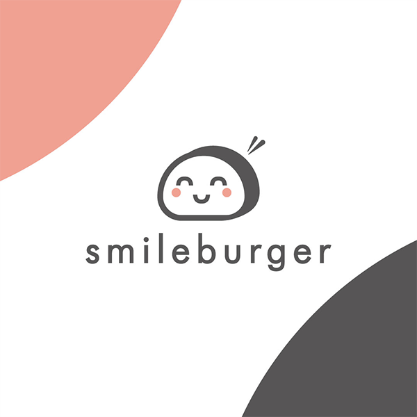
Smile Burger by adriancarretero
Pro tip: Think about your audience.
The critical thing about logo design is putting your audience first. To make a logo effective, you must create something that will resonate with the people you want to reach. You want to consider what interests them. Shoot for a kawaii logo if your audience is the type of people who will be drawn to it, like artists or craft enthusiasts.
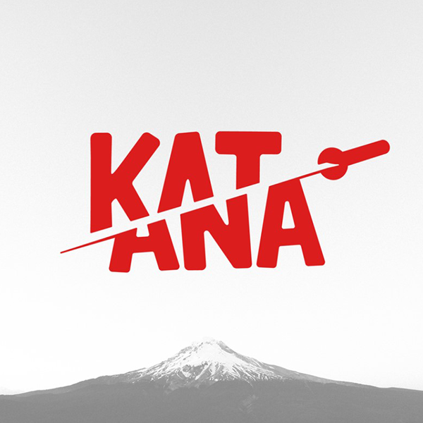
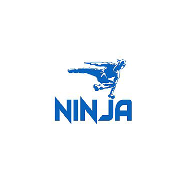
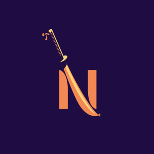
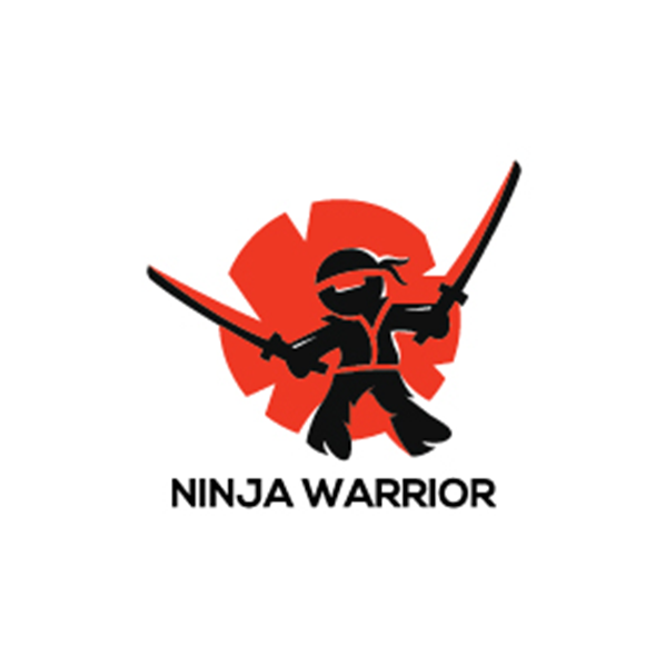
Ninja logos
The ninja is one of the best characters in anime. It is an occupation that warriors took back in the old days of feudal Japan. They’re known for their stealth, espionage, and combat skills. These characters represent mastery of ninjutsu and excellence.
Edgy brands that are in the industry of gaming and tech tend to gravitate towards this design. One example is Tyler Blevins, also known as Ninja, who is the top-earning gamer today. He has a blue and yellow logo to stand as the face of his brand.
To design one, you can illustrate a person with a black mask or an eye mask. The reason behind this is that ninjas often conceal their identities for protection. You can even add weapons such as katanas and ninja stars.
CHEF NINJA by ZtoAlphabet Logo Design
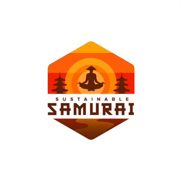
Sustainable Samurai by juan carlos lemus
Pro tip: Don’t forget about space
Space is essential to any design, especially for logos. Negative space helps you prevent oversaturation. Plus, giving design elements room to breathe makes them clearer and easier to digest.
Superhero logos
In Japan, one genre reigns supreme, which is called shonen. Shows categorized as shonen are often geared towards heroes and combat. It typically targets young audiences ranging from 15 to 18 years old. Some of Japan’s most iconic heroes are Deku from Boku No Hero Academia and Saitama from One Punch Man.
Adding heroic elements to a brand logo helps a brand look more authoritative and influential. If you’re designing a logo for your team or clan, a superhero theme will help you build a more dominant image. You should also expect to see many superhero logos created with yellow, red, and blue. These colors help signify patriotism.
To make your superhero stand out, you want to make sure that your typography is readable. This ensures that your audience pays attention to your brand name, allowing them to be aware and familiar with it.
Anime fandub project logo by Nikita Zadvornijs
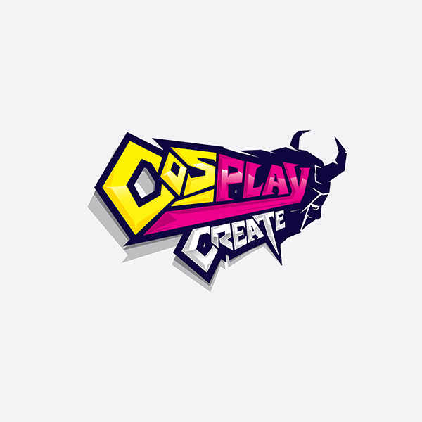
Cosplay Create by Christopher.Min
Elegant, Games Games Logo Design by EPIC PEN
Elegant, High Logo Design by Graphika.jrb
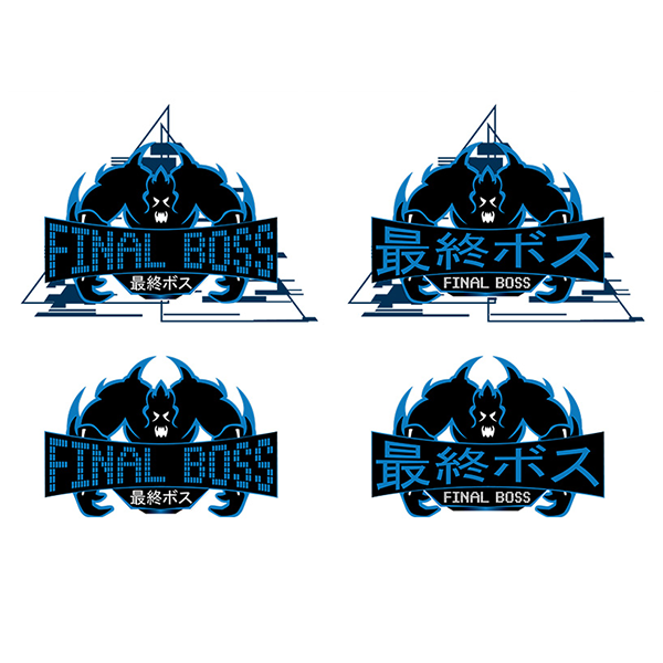
Final Boss by DesignConnection,
Playful, Cute Retail Logo Design by antsdesign
R Squeegee Perfect Cleaning by Mihaela
SHURIKEN by RossRichardsDesign

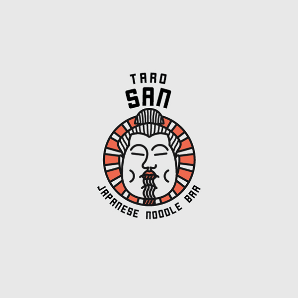
Taro San japanese noodle bar by mildtravis
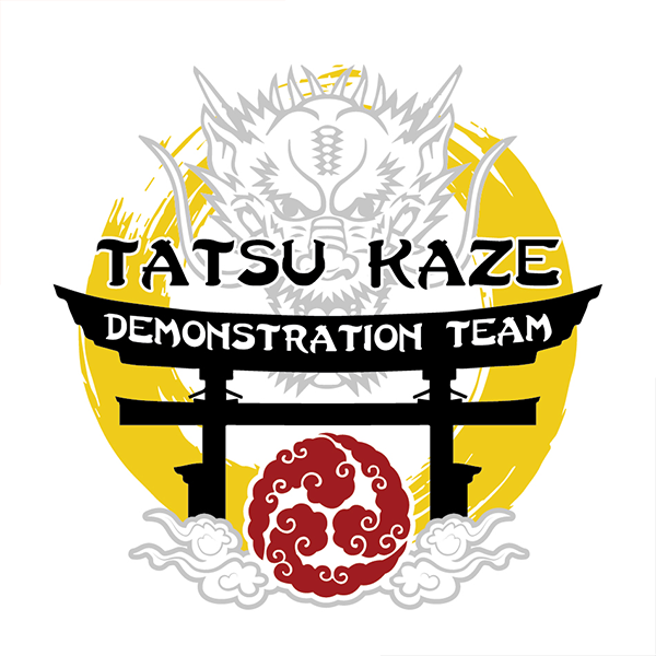
TATSU KAZE by BEGD – Bradley Edwards Graphic Design
Yumi anime club logo design by ansi rasslen
Pro tip: Use color wisely
With the help of color psychology, you can communicate a broad spectrum of traits through design. Studies suggest that consumers assign human characteristics to different colors. For example, red represents passion, yellow represents joy and more.
Conclusion
Commonly mistaken for cartoons, anime is an animation genre that originated in Japan. According to research by Grand View Research, it’s one of the most popular forms of animation entertainment with a CAGR of 8.8%. Globally, the anime’s market size is at $20.47. Above all, it makes for a great logo.
The growing popularity of anime and the show-stopping designs you’ve seen on this list has undoubtedly inspired you to get one, too.
Crowdsourcing your logo design is a great option. The best crowdsourcing platforms like Designcrowd lets you work with designers from all over the world to achieve the Japanese-inspired look you want. Launch a logo design contest and get up to 50 original design bids today.
Another way you can get an otaku logo is by creating one with the BrandCrowd anime logo maker. This gives you access to a design library that you can customize. The tool has features that let you express your identity and specialties through typography, colors, and more. Try it right here.