Brilliant! A Bouncy Squash Club Logo
Logos for modest sports-related entities are typically graphical train wrecks. Others come with horrendous typography and cringeworthy, clipart-like imagery.
But not the logo for Melbourn Squash Club. The MSC prides itself on being a family-friendly space located in the Cambridgeshire village of Melbourn.
The agency behind the logo, Distil Studio, spoke of the project, “When Cambridgeshire-based Melbourn Squash Club approached us to design their branding we applied some hard-hitting, off-the-wall thinking.”
What served an inspiration for the studio is “every thwack, thud, squeak, and sneaky drop shot to form their unique club initial.”
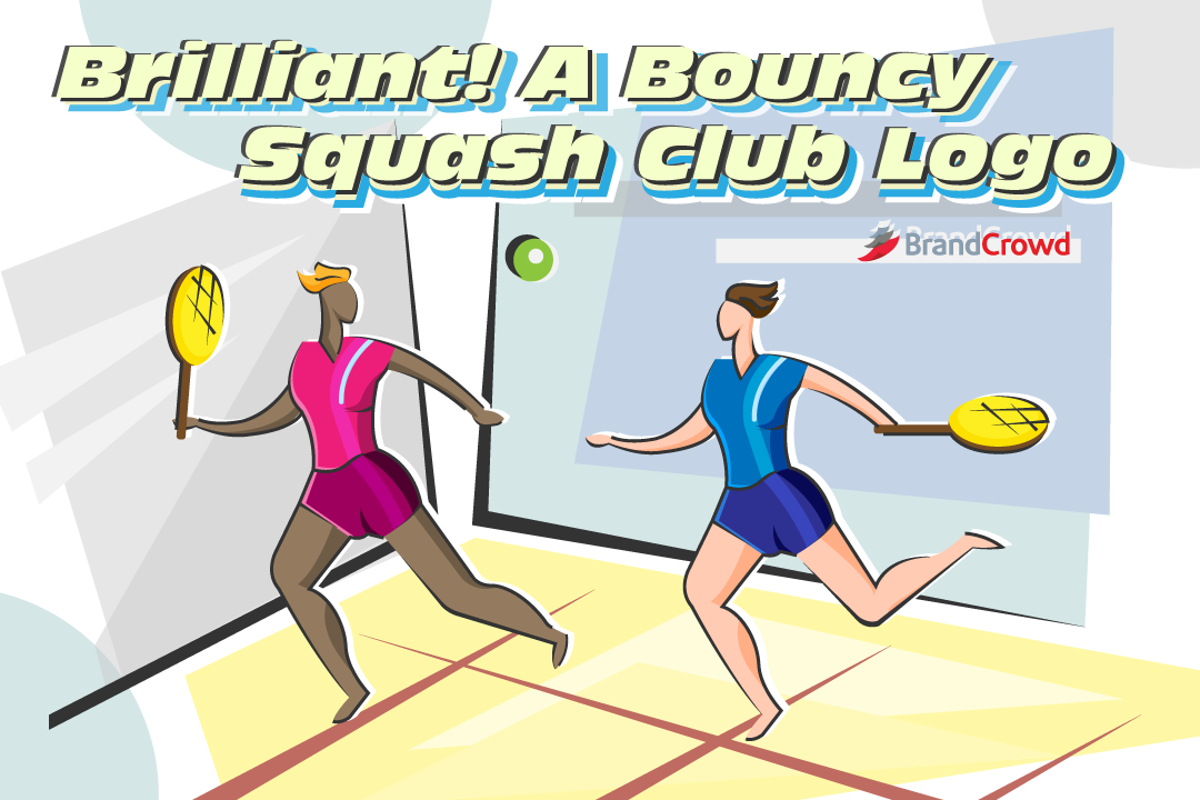
Take a look at the logo below:

The lines aren’t just for decoration. It also symbolizes the movement that the players make during actual matches. This bold choice resulted in an eye-catching and out-of-the-box design. The firm successfully avoided the use of rackets and other elements of common-place squash logos.
Well played, gentlemen!
Conclusion
Finding the right emblem for your sports club and team helps you establish your brand. It gives your members a unifying symbol to connect to. Plus, it gives your audience an idea of what they can expect from you.
You can acquire a professional sports logo for your team, too.
With the help of DesignCrowd, your team can start a logo design contest and start receiving design bids from international designers today. Don’t miss out.
Or generate a sports logo in minutes. BrandCrowd’s logo maker is an excellent place for you to start browsing sports logo design ideas and personalize one to your liking. You can get as particular as you want in font, color, and other design elements. Have a go at it today!

