Logo History: Cadbury
Are you familiar with the feeling of peeling back the wrapper and revealing a smooth, rich piece of chocolate? You take a bite, and instantly, the creamy texture and perfect sweetness take over. It melts in your mouth, leaving you craving just one more piece—pure happiness in every bite.
Let’s be honest: who doesn’t love chocolate? It’s the ultimate comfort food, the treat we reach for when we need a little pick-me-up, and the best gift to celebrate Valentine’s Day.
When it comes to chocolate, one name stands out—Cadbury. But have you ever noticed how just seeing the Cadbury logo design makes you crave chocolate? Something about that signature script feels warm, familiar, and irresistible.
So, let’s take a fun trip down memory lane and see how this famous chocolate logo branding has become a symbol of chocolatey happiness.
The Science of Chocolate Love

Ever wonder why chocolate makes you feel so happy? Why can just thinking about it make your mouth water? Well, there’s some serious science behind our love affair with chocolate. Aside from the taste, chocolate does something to your brain, body, and emotions.
1. The happiness chemical boost
Chocolate is a natural mood booster. When you bite, your brain releases dopamine, the feel-good chemical that makes you happy and satisfied. But that’s not all! Chocolate also contains:
- Serotonin: Helps reduce stress and brings a sense of calm.
- Endorphins: The same chemicals released when you exercise, giving you that warm, happy feeling.
- Theobromine: A gentle stimulant that gives you a light energy boost (without the jitters of coffee).
2. Melts in your mouth, melts your stress
There’s something magical about the way chocolate melts perfectly on your tongue. Its melting point is just below body temperature, making it feel smooth, creamy, and oh-so-satisfying. Scientists say this texture plays a huge role in why we crave chocolate—it’s a pleasure to eat!
3. A sweet memory machine
Chocolate isn’t just a treat—it’s tied to some of our best memories. Think about it:
- That first chocolate bar you got as a kid
- A box of chocolates on a special occasion
- Sharing a bar with someone you love
Because chocolate is linked to positive experiences, your brain associates it with happiness, making you crave it even more.
4. Comfort food at its best
Ever reach for chocolate when you’re feeling down? There’s a reason for that! Chocolate reduces cortisol, the stress hormone, helping you feel calmer and more relaxed. That’s why a piece of chocolate hits differently after a tough day.
5. The ultimate craving trigger
Why does just seeing a chocolate bar make you want one? It’s science! The combination of sugar, fat, and cocoa creates an irresistible craving. Your brain recognizes chocolate as an energy-packed food, so stopping at just one bite is hard. (But hey, no judgment if you don’t!)
See here how chocolates are made:
Cadbury Logo: Overview
What comes to mind when you think of Cadbury? The creamy, rich chocolate? The comforting taste that melts in your mouth? Or the iconic logo, smooth, elegant lettering that feels as classic as the brand.
The Cadbury logo is more than a name. It represents warmth, indulgence, and sweet memories. Over time, the design has changed, but its essence remains the same—a familiar symbol that chocolate lovers instantly recognize.
The Power of Purple

Ever noticed how Cadbury’s deep purple packaging feels rich, inviting, and a little magical? That’s no coincidence. The brand didn’t just pick purple randomly—it’s a color deeply connected to luxury, indulgence, and creativity.
Purple in color psychology
In color psychology, purple represents royalty, elegance, and sophistication. It has long been associated with wealth and exclusivity since, in ancient times, purple dye was rare and expensive. Today, it still carries that prestige, making it a perfect fit for a brand that prides itself on quality.
Beyond luxury, purple also has a calming and comforting effect. It blends the stability of blue with the energy of red, creating a soothing and exciting balance—just like a bite of smooth, creamy chocolate.
Why did Cadbury choose purple?
Cadbury first introduced its signature purple in 1914. Some say it was a tribute to Queen Victoria, while others believe it was chosen to make the brand stand out. Either way, the color quickly became essential to Cadbury’s identity.
The rich purple gives Cadbury chocolates a premium quality. It tells chocolate lovers what’s inside is unique, worth savoring, and crafted with care. Over time, this distinct shade became so iconic that Cadbury even trademarked it to protect its distinctive identity.
Check out some examples of purple logos below:
Cute Purple Elephant by BrandCrowd
Purple House Real Estate by BrandCrowd
Purple House Realty by BrandCrowd
Purple Cloche Protractor by BrandCrowd
Mechanical Purple Flower by BrandCrowd
Purple Heart Jellyfish by BrandCrowd
Purple Baby Boutique by BrandCrowd
Cadbury Logo History
The Cadbury logo has evolved over the years. Check out its variations below:
1905-1915

Did you know Cadbury Dairy Milk’s first logo was created between 1905 and 1915? It was designed to match the chocolate bar’s wrapper, with a lilac background that made it stand out and feel special.
The logo’s floral theme added a nice touch while reminding people of the chocolate’s rich aroma. Clear text at the top and bottom made it easy for customers to read. The Cadbury name was proudly displayed in the center, honoring the brand’s founders and building trust.
Fun fact: A customer came up with the name “Dairy Milk”! A small milk pail next to it highlighted the fresh, high-quality ingredients that made Cadbury different.
(Check out our business name generator for fun business name ideas!)
One unique detail was the letter C, designed with a swirl to show the smooth blend of chocolate and milk. This slight touch made the logo feel even more special and reflected the care put into every bar.
1915-1923

Cadbury updated its logo at a key moment to make it more recognizable worldwide. This change came as the company opened a new factory and aimed to grow its market. The new logo removed the background, symbolizing a fresh start and a push toward a global audience. It showed Cadbury’s ability to evolve and connect with more people.
The refresh introduced gold and purple—gold for luxury and quality and purple for uniqueness and elegance. This gave Cadbury Dairy Milk a more premium feel, making it even more appealing to chocolate lovers.
1923-1940

Cadbury redesigned its logo at a key historical moment to reflect tradition and success. The new heraldic-style design gave it a regal feel, symbolizing stability and prestige. The company name appeared on scroll-like elements, emphasizing Cadbury’s rich heritage and long-standing reputation.
During World War I, Cadbury adjusted its brand image as chocolate shifted from a luxury to a valued source of nutrition for soldiers. The golden details were removed to focus on practicality, and floral motifs disappeared to appeal to a broader audience, especially men.
The more straightforward design highlighted Cadbury chocolate as a reliable source of energy and strength.
1940-1952
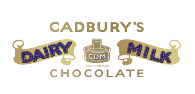
Cadbury updated its logo to reflect changing times, bringing back gold to symbolize success and top quality. This highlights its strong sales and reminds consumers of its trusted reputation. The brand name now appears in rich blue, making it stand out while adding a sense of reliability and professionalism.
A subtle gradient adds depth and a modern touch, showing Cadbury’s commitment to innovation. The refined design reinforces the chocolate’s premium quality, positioning it as a luxurious treat rather than just a simple sweet.
1952-1961

1952, Cadbury refreshed its logo to match modern design trends and consumer tastes. The new look featured the Cadbury name, styled like thick caramel or melted chocolate, making it instantly appealing. This creative touch highlighted the brand’s craftsmanship and delicious flavors, strengthening its connection to chocolate lovers.
The logo also introduced two golden wrappers, symbolizing rich quality and extra milk content for a creamier taste. Gold added a touch of luxury, making the chocolate feel even more special.
The milk pail was removed for a cleaner, more modern look, showing Cadbury’s ability to evolve while staying a top name in chocolate.
1961-1970
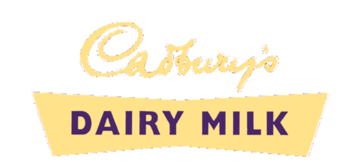
In 1961, Cadbury introduced a bold new logo with a light yellow design, symbolizing innovation and change. However, the color wasn’t instantly recognizable, making brand recognition challenging.
The redesign combined two halves of the emblem into a shape resembling a broken chocolate bar or a ship’s hull, representing Cadbury’s adventurous spirit in creating new flavors.
The parent company’s name was styled like a flag, adding energy and a sense of exploration. A purple “Dairy Milk” inscription stood out against the background, reinforcing Cadbury’s premium quality.
While the logo’s unique shape and pale yellow color made it harder to recognize, they reflected the brand’s creativity and introduced a fresh, airy corn recipe.
1970-1980

In 1969, Cadbury merged with Schweppes, strengthening its brand and updating its logo. Gold shades were brought back to highlight luxury and quality, reinforcing Cadbury’s reputation for rich, refined chocolate.
The design was simplified to focus on the brand name, making it more eye-catching and recognizable. A decorative frame added a touch of exclusivity, emphasizing Cadbury’s commitment to high-quality, premium treats.
1980-1991
In 1980, Cadbury refreshed its logo to reflect its growth and adaptability. The brand name was placed between two horizontal stripes, resembling a label, symbolizing openness and constant evolution.
The top featured the parent company’s name to highlight its leadership, while the bottom clearly stated “Dairy Milk Chocolate” for stronger brand recognition.
The design felt light and modern, reinforcing Cadbury’s commitment to innovation. This update wasn’t just about looks—it aimed to create an emotional connection, making every chocolate bar a delightful experience for consumers.
1991-1993

Cadbury’s latest logo update is bolder and more eye-catching. The emblem was moved to the left, creating an asymmetrical design that stands out. It resembles a book page, making Dairy Milk feel like an important chapter in Cadbury’s rich chocolate history, inviting consumers to be part of the story.
Thin and thick stripes symbolize the perfect mix of chocolate and milk, emphasizing quality and flavor. Straight lines now frame the brand name, giving the logo a clean, structured look that mirrors the shape of a Dairy Milk chocolate bar.
1993-1999
Cadbury’s latest logo update brings more energy and meaning to its design.
A stylized image of 1.5 glasses of milk adds color and texture, highlighting the chocolate’s creamy, natural goodness. Two flowing milk streams weave through the brand name, creating a sense of freshness and movement, reinforcing Dairy Milk’s rich and smooth taste.
The new design also includes a three-dimensional chocolate bar, making the logo more visually appealing. This detail showcases the chocolate’s texture and quality, inviting consumers to enjoy every bite.
1999-2003

In 1999, Cadbury Dairy Milk updated its packaging to blend nostalgia with a fresh, modern look. The iconic purple wrapper honored the brand’s heritage, symbolizing indulgence and quality. It aimed to transport consumers to a delightful, chocolate-filled experience.
The new design portrayed each piece of chocolate as part of a flowing river of milk, emphasizing its creamy texture and rich flavor. This visual reinforced Cadbury’s commitment to high-quality chocolate, making every bite a magical treat.
2003-2010
In 2003, Cadbury Dairy Milk introduced a new logo highlighting the chocolate and milk blend. A swirling design symbolizes their smooth mixing, reinforcing the rich, creamy taste that makes Dairy Milk unique.
The logo also features milk-filled glasses, emphasizing the chocolate’s natural ingredients and nutritional value. With soft, blurred edges, the design creates a light, airy feel, making the chocolate experience even more inviting.
2010-2013
The new Cadbury logo has a fresh, dynamic look. It emphasizes the blend of milk and chocolate that makes Dairy Milk so delicious. The brand name appears filled with flowing milk, instantly showcasing the creamy, rich ingredients.
A bold chocolate block in the design highlights the careful craftsmanship behind each bar. This eye-catching detail reassures customers that every piece of Dairy Milk is made for pure enjoyment and top quality.
2013-2021
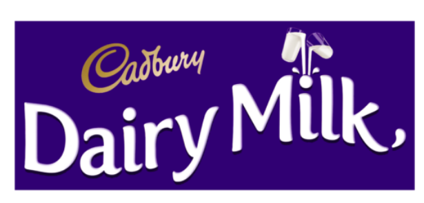
In 2013, Cadbury refreshed its logo with a taller, slimmer font to give it a modern and elegant look. This change reflects its chocolate’s smooth and light texture, making the brand feel more refined.
Each letter now resembles a rich chocolate groove filled with flowing milk, highlighting its signature creaminess. This design reinforces Cadbury’s dedication to quality and innovation while keeping its classic charm.
2021-Present
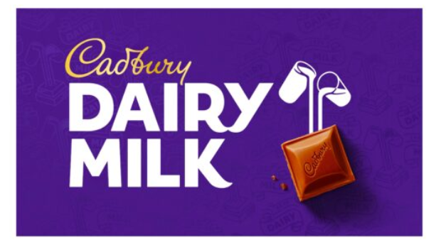
The latest Cadbury logo blends precision with creativity. It features clean, right-aligned text beside an image of chocolate emerging from milk, highlighting the brand’s signature ingredient and quality.
A chocolate bar at the center grabs attention, showcasing Cadbury’s pride in its rich taste. The classic purple background ties everything together, making the design stylish and instantly recognizable.
How Small Businesses Can Benefit From This
Small businesses can learn valuable branding lessons from the Cadbury logo, such as:
- Strong Brand Identity: Cadbury’s consistent use of colors and typography shows how a well-designed logo can build trust and recognition. Small businesses can create a professional look that attracts customers.
- Emotional Connection: The Cadbury logo tells a story through design. Small businesses can use symbols, colors, and fonts to convey their values and connect with their audience emotionally.
- Memorable Visuals: A simple yet distinct logo helps a brand stand out. Small businesses should focus on clear, eye-catching designs that make their brand easy to remember.
- Consistency in Branding: Cadbury’s logo evolution maintains key elements while modernizing its look. Small businesses can update their logos over time while keeping core brand elements intact.
- Competitive Edge: A unique and well-thought-out logo helps businesses differentiate themselves in crowded markets. Small companies can use strategic design to highlight uniqueness and attract more customers.
Design Your Chocolate Logo Today
Your chocolate brand deserves a logo that’s as rich and inviting as your treats! A well-designed logo makes your brand stand out and instantly connects with customers. Think about warm browns, creamy golds, or deep purples—colors that bring chocolate to mind.
Ready to create the perfect logo? BrandCrowd makes it easy! With our simple logo maker, you can customize designs in minutes. Pick a template, adjust colors and fonts, and create a unique logo representing your brand. Start designing today!