Font Trends: When Should You Use Cursive Fonts?
The handwritten look has a certain charm, and it’s making a big comeback in the digital world. We’re talking about cursive fonts; those elegant styles that remind us of old letters and fancy invitations.
Digital typefaces took over for a while, making cursive seem like a thing of the past. However, in 2025, people crave that personal touch more than ever.
Research shows that designs using handwritten fonts can make customers more likely to buy something. This can boost their preference from about 5% to over 30%! Big brands like Ray-Ban and Sharpie already use cursive to make their logos feel classy and personal.
So, if you’re looking for the best cursive fonts to add unique flair to your next project, or wondering how a logo maker can help you achieve that perfect handwritten feel, you’re in the right place. Discover why these fonts are more than just a pretty face. They are a powerful tool for connection and creativity.
Understanding Cursive Fonts
Cursive fonts copy the natural flow of human handwriting, with letters that usually connect in a smooth line. Unlike block letters that stand alone, this connection gives them a sense of movement. They also often feel more personal and artistic than other font styles.
However, “cursive” isn’t just one look. It covers many styles, from formal fonts with decorative swirls to relaxed, playful ones that feel truly handwritten. The smooth way their lines flow is a key feature, making them easy to spot. This often gives any design a softer, more inviting feel.
The history of cursive
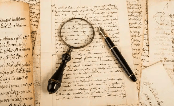
These fonts have a long history. Think about old handwritten documents and beautiful writing from centuries ago. Before printing presses, people wrote everything by hand. These unique writing styles became the first cursive scripts.
When books and papers started being printed, designers still wanted to capture that personal, handwritten beauty. As a result, they created the first digital cursive fonts.
These were made to look just like smooth, connected handwriting for computer use. This long history is why many elegant cursive fonts feel timeless. They connect today’s designs to centuries of art.
Cursive in the digital age
Today, computers have not just kept cursive fonts alive; they have changed them significantly. Designers now have many new versions, pushing what these classic fonts can do. They make text feel personal in websites and apps, adding a special touch to screens, email names, and even buttons.
These new versions keep cursive fonts fresh and exciting in the digital world. This also makes them excellent for branding and high-end design work.
When To Use Cursive Fonts
Cursive fonts are powerful tools when used correctly. Their unique look can create specific feelings and convey clear messages.
They often work more effectively than other font styles in certain situations. Knowing when and where to use them is key to making them effective.
Branding and logo design

Cursive fonts are excellent for brand names and logos. They are especially effective when a company wants to show style, heritage, or a personal touch. Their smooth lines often suggest quality, tradition, or something exclusive, making them perfect for fashion, beauty products, luxury goods, and hotels.
Their unique look also helps people recall the brand more effectively. Choosing them for a logo is not just about looks. It’s a wise choice that allows people to connect emotionally with the brand.
Wedding and event invitations

Few uses show cursive fonts’ romantic and formal side better than wedding and event invitations. Cursive script adds timeless elegance and a personal, handmade feel, making invitations feel special and setting the mood for a memorable event.
Formal weddings often use neat, refined cursive fonts to highlight tradition and sophistication. For casual events, looser, more playful script fonts can offer the charm of handwriting yet maintain a relaxed vibe.
Choosing a cursive font for an invitation instantly makes it feel more valuable and emotional, turning each invite into a treasured keepsake.
Digital interfaces and UX

Cursive fonts might seem challenging for screen readability. However, using them wisely can boost a digital experience and add a clear personality. The key is to use them in small amounts and with careful thought. They work best in digital spaces for short pieces of text. In these instances, their unique look matters more than how quickly they can be read.
They are excellent for headlines as they grab attention and set a mood. They also work well for memorable or inspirational quotes to make them stand out. You can even use them on buttons to make them more inviting and unique.
When chosen carefully, these fonts can add visual breaks, give character, and strengthen a brand’s unique identity. They do this without making the whole screen difficult to read.
Packaging and product design

Cursive fonts are excellent storytellers when used in product packaging and design. They instantly suggest good quality, a handmade feel, and a personal touch. They show that something was made with care and attention to detail, hinting that the product inside is special or crafted with passion.
For example, a small coffee brand using a warm cursive font on its packaging immediately creates a cozy, welcoming feeling. Similarly, a natural skincare line might use an elegant cursive font to suggest purity and a connection to nature.
In these cases, cursive fonts do not just label. They create an emotional link, turning a simple product into an experience.
Best Practices for Using Cursive Fonts
While cursive fonts can look amazing, using them well depends on following a few key rules. Misusing them can quickly make things difficult to read or appear messy.
By following these guidelines, designers can use the special charm of cursive fonts without losing clarity or visual appeal.
Pairing with other fonts
One of the most critical aspects of using cursive fonts well is knowing how to use them with other typefaces. Because they are often ornate and detailed, these fonts usually do not work well as the primary font for large blocks of text. Instead, they are most effective as accent fonts.
Cursive fonts are typically used with simpler, easy-to-read serif or sans-serif fonts. This creates a balanced look, allowing the cursive font to draw attention to key elements like headings or logos, while the other font ensures the main text is clear.
The main rule is to avoid using many cursive fonts together, as this can make designs appear messy and confusing. Pick one cursive font instead and let it be the star.
Readability considerations
Readability is crucial in design. Cursive fonts, by their nature, can be challenging in this regard. Their connected letters and often varied line thickness can make them difficult to understand, especially when small or used in long paragraphs. Therefore, it is crucial to use them for short pieces of text.
Also, ensuring sufficient color contrast between the text and its background is vital for readability, especially with detailed cursive scripts. The correct size is also key. A cursive font that looks excellent at a large size might be unreadable when small.
Always check your designs at different sizes and on various devices. When selecting a cursive font, always prioritize clarity over aesthetics.
Cultural and contextual sensitivity
The choice of a cursive font can carry cultural meanings. It can also evoke specific periods in history or art styles. Therefore, designers must be mindful of how different cursive styles are understood in various cultures.
Ultimately, the font must match the brand’s overall message and target audience. A tech company wanting to seem more human but still modern might use a subtle cursive touch in its ads or for a specific product name.
This judicious use of a cursive font can add personality and warmth without harming the brand’s image of being innovative. Always think about your audience and the feelings you want to create with your fonts.
Emerging Trends in Cursive Fonts in 2025
The world of fonts constantly changes, and cursive fonts are no different. In 2025, exciting new font trends are emerging. These trends illustrate how these classic scripts are designed and used. They also reveal larger shifts in digital aesthetics and user interaction.
The rise of variable cursive fonts

One of the most significant advancements is the continued rise of variable cursive fonts. These are more than just single font files. They are powerful tools that offer designers extensive control.
With variable fonts, designers can smoothly change things. They can adjust thickness, width, slant, and even the amount of decorative swirls within one font. This means greater freedom and less need for numerous different font files. It allows for more dynamic and flexible font designs across various devices. Designers can create exquisite cursive fonts with ease.
Cursive in new digital experiences
Cursive fonts are appearing more frequently in new digital experiences beyond regular screens. There is a clear trend of using these fonts in augmented reality (AR) and virtual reality (VR) screens.
Imagine a virtual shop where product descriptions appear in animated cursive fonts. Or consider a VR game where story elements are shown in a playful handwritten style. These growing technologies add a new layer of personal feeling and immersion, helping digital worlds feel more connected to human touch.
Social media and personal connection
The impact of social media visuals cannot be ignored. Cursive fonts are used more frequently in social media posts. Brands aim to appear authentic, personal, and unique, striving to stand out from generic digital messages.
Animated cursive fonts are already often used in Instagram stories, TikTok videos, and other platforms. This helps them connect with people more actively and personally, making them appear more human and approachable.
Samples of Cursive Fonts in 2025
To help you explore the many types of cursive fonts, here are some examples of versatile, trending font options. Each offers a unique appearance, making it suitable for different design uses.
Playful Script BC
This font presents a cheerful and casual feel. Its letters are smooth, slightly rounded, and connect naturally, resembling neat handwriting with an added flair. It conveys a youthful, approachable vibe, making it great for children’s brands, lighthearted product packaging, greeting cards, or informal invitations. Picture it on a homemade candle’s label or a whimsical storybook’s cover.
See it in action:
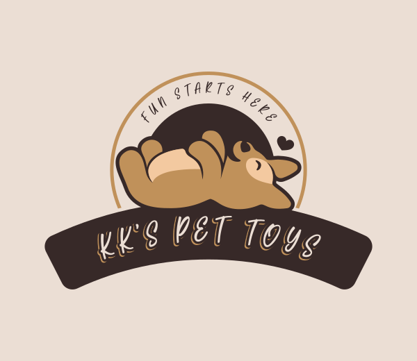
Dog Puppy Playing by BrandCrowd
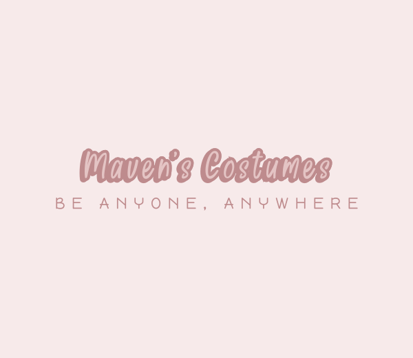
Feminine Playful Business by BrandCrowd
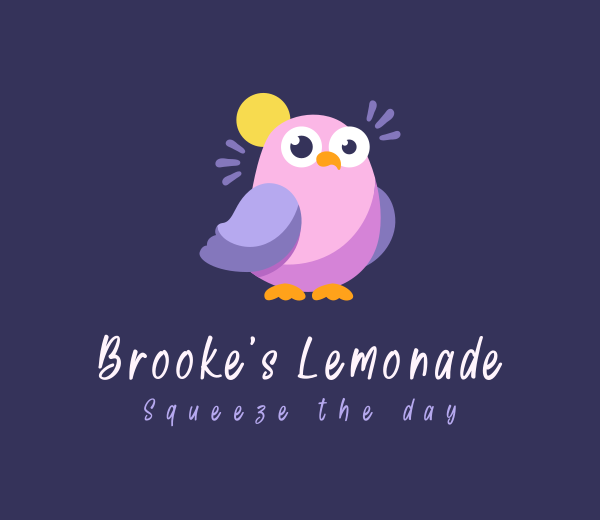
Cute Playful Dove by BrandCrowd
Silken BC
Silken BC is a smooth, versatile font with a soft, rounded appearance. Its letters connect cleanly and gently, like bubble writing with a sophisticated twist. It manages to feel both friendly and elegant at the same time.
This makes it a strong choice for logos, product labels, or charming packaging. Think of it on a handmade lotion bottle, a boutique store sign, or a cozy brand’s social media posts.
See how it looks here:
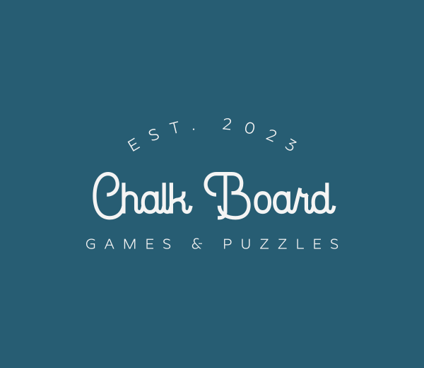
Playful Business Shop by BrandCrowd

Business Boutique Agency by BrandCrowd
Seashell BC
Seashell BC offers a relaxed and inviting look, making it excellent for invitations, personal notes, or branding that seeks an approachable and warm feel. Its letters are easy to read, with a natural flow that brings a personal touch to any project. It works well for short phrases, names, or anywhere you want a soft and welcoming presence.
Feminine Wellness Apparel Logo by Design
Textured Artistry Signature Logo by Design
Bristle Two BC
This font features a smooth, handwritten appearance, as if drawn with a soft marker or brush. Its letters connect and flow effortlessly from one to the next. Bristle Two BC feels casual and creative, ideal for personal notes, invitations, or projects aiming for warmth and hospitality. The letters are clear and have a playful, energetic style that stands out subtly.

Elegant Mandala Wellness Spa by Design
Pancake Breakfast Delight by Design
Elegant Urban Apparel by Design
Gold Coast BC
Gold Coast BC displays bold, rounded letters in a smooth, connected cursive style. This gives it a friendly and lively character. It is easy to read and carries a playful, vintage charm, making it effective for signs, logos, or anything that aims to be fun and welcoming. Its classic script elements add a touch of retro appeal while remaining modern and approachable.
Butterfly Book Pages by BrandCrowd

Stock Arrow Finance by BrandCrowd
Embracing Cursive Fonts in Modern Design
Cursive fonts are incredibly versatile tools for designers. They can add a touch of luxury to a brand logo, bring romance to a wedding invitation, or even make a digital screen feel more personal. The key is understanding their strengths and being aware of their cultural implications.
Discover the ideal elegant cursive font for your next project in the vast collection on BrandCrowd. Their wide selection includes cursive fonts for every need, from elegant cursive fonts for formal designs to decorative and playful cursive fonts for more casual projects. These beautiful scripts can truly transform your designs!
Allow your creativity to flow, connect with your audience, and let your designs truly tell their own story.
Read more on designs here:
- The Color Cream | Meaning and Psychology
- 7 Father’s Day Ads That Nailed Emotion and Creativity
- How Digital Gift Cards Can Supercharge Your E-Commerce Marketing Strategy
FAQ: Cursive Fonts in Design
1. What distinguishes cursive fonts from script fonts?
While cursive and script fonts copy the look of handwriting, the main difference lies in how their letters connect. Cursive fonts typically feature letters visibly joined together in a continuous flow, much like traditional penmanship. On the other hand, script fonts can have either connected or separate letters, often with more varied and artistic styles that might not always maintain a strict connection.
2. Are cursive fonts suitable for body text?
Cursive fonts, including long paragraphs or main content, are generally unsuitable for body text. Their connected letters and often detailed designs can make them very hard to read quickly, especially at small sizes. For better readability, it’s best to use them only for short phrases, headlines, or small accent elements where their unique beauty can be appreciated without hindering comprehension.
3. How can I pair cursive fonts with other typefaces?
Combining cursive fonts with simple, clean serif or sans-serif fonts is the right way to go. This creates a good visual contrast, allowing the cursive font to stand out without making the design look messy. This approach helps maintain good readability and establishes a clear visual hierarchy in your design.
4. Do cursive fonts work well in digital interfaces?
Yes, cursive fonts can work well in digital interfaces if used smartly and in small amounts. They can add a personal, warm, or elegant touch to a design, especially for elements like headlines, decorative quotes, or special call-to-action buttons. The key is to avoid using them for large blocks of text to ensure the overall user experience remains smooth and easy to read.
5. Can cursive fonts be used in professional settings?
Absolutely! Cursive fonts can be used professionally to match the specific context. A formal, elegant cursive font can convey sophistication and luxury, making it perfect for high-end branding, formal invitations, or legal documents. However, picking a style that aligns with the brand’s overall tone and ensures readability for the intended professional audience is crucial.
Hannah Suroy suroy loves turning big stories into easy-to-digest articles about movies, TV, business, and more. These days, she mainly writes creative articles and insights focused on the world of design.
Original Artwork by Selwyn Legaspi