How Color Palette Choices Influence E-commerce Sales
Have you ever noticed how some online stores catch your eye and make you want to stick around?
A lot of that has to do with color. The colors you see on a website affect how you feel, what grabs your attention, and whether you decide to buy something.
Using color psychology in e-commerce can make a big difference. It can help customers trust you, feel good about shopping, and remember your brand.
No matter what you’re selling, knowing how to use color correctly when setting up your website can help you sell more and keep people coming back.
Let’s examine how color choices impact online shopping and what you can do to get it right!
What Is Color Psychology in E-Commerce?
Colors can influence how we feel and what we do, especially when shopping online. Different colors can trigger different emotions and reactions, making understanding color psychology beneficial for any e-commerce business.

Emotional triggers
- Red is bold and exciting. It creates a sense of urgency, so you’ll often see it on “Buy Now” or “Limited Time Offer” buttons.
- Blue feels calm and trustworthy, making it a favorite for brands like banks or tech companies that want to demonstrate reliability.
- Green gives off a vibe of health and tranquility, which works well for wellness and eco-friendly products.
- Yellow is bright and optimistic. It grabs your attention quickly, but should be used carefully, so it doesn’t overwhelm.
- Black exudes luxury and sophistication, making it perfect for high-end brands.
Gender preferences
Colors can also appeal differently depending on who you’re targeting. Studies show that women prefer blue, purple, and green, while men lean more toward blue, black, and green. Knowing this can help you tailor your color choices based on your audience.
Cultural considerations
Colors don’t mean the same thing everywhere.
For example, white often represents purity in Western cultures but can symbolize mourning in some Eastern cultures. If you’re selling internationally, it’s essential to consider how colors might be perceived worldwide.
Understanding these basics gives you a great foundation for picking colors that look good and connecting with your customers on a deeper level.
Choosing Colors for Your Type of Business
Not all businesses are the same, and their color choices should not be. Here’s how different industries use color to speak to their audiences effectively:
Health and wellness stores

Health and wellness brands often want to communicate freshness, calm, and trust. Shades of green are a natural choice here because green is strongly associated with nature, health, and tranquility.
Lighter mint tones and soft blues also work well, helping customers feel relaxed and confident in the products they’re buying.
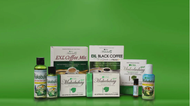
Besides creating a soothing environment, these colors help emphasize ideas like sustainability and natural ingredients, which many shoppers look for in wellness products.
Luxury brands

Luxury brands thrive on feelings of exclusivity and elegance, and color plays a significant role in setting that tone.
Deep blacks, rich golds, and royal purples are common choices because they convey sophistication, power, and wealth. These colors help your brand feel upscale and special, making customers feel like they’re investing in something valuable.
See how these dark color palettes elevate high-end products:

Gold Jewelry Shop by BrandCrowd

Fashion Jewelry Shop by BrandCrowd

Gemstone Jewelry Shop by BrandCrowd

Generic Business Company by Design

Luxury Perfume Lounge by Design
Tech and finance sites

Trust and professionalism are key in tech and finance. That’s why blue is the go-to color for many companies in these industries when they set up shop online.
Blue signals reliability, security, and intelligence, helping customers feel safe when sharing sensitive information or making big decisions.
Tech and finance websites also often combine blue with neutral tones like gray or white to keep the look clean and modern.
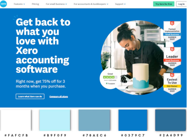
This combination communicates that the company is both cutting-edge and dependable, a balance essential for winning customer confidence in these fields.
Want something similar for your tech services? Here are some templates you can customize:

Digital Technology Service by Design

Digital Cybersecurity by Design

3D Printing Technology by Design

Cyberspace Data Protection by Design
Kids’ products
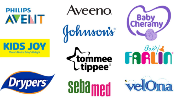
Bright, cheerful colors are a must when designing for kids’ products. Colors like yellow, orange, and bright red bring energy and playfulness to a site, catching the eye of both children and their parents. These colors create a fun atmosphere, making shopping online for toys or clothes exciting and joyful. With effective product listing and inventory sync, retailers can ensure that these vibrant, appealing products are always available and properly displayed to maintain that positive shopping experience.

It’s also essential to use colors in a way that feels safe and approachable. Overloading too many bright colors can be overwhelming, so balancing bold colors with softer pastels can make kid-friendly websites easier to navigate for families.
Fashion and lifestyle shops

Fashion and lifestyle brands often want to tap into creativity, trendiness, and personality. Soft purples, pinks, and neutral tones like beige or gray are popular because they feel modern and stylish without overpowering the products.
These colors help create an inviting vibe that appeals primarily to a younger, fashion-forward crowd. Choosing a palette that matches your brand’s style and energy makes it easier for shoppers to connect emotionally and return for the latest trends.
Best Practices for Implementing Color Strategies
Follow these tips when implementing color strategies for your brand:
- Keep your color scheme consistent: Use the same colors across your website, emails, and marketing materials to build brand recognition. Consistency helps customers remember your brand and feel more confident about your products. If you also sell on Amazon, Amazon account management can help keep your listings and storefront consistent with the rest of your brand.
- Ensure good contrast and readability: Make sure text stands out clearly against backgrounds. High contrast improves readability and helps important buttons and messages catch the eye, especially on mobile devices.
- Consider cultural meanings and preferences: If you sell internationally, research how different colors are perceived in your target markets. Avoid colors with negative or confusing associations in certain cultures to make your brand welcoming everywhere.
- Use A/B testing to find what works best: Test different color combinations for buttons, backgrounds, and calls to action. Minor tweaks can significantly improve engagement and sales, so keep experimenting and optimizing.
- Design with accessibility in mind: Remember that some users have color vision deficiencies. Use patterns, labels, or icons in addition to color cues to ensure everyone can navigate your site easily and complete purchases without frustration.
Conclusion
Colors do more than just make your store look nice; they help people feel something, trust your brand, and even hit “Buy Now.”
Picking the right colors for your shop is about knowing what works for your audience and using that to your advantage. Whether you’re going for calm and clean or bold and exciting, the right color palette can help you stand out and sell more.
So play with color, test what works, and have fun with it. Your next sale is one color away!
Read more on website design and e-commerce here:
- The Tiny Icon That Could: A Complete Guide to Favicons
- The Role of User Experience in Website Design for Small Businesses
- How Digital Gift Cards Can Supercharge Your E-Commerce Marketing Strategy
FAQs About Color Psychology and E-commerce
How does color influence online shopping behavior?
Color affects how people feel when they visit your site. It can build trust, create urgency, or make shopping fun and easy. The right color choices can guide emotions and lead to more clicks, more time on site, and more purchases.
What colors are best for increasing conversions?
Red and green are often top performers for call-to-action (CTA) buttons. Red creates urgency and excitement, leading to quick decisions, while green feels positive and inviting. Orange and yellow are also great for grabbing attention.
Should I use different colors for different markets?
Yes! Colors can mean very different things depending on the culture. For example, white symbolizes purity in many Western countries, but can represent mourning in parts of Asia. If you sell internationally, it’s smart to adjust your colors to match local preferences and avoid sending the wrong message.
How often should I test my website’s color scheme?
You should test your color scheme regularly, especially when launching a new product, updating your branding, or targeting a new audience. A/B testing different button colors or background shades can reveal what your customers respond to best.
Can color choices affect brand recognition?
Absolutely. Using consistent colors across your website, logo, and marketing materials helps people recognize and remember your brand. Studies show that consistent color use can boost brand recognition by up to 80%. Over time, your color palette becomes part of your brand’s identity.
Shayne Jain is a content writer with 7 years of experience specializing in creating engaging and impactful content. Her passion for writing began at age 8, when she started crafting short stories and songs. When she’s not writing, you can find her kicking balls on the football field or immersed in a good video game.
Original Artwork by Selwyn Legaspi