How To Choose the Best Logo Design Based on Data
A logo does more work than almost anything else in your business. It represents your brand on your website, in ads, products, app stores, social media, and email campaigns. And all those places look different, work differently, and demand different things from your design.
Getting this decision right matters, but it’s difficult when relying purely on personal preference. What looks appealing in a design file might not perform well at smaller sizes or different backgrounds. You need a method to evaluate options based on real-world performance.
This guide provides that method. You’ll learn which signals indicate a logo works and how to test your options. You’ll also see how a logo maker helps you generate variations efficiently to compare real choices backed by data.
Why Data Matters in Logo Design
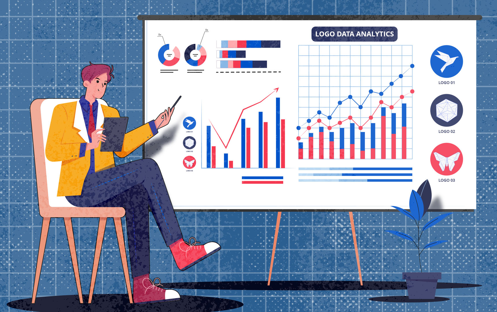
But first, why does data matter in logo design anyway? When you base your decision on evidence instead of hunches, you reduce the risk of costly redesigns and increase the odds your brand sticks in people’s minds. Testing reveals what works before you commit.
What “logo success” looks like
A working logo does four things well:
- It’s memorable. People can recall it after brief exposure.
- It’s recognizable. Customers can spot your brand quickly in a crowded feed.
- It’s legible. The design stays clear at any size, from a tiny favicon to a large banner.
- It carries emotional weight. Colors, shapes, and fonts align with how you want people to feel about your business.
These four qualities determine whether your logo actually performs or just exists. The question is how to measure them reliably.
Why is logo design testing important in 2025?
Measuring logo performance matters more now than ever before. Your audience sees logos across dozens of devices and platforms, often while scrolling at high speed on small screens. Brand saturation means thousands of companies are competing for the same attention.
A logo that works today must withstand these conditions, staying clear on a smartwatch and impactful on a desktop. Data tells you whether your design can handle these demands before you launch.
What happens when you skip testing your logo design?
Without data, you’re gambling with your brand identity. You might discover too late that your logo doesn’t connect with your audience. The colors might create the wrong impression. The design might vanish at smaller sizes or disappear against specific backgrounds.
You end up with something that looks fine in isolation but fails in real conditions. That leads to weak brand recognition, poor emotional connection, and an expensive redesign you could have avoided.
Not all logos are created equal, and not all feedback is valuable. These six criteria will help you evaluate logo options objectively and determine which design best suits your brand.
Legibility
Your logo must stay crystal clear whether it’s a 16×16 pixel favicon or a full-size header image. Test each option at thumbnail size, on mobile screens, and in tiny contexts like app icons. If details disappear or the design becomes a blurry mess when scaled down, that’s a red flag.
Legibility isn’t optional. It’s the baseline for everything else. A logo that loses clarity at small sizes will fail in most places your audience encounters it.
Memorability
Can someone recall your logo after seeing it briefly? This metric tells you whether your design has real sticking power. You can test this by showing users a logo for a few seconds, then asking them to describe it or pick it out of a lineup later.
High memorability means your brand has a better chance of staying top of mind. Low memorability means you’re invisible, no matter how much you personally like the design.
Emotional resonance
Logos create feelings before people even process what they’re looking at. A playful font might make people smile. Bold red can signal energy or urgency. Soft blues create calm and trust.
The question is whether your logo’s emotions match the emotions you want your brand to evoke. Gather feedback on how your logo makes people feel. If the data shows a mismatch between your intent and their reaction, that logo isn’t the right choice.
Versatility
A great logo works everywhere. It looks sharp on white backgrounds and dark backgrounds. It translates well to monochrome when color isn’t an option.
Test your logo variations in different contexts by placing them on product mockups, social media posts, email headers, and business cards. If a design only works in one specific scenario, it’s not versatile enough for real-world use.
Distinctiveness
Your logo should feel connected to your brand identity while standing apart from competitors. Relevance means the design aligns with your industry, values, and personality. Uniqueness means it doesn’t look like a knockoff of someone else’s brand.
Compare your options side by side with competitor logos. If yours blends into the crowd or feels disconnected from your business, eliminate that option and test another design.
Preference
Subjective taste matters, but it matters most when backed by feedback from real people in your target audience. Run preference surveys asking users which logo they find most appealing and why. Track which designs get the most positive reactions.
Aesthetic appeal becomes a reliable metric when measuring it across a broad sample. One person’s opinion tells you almost nothing. Fifty people’s consistent preference tells you a lot.
Methods To Gather Data on Logo Options
Knowing what to measure is one thing. Actually collecting that data is another. These five methods will help you test your logo candidates and gather meaningful feedback, enabling you to make an informed choice rather than relying on gut feelings.
Surveys and user feedback
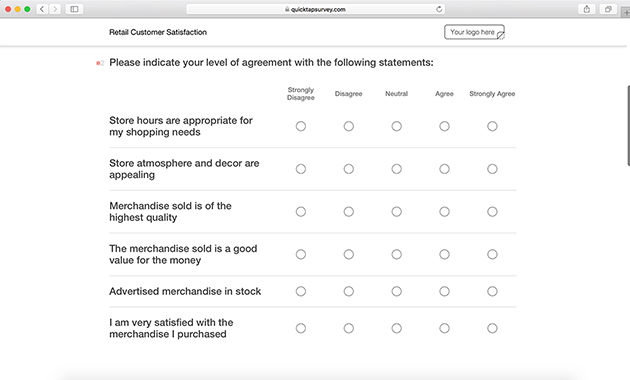
Surveys are the simplest way to gather structured feedback. Create a questionnaire that shows your logo options and asks specific questions like which logo is most memorable, which feels most trustworthy, or which one people would click on. Use platforms like Google Forms, Typeform, or SurveyMonkey to reach your audience.
The more responses you collect, the clearer the patterns become. Aim for at least 50 responses if possible. Anything less and you’re still mostly guessing.
A/B testing
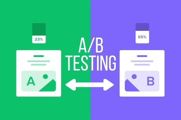
A/B testing puts your logos head-to-head in real-world conditions. Run two versions of an ad with different logos and track which gets more clicks. Test different logos in email headers and measure open rates.
This method gives you performance data instead of just opinions. You see which logo drives behavior, not which people say they prefer in a survey.
Eye tracking and heatmaps

If you have access to the right tools, eye tracking and heatmaps reveal where people’s attention goes when they see your logo. Do they focus on the icon or the text? Does their gaze skip over the design entirely?
This data shows you what works visually and what gets ignored. Tools like Hotjar or Crazy Egg can provide heatmap insights even on a smaller budget.
Mockups in real contexts
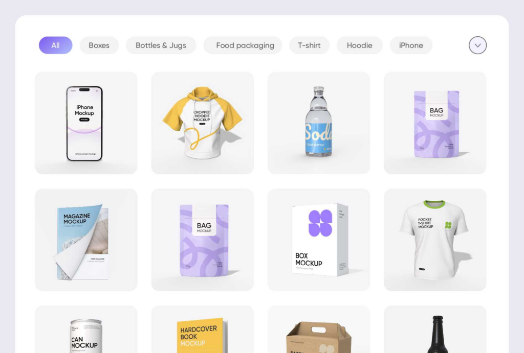
Seeing logos in context changes everything. Use mockup generators to place your logo on business cards, t-shirts, packaging, phone screens, and storefronts. Share these mockups with your audience and ask for feedback.
Real-world previews reveal issues that flat designs on a white background never will. A logo might look great in isolation, but feel wrong on a product or business card.
Recognition testing
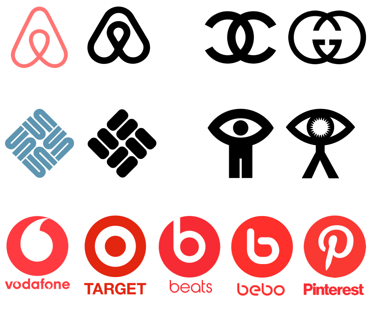
Test whether people can actually remember your logo. Show users a logo for five to ten seconds, then remove it. Later, ask them to describe or identify what they saw from similar logos.
High recall rates mean your logo has sticking power. Low recall rates mean it’s forgettable. This type of test cuts through subjective opinions and measures actual memory performance.
How To Generate Logo Variants for Testing
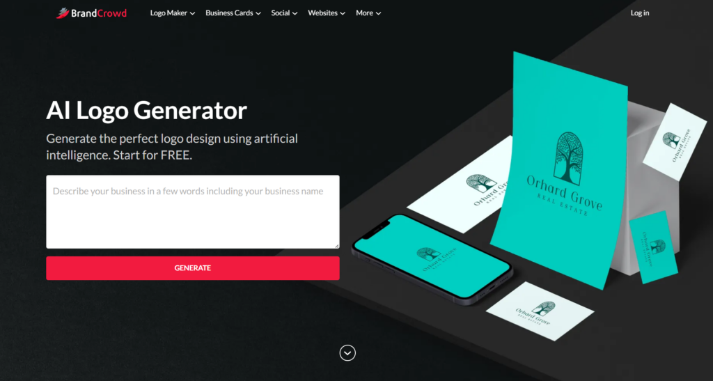
All the testing methods won’t help if you only have one or two logo options to evaluate. You need multiple candidates to compare, and that’s where a logo maker becomes essential.
BrandCrowd’s Logo Maker lets you quickly generate and customize dozens of design variations, giving you real choices to test.
Creating multiple options
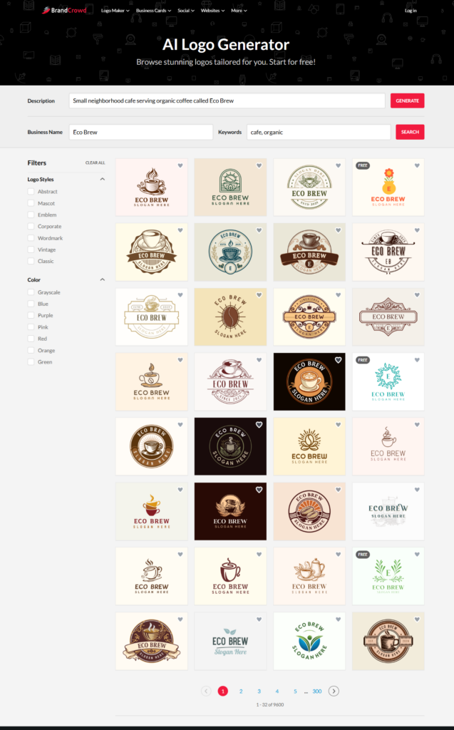
Start by entering your business name and industry into BrandCrowd. Its AI logo generator instantly creates hundreds of ideas based on your input. From there, browse through different styles and customize what catches your eye.
Try a bold icon with modern fonts. Experiment with minimalist text-only designs. Play with layouts that put the icon above, beside, or inside the text. Each variation gives you another candidate to test with real users.
Exporting for different scenarios
Once you’ve customized a logo you like, create multiple versions for different testing scenarios. Export your logo with various color schemes, save light and dark background versions, and download the design in different formats, such as PNG for digital use and vector files for print.
The more versions you have, the better you can test performance across contexts. One logo might work great on white backgrounds, but disappear on dark ones. You won’t know until you create both versions and test them.
Keep everything organized
Keep your logo testing organized, or you’ll drown in files. Name each variant clearly using labels like “Logo_BlueIcon_BoldFont_v1” or “Logo_MinimalistText_DarkBG_v2.” Create a simple spreadsheet to track which version performed best in which test.
Good organization makes it easier to spot patterns in your data and avoid mixing up results. You don’t want to accidentally choose the wrong file because you lost track of which version tested better.
Iterating based on feedback
Use BrandCrowd to iterate quickly based on what you learn from testing. If your first round shows that users prefer icons over text-only designs, go back and generate more icon-based options. If feedback says the colors feel too aggressive, adjust the palette and export new versions.
The faster you can create and test variants, the quicker you’ll find a logo that works. This feedback loop is where data-driven design turns vague preferences into concrete improvements.
Interpreting Data and Making the Final Choice

You’ve run your tests and collected feedback. Now you’re staring at a pile of data, wondering what it means. Interpreting results doesn’t have to be complicated if you focus on what matters most and know how to separate signals from noise.
Weighing numbers against reasons
Quantitative data gives you numbers like click-through rates, preference percentages, and recognition scores. Qualitative data gives you reasons, explaining why people liked a logo, what feelings it triggered, or their concerns. Both matter, and you need to use them together.
Use quantitative data to spot clear winners and losers. Use qualitative feedback to understand the why behind the numbers. If a logo wins on the numbers but users describe it as “boring” or “confusing,” dig deeper before making it your final choice. If you’re also benchmarking against competitors, data gathered through a scraper API can help you identify common design patterns and branding trends across your industry.
Spotting meaningful differences
Not every difference in your data is meaningful. If Logo A got 52% preference and Logo B got 48%, that’s a tie. The size of the gap that matters depends on how many people you surveyed.
In small samples under 100 responses, look for at least a 10 to 15 percentage point difference before calling it significant. In larger samples with hundreds of responses, smaller gaps become more reliable. If unsure, online statistical significance calculators can help determine whether your results are solid or just random noise.
Knowing when to decide
Perfect data doesn’t exist. You need to make a call at some point, even if the results aren’t overwhelmingly clear. That signal is worth following if one logo performs slightly better across multiple metrics.
Trust that context if the data is mixed. The goal isn’t finding the logo that wins every single test. It’s finding the one that performs well enough overall while fitting your brand identity.
Balancing feedback with strategy
Sometimes your audience prefers a logo that doesn’t match your long-term vision. Maybe they like something trendy, but you’re building a brand meant to last decades. Or they prefer a playful design, but you’re targeting serious enterprise clients.
Data should inform your choice, not dictate it. Weigh audience feedback heavily, but don’t ignore your strategic goals. The best logo is one that your audience responds to and that supports your brand’s direction.
Common Pitfalls in Data-Driven Logo Selection
Even with good intentions, it’s easy to mess up data-driven logo decisions. Watch out for these traps so your testing leads to better outcomes instead of more confusion.
Testing the wrong audience
You’ll get a biased view if you only ask your existing customers or friends for feedback. Ensure your test sample represents the audience you want to reach, not just the people who are easiest to contact.
Otherwise, you’ll optimize for the wrong people. Your logo might perform well with your current circle, but completely miss the mark with the broader market you’re trying to attract.
Overwhelming people with options
Testing twenty logo variants sounds thorough, but it overwhelms respondents and dilutes your data. When people face too many choices, they stop making careful decisions and start picking randomly. Narrow it down to three to five strong candidates before running major tests.
Too many options lead to decision fatigue and unreliable feedback. You want people to evaluate your logos thoughtfully, not just click through to finish the survey.
Chasing likes over performance
A logo might get tons of social media likes, but fails when used in your app or packaging. Likes are easy to collect but not always meaningful because people don’t consider real-world applications.
Focus on performance metrics that reflect actual use cases, not just popularity contests. Test how the logo works in context rather than asking people which looks prettiest in isolation.
Following trends instead of strategy
Trends change fast. If you chase whatever’s hot right now, your logo will look dated in two years, and you’ll return to square one. Data should guide you toward what works for your brand, not what’s trendy across the industry.
Make sure your final choice fits your brand’s personality and can grow with you over time. A strategically sound logo will outlast any temporary design trend.
Make Your Logo Decision Count
Choosing a logo doesn’t have to be a guessing game. When you use data to guide your decision, you minimize risk and maximize the chance your brand makes a real impact. Test for legibility, memorability, and emotional resonance. Gather feedback through surveys, A/B tests, and real-world mockups. Let the evidence show you what works.
Start by using BrandCrowd to generate multiple design options in minutes. Customize fonts, colors, and layouts until you have a solid set of candidates. Then run your tests and let the data lead you to the best choice for your business.
Because the best logo isn’t the one you like most, it’s what your customers remember.
Read More on Logo Design Here:
- Top Brand Asset Management Systems To Streamline Your Marketing Efforts
- Design Thinking Workshops: How To Build Your Brand from Scratch
- 10 Logo Color Combinations That Always Work (and Why)
FAQs on Data-Driven Logo Design
- How do I pick a logo for my business?
Pick a logo by testing multiple options with your target audience using surveys, A/B tests, and real-world mockups. Measure legibility, memorability, emotional resonance, and versatility across different contexts. Choose the best design across these metrics while aligning with your brand strategy.
- How do I design a logo for my business?
Enter your business name and industry into a logo maker like BrandCrowd to generate multiple design options. Customize fonts, colors, icons, and layouts until you have several strong candidates. Then, test these options with real users to determine which one works best.
- What makes a logo successful?
A successful logo is memorable, recognizable, legible at any size, and emotionally resonant with your audience. It should work across different contexts like social media, business cards, and app icons. Test your logo against these criteria to ensure it performs in real-world conditions.
- How many logo options should I test?
Test three to five logo options to get meaningful data without overwhelming your audience. Testing too many options leads to decision fatigue and unreliable feedback. Focus on strong candidates that represent different design directions.
- What data should I collect when testing logos?
Collect quantitative data like preference percentages, click-through rates, and recognition scores. Also, qualitative feedback should be gathered to explain why people prefer specific designs and what emotions they trigger. Use both types of data together to make an informed decision.
Hannah Suroy suroy brings clarity to complex topics across entertainment, business, and creative industries. She specializes in translating industry trends and innovations into engaging content that helps readers understand the creative process behind the work they love.
Original Images by Khim John Blazo