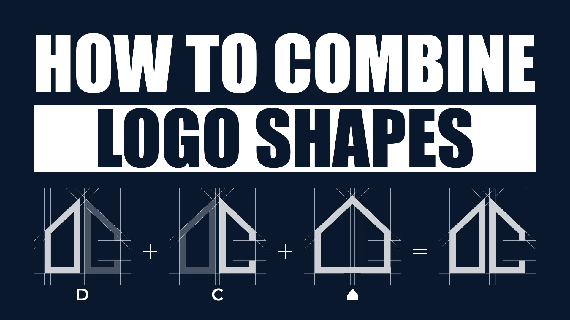
How To Combine Logo Shapes
When you look at a great logo, you usually notice its shape first before anything else. That’s because our brains read shapes faster than colors or words. A good shape combination can make your logo instantly recognizable and full of meaning.
If you’ve been using a logo maker or designing from scratch, learning how to mix and combine shapes can take your logo from ordinary to unforgettable. It’s one of the most powerful ways to make your brand feel unique without overcomplicating the design.
Let’s check out some creative ways to combine logo shapes to make your design stand out!
The Psychology of Shapes in Logo Design
Why shape matters
Shapes carry meaning. They’re like silent messengers that speak to emotions and ideas before the viewer even reads your brand name. When used well, they make people feel something about your brand: safe, excited, creative, or confident.
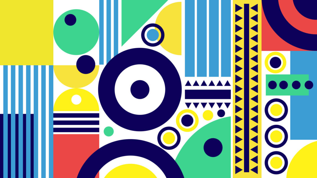
Every shape has its own personality.
- Circles show unity, friendliness, and wholeness.
- Squares and rectangle logos show structure, trust, and professionalism.
- Triangles feel dynamic and bold, pointing toward growth and direction.
- Organic or curved forms feel natural, soft, and creative.
You can already see why some brands prefer circle logos to show inclusion and flow, while others choose square logos or rectangle logos for stability and balance.
That’s why how shapes influence emotions is such an important idea in logo design. Even small adjustments, rounding a corner or angling an edge, can shift how people see your brand.
Implications for combining shapes
When you combine shapes, you’re not just merging visuals but blending meanings.
A square (stability) paired with a leaf-like curve (growth) tells a story of a brand that’s both solid and evolving. A circle merged with a triangle might express friendly innovation or guided movement.
But there’s a rule: keep clarity first. If two shapes compete for attention or overlap awkwardly, the message gets lost. Always check balance, spacing, and hierarchy so the design feels united, not messy.
Why Combine Shapes? The Benefits and Design Rationale
Combining shapes can make your logo far more interesting without adding clutter. Instead of using a single plain shape, two or more can work together to create depth and meaning.
Here are the biggest benefits:
- You can express layered ideas like growth and reliability, or playfulness and strength.
- Dual shapes make your design more memorable and less likely to look like a template.
- Creative overlaps, transparency, or hidden symbols make viewers pause and look twice.
- It helps your logo adapt well to posters, app icons, and other media without losing clarity.
- You can create a more flexible visual identity that looks polished everywhere, from packaging to your website.
Using shape combinations wisely is also a great exercise in thinking conceptually. It pushes you to go beyond basic geometry and explore how meaning and emotion can blend visually.
Core Design Principles When Combining Shapes
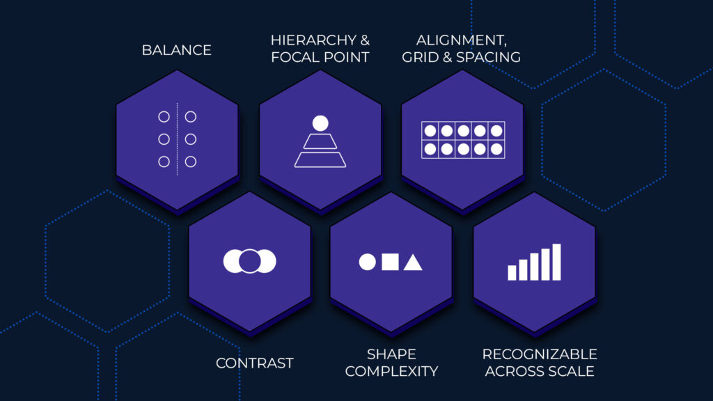
Combining shapes is fun and creative, but it still needs structure. Without some graphic design rules, your logo can easily look crowded or confusing. These principles will help you balance creativity with clarity, so your final logo feels clean, intentional, and professional.
Balance
Balance is what makes your logo feel stable and pleasant to look at. If one side feels heavier or one shape grabs too much attention, the whole design can look off. Think of it like arranging furniture in a room, where you don’t want everything pushed to one corner.
Definition: Visual stability that makes logos feel harmonious and grounded
Technique: Distribute visual weight evenly across the design using:
- Size adjustments
- Color variation
- Line weight differences
- Opacity control
Example: Balance a large solid square with a smaller circle or lighter outline
Test Method: View from a distance or flip upside-down to check if balance persists
Hierarchy and focal point
Every logo needs a clear star of the show. That’s your focal point: the first shape or area people notice. Without hierarchy, all parts compete equally, and the message becomes unclear.
Purpose: Establish a clear primary element that captures attention first
Implementation:
- Identify the main shape that conveys core message
- Make supporting shapes smaller, lighter, or less detailed
- Create natural visual flow from primary to secondary elements
Outcome: Instant comprehension with clear directional flow
Alignment, grid, and spacing
Alignment brings order to creativity. Even abstract logos benefit from invisible structure. Grids and spacing help shapes relate to one another in a way that feels deliberate, not random.
Alignment: Creates deliberate relationships between shapes through:
- Center alignment
- Edge alignment
- Diagonal alignment
Grid Usage: Maintains consistent spacing and proportions
Spacing Guidelines:
- Too close = shapes merge and lose definition
- Too far = disconnected appearance
- Optimal = adequate white space for visual breathing room
Contrast
Contrast makes your shapes stand out from one another and gives your design energy. It’s how you create visual interest while keeping the message clear.
There are many ways to add contrast:
- Fill vs. outline: A solid triangle paired with an outlined circle instantly creates depth.
- Light vs. dark: Try mixing a darker geometric shape with a lighter organic one.
- Positive vs. negative space: You can even carve a shape out of another to create hidden meaning.
Strong contrast helps guide the viewer’s eye and separates layers in the design. Without it, shapes can blend together, making the logo hard to read. The goal is balance, enough contrast to be interesting but not so much that it feels harsh.
Shape complexity
It’s tempting to keep adding shapes, details, and overlaps to make your design “unique,” but less is often more. Complex shapes can look great on a large screen, but they usually fall apart when scaled down.
Guideline: Limit to 2-3 main shapes for optimal clarity
Simplification Strategy:
- Clean up edges
- Remove unnecessary overlaps
- Ensure recognizability at small sizes
Scalability Test: Logo must remain readable when:
- Reduced to favicon size
- Converted to grayscale/black and white
Recognizability across scales
A logo should work everywhere: from a giant billboard to a phone screen icon. That’s why you need to check how your shape combination performs at different sizes and in different formats.
Multi-Format Testing:
- Scale down to 32 pixels
- Print at business card size
- Convert to monochrome
Quality Indicators:
- Shapes remain distinct at all sizes
- Details don’t disappear when scaled
- Lines stay sharp and clear
Also, test it in monochrome (black and white). A strong logo doesn’t rely on color alone. The best designs are recognizable just by their shape and outline. This ensures your logo stays flexible whether it’s used online, on packaging, or even embroidered on fabric.
Techniques and Creative Approaches to Combining Shapes
Now that we’ve covered the basics, here are practical and creative ways to combine shapes:
Overlay and masking
Overlaying means placing one shape partly over another. Masking is when you use a shape to hide or reveal parts of another shape, almost like cutting out sections. This creates a sense of depth or hidden meaning.
Overlay
- Definition: Positioning one shape partially over another to create visual depth
- Effect: Generates layered composition with spatial hierarchy
Masking
- Definition: Using one shape as a cutting tool to reveal/conceal portions of another shape
- Mechanism: Subtractive technique that carves sections from the base geometry
Application examples
- Circle + Triangle overlay → Shield or eye form (conveys focus, protection, strength)
- Square with leaf-shaped mask → Stability merged with organic growth symbolism
Negative space and hidden shapes
Negative space is one of the smartest ways to make your logo unforgettable. Instead of adding more shapes, you use the empty space around or inside them to form new images.
Strategic value
- Creates dual-reading logos with layered meaning
- Increases memorability through a discovery moment
- Adds sophistication without visual complexity
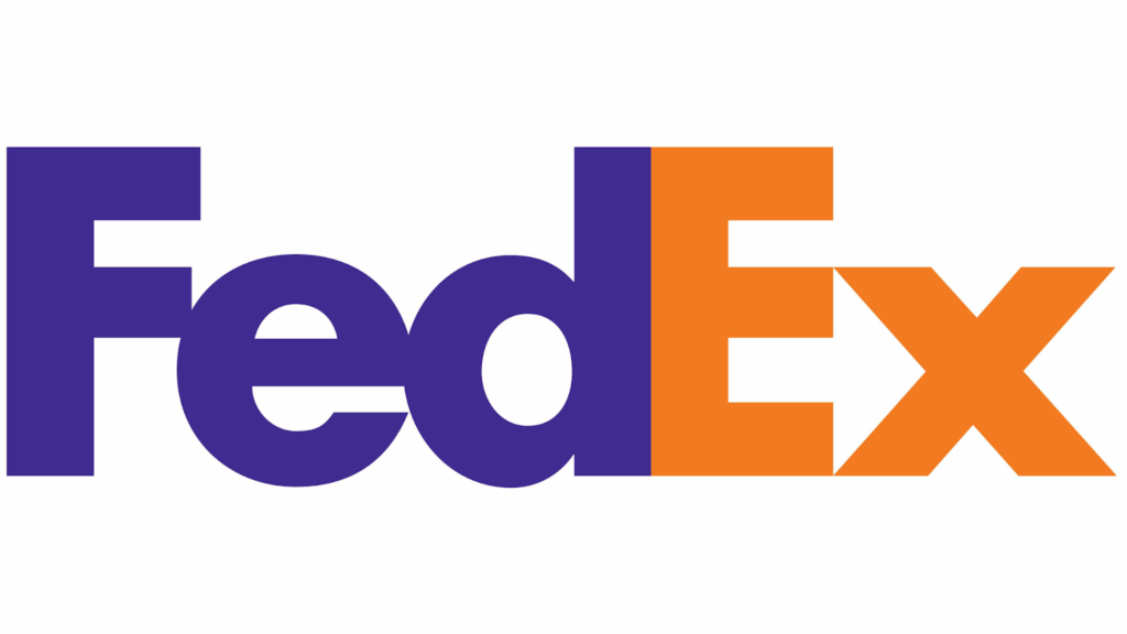
A classic example is the FedEx logo, which hides an arrow between the E and the X to suggest speed and direction. Another great example is the World Wildlife Fund (WWF) panda, where black shapes form both the panda’s body and the white negative space of its face.
Implementation techniques
- Carve geometric shapes within primary forms (triangle inside circle = precision)
- Form letters/symbols using space between adjacent shapes
- Design for “second look” engagement that aids brand recall
Intersection and geometric fusion
This method happens when two or more shapes overlap and the intersection creates a brand-new form.
Techniques
- Union: Merge shapes into a single form
- Subtract: Remove overlapping area from base shape
- Intersect: Retain only the overlapping region
For example, when two circles overlap, as can be seen in the Mastercard logo. they form a shape called a “Vesica Piscis.”
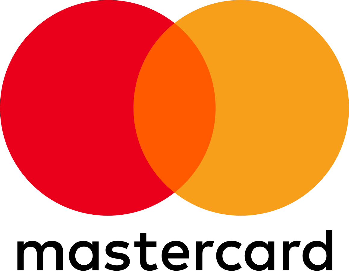
This overlap can symbolize balance, partnership, or connection, great for brands about collaboration or community.
Shape morphing or hybrid forms
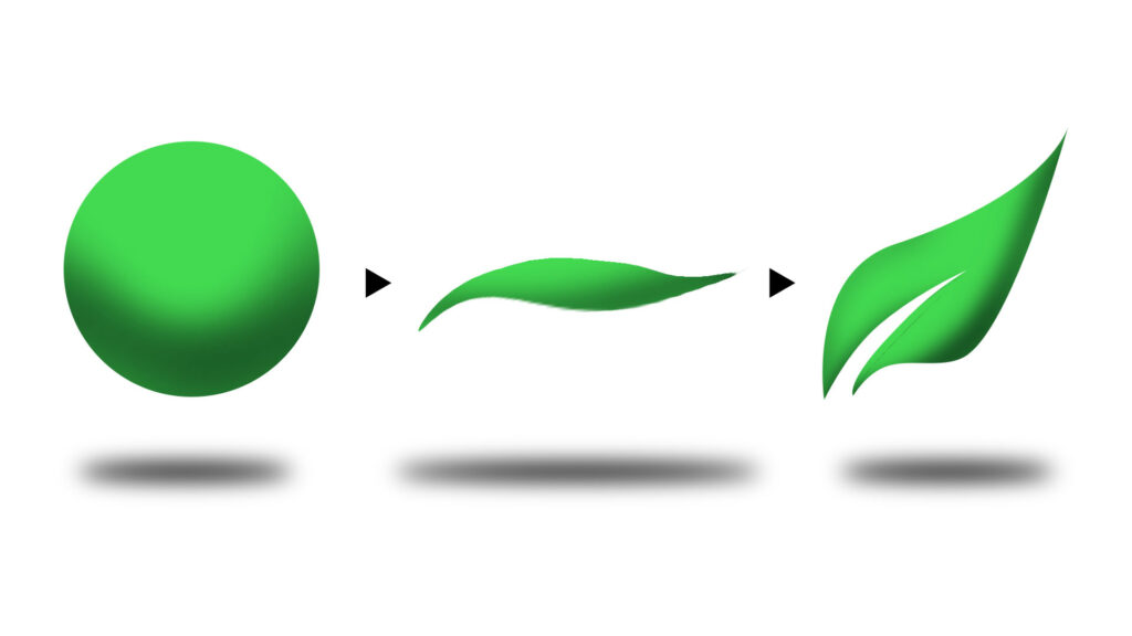
Morphing means blending two shapes together so they transform smoothly from one form to another. It’s like watching a circle slowly stretch into a leaf or a wave. This technique is ideal for brands that want to show change, growth, or transformation.
Layering and transparency
Layering adds depth and richness without clutter. You stack multiple shapes on top of each other, sometimes with transparency, so they interact visually. It’s a great way to show motion or connectedness.
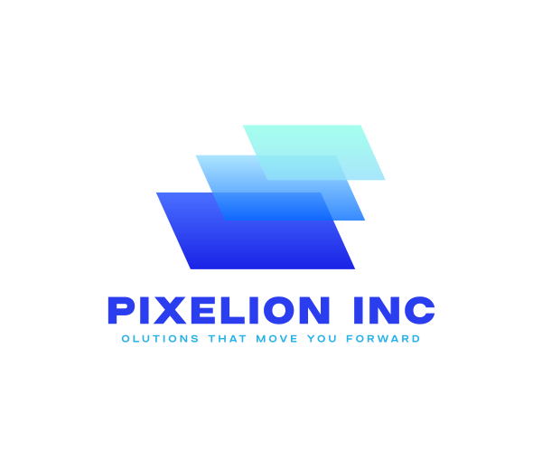
Digital Geometric Layer by BrandCrowd
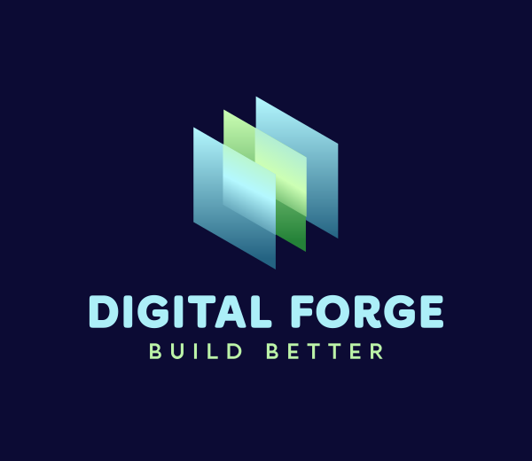
Layer Multimedia Advertising by BrandCrowd
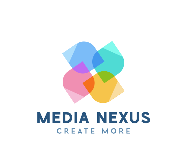
Pinwheel Colorful Media by BrandCrowd
Modular shape units or tessellation
Modular design uses repeated smaller shapes to create a larger pattern or form. Each unit connects like puzzle pieces, forming a cohesive whole. This is a great way to show consistency, connection, or innovation.
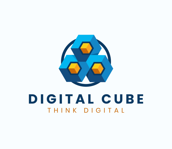
Geometric Flower Pattern by BrandCrowd
Elegant Flower Mandala by BrandCrowd
For example, the Adobe logo uses simple geometric angles repeated across its brand family. Another idea is using hexagon tiles to form a beehive pattern, perfect for brands about teamwork or creativity.
Conclusion
Combining logo shapes is a creative way to stand out in a world full of similar-looking designs. When you understand shape psychology, apply balance and contrast, and use the right tools, you can build something that looks professional and feels meaningful.
If you’re ready to experiment, check out BrandCrowd and explore shape combinations. It’s like your own creative playground where you can layer, mask, and adjust until your logo feels just right.
Read more about logo design here:
- Mobile-First Logo Design: How To Optimize for Small Screens
- 10 Logo Color Combinations That Always Work (and Why)
- 5 Logo Variations Your Brand Needs (And Where To Get Them Fast)
FAQs on Logo Shapes
1. What is the best shape for a logo?
There isn’t one “best” shape. It depends on your brand personality. Circles feel friendly, squares feel strong, and triangles feel dynamic.
2. Should a logo be square or rectangle?
Choose a shape that fits your layout needs. Square logos are balanced and easy to place, while rectangles can fit better in website headers or product labels.
3. What is the most popular logo style?
Minimal geometric logos are popular because they scale well and look clean across platforms.
4. What does a triangle logo mean?
Triangles suggest direction, energy, and forward thinking. They’re often used by brands that want to show innovation or progress.
5. What are the shapes you can draw in a logo?
You can use circles, squares, triangles, polygons, and organic curves. What matters most is how you combine and simplify them to express your message.