
White Space: The Design That Intrigues Clients
Space when not in the context of the scientific field is terrifying. But, what if it was the best way to convey what you mean?
In art theory, negative space describes the spaces in between objects in any graphic. Often, we see these in optical illusions—examples like two faces and the face of a man playing the sax and the woman’s face.
Illusions are fun, but the negative space, also known as white space, can serve a more significant meaning in design. The area shows relationships and tells the audience where to look—the focal point.
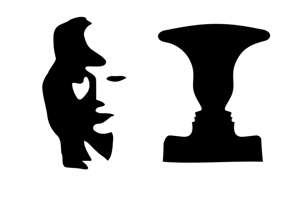
Optical Illusions
White space also provides balance and lighting to specific designs. Works by M.C. Escher are an excellent example:
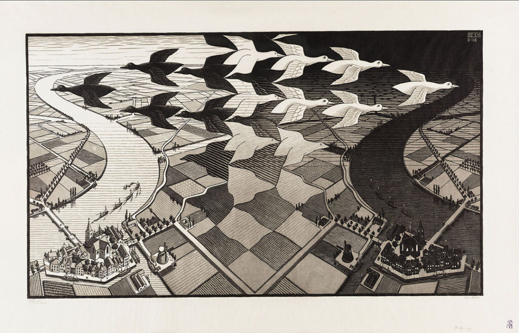
Source: “Day and Night” by M.C. Escher © The M.C. Escher Company B.V. Baam – the Netherlands
What’s this about Negative Space?
Negative space derives its complexity from the understanding of human perception—specifically, Gestalt theory of learning.
Kurt Koffka, a famous german psychologist, defined the theory as the perception of “The whole is other than the sum of the parts.” Meaning that when a person sees multiple complex elements relating to an image, they see it as one whole image.
Understanding gestalt theory on the processing of information will aid you in designing, especially when you want to get the attention of your market.
Aside from the Gestalt principle, you also have to understand that the counterpart of negative space is positive space. They are the elements of a graphic that have color or shade.
Thus, both areas work hand in hand for the betterment of your graphic design. Dark shades or colors define the positive space in a visual. It becomes the outline of an image—but vice versa is fine, but the focal point changes with the shade reversal.
What is Negative Space in Design?
We learned the brief definition and history of negative space. Now, let’s understand its impact on design.
As stated earlier, positive and negative spaces are reversible, but the emphasis of the images changes depending on your message. Catch a glimpse of white space in logo creation, web design, photography, and typography.
In logo creation, white space allows you to create shapes and figures that change the message of your logo. Negative space doubles the impact, whether a dot inside a positive area represents an eye or an outline of a cat inside a dog.
Negative space in web design serves a similar purpose of focusing your users’ attention on a specific portion. Examples include the spacing between tabs and the distance of the logo to your business name.
It’s like building a visual hierarchy to guide users around the page and drive traffic to specific website areas.
For photography, negative space is the background of the images. It distinguishes the main subject of the photo. Picture your product. Is the environment bare, or will you use the perspective of looking through a hole?
Consider this when understanding how to edit the photo to add graphics or typography onto it.
In typography, the arrangement of words matters. From considering using all CAPS or purely lower case with an outline of a flower—choose wisely. Make sure you choose something easy to read but the theme is understandable.
Combine the knowledge of all four, and you would create the best brand identity that transcends into the multiple platforms of social media, website, and personal merchandise.
Techniques in Spacing
Let’s dive into the good stuff, and let us give you some tips on creating a logo that utilizes negative space.
- Simplicity is Key: White space keeps your logo from overcrowding. It creates a boundary for you that allows you to get creative and work with what you have on the canvas.
- Do a Double Entendres: Put an image within another image. It makes for a memorable logo because of its optical illusion effect, like the Guild of Food Writers Logo.
- Spot the Hidden Image: Compared to double entendres, a hidden element is also within an image, but in a more subtle way like Toblerone’s Bear in the mountain.
- Get Closure: Your logo would use negative space as a sort of boundary to create a complete image, like the World Wildlife Fund’s Panda.
- Typographize It: Use negative space to spell out your business’s name inside an image. Or, as you assemble your name, put some white space into your positive space to create the outline of a letter. Like a dot for O and three vertical areas, create an E.
Negative Space Logo Inspirations
Now you know some best practices, here are some examples for your next logo design. Incorporate negative space and make an impact in your market.

Bird Negative Space by artbysugu

Dog Snout Apostrophe by SimplePixelSL

Gents Barber Club – Logomark Design by Wisecraft
Little Red Collar by GLDesigns

Non Stop & Infinity by Daniel Bodea / Kreatank

North Woods Series USA Collection by Allan Peters

Real Estate Logo Design by Be_
Ticket Logo Concept – Negative space by Apex Designs
You Found Your Distance!
Congratulations!
You are now ready to create an impactful logo that would wow your audience. Less is more when it comes to logo design sometimes.
It still really depends on your taste and how you want to portray your brand online.
Thinking of a design is hard. It’s even harder when you do not know how to create your own.
We’ve got you covered with BrandCrowd’s DIY logo maker!
You can choose from thousands upon thousands of logo designs that you could edit and save at a reasonable price.
What are you waiting for?
Edit and save your logo today and get the attention of the internet with negative space!
