Mastercard Logo History: How a Priceless Design Came To Be
Written By: Hannah Suroy suroy
From a simple mark to a wordless icon, the Mastercard logo’s journey mirrors the evolution of commerce itself. This is the story of a brand that recognized the power of visual identity, strategically adapting and simplifying its logo to thrive.
Decades of visual recognition and a focus on digital optimization have made Mastercard one of the most recognizable “M” brands globally, allowing it to stand confidently on its iconic circles alone.
Let’s explore the strategic decisions, logo design choices, and market trends that shaped Mastercard’s enduring symbol of trust, connectivity, and global possibilities.

The Origins of Mastercard and Its Initial Branding
To understand Mastercard’s success, we must explore its roots in a time when payment systems were radically different.
Formation of the Interbank Card Association (ICA)
Mastercard’s story began in the late 1940s when U.S. banks issued paper cards that acted as cash substitutes for local purchases. By the 1960s, these efforts evolved into franchises where banks partnered with select merchants to accept card payments.
In 1966, several California banks joined forces to form the Interbank Card Association (ICA), a collaborative network designed to create a unified payment system.
Unlike other networks controlled by single institutions, ICA operated collectively. Member committees managed areas like security, marketing, and legal frameworks. Their goal? To challenge existing credit card systems and introduce a card that simplifies commerce for banks and consumers.
The First Logo: Interbank’s Symbol
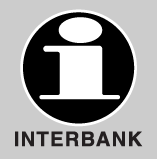
ICA’s first logo featured a lowercase “i” inside a black circle, paired with the word “INTERBANK.” This minimalist design symbolizes unity and clarity, with the circle representing completeness and collaboration.
However, as ICA was new to the market, it faced the challenge of building brand recognition in a rapidly growing market.
Transition to Master Charge: The Interbank Card
By the late 1960s, the ICA needed a fresh identity to better connect with consumers and stand out in the growing credit card market. In 1969, the ICA rebranded as “Master Charge: The Interbank Card,” marking a pivotal moment in its history.
The name “Master Charge” conveyed empowerment, convenience, and reliability. It unified the brand across issuing banks, ensuring a consistent identity nationwide. The tagline “The Interbank Card” kept ties to its origins, emphasizing collaboration among member banks.
Design Elements of the 1969 Logo

The rebrand introduced a striking logo that became an instant classic: two overlapping circles in red and orange, creating a vibrant third color at their intersection. This design symbolizes connection and progress.
Inside the circles was the lowercase “Master Charge” wordmark in a sans-serif font, with “The Interbank Card” below it, displayed in white for continuity with ICA’s original branding. The smaller “i” symbol from ICA’s first logo was subtly retained, linking the new identity to its roots.
The vibrant design mirrored the cultural trends of the late 1960s, with bold geometric shapes and colors symbolizing energy, collaboration, and progress.
Market Reception and Impact
The rebranding was a resounding success. The bright red and orange circles stood out against competitors like BankAmericard’s (later Visa) stripes and American Express’s centurion. Consumers also quickly associated Master Charge with reliability and simplicity, boosting its visibility and competitive edge.
This move set the stage for Mastercard’s global dominance. The name and logo evolved over time, but the DNA of those iconic overlapping circles remains central to its identity today, symbolizing innovation and unity in payments worldwide.
Evolution into Mastercard: Refining the Brand Identity
As the ICA expanded its global reach, it needed a brand identity reflecting its growing international ambitions. This led to a major rebranding effort in 1979, marking the birth of Mastercard as we know it today.
Name Change to Mastercard
In 1979, ICA shortened the name “Master Charge: The Interbank Card” to favor the more concise and universally appealing “Mastercard.”
This shift signaled the brand’s vision to become more than a credit card company, positioning itself as a global payment solution. The streamlined name resonated across cultures and markets, making Mastercard instantly recognizable.
Logo Redesign from 1979 to 1990

The rebranding came with an updated logo that retained the iconic overlapping red and yellow circles introduced during the Master Charge era. The wordmark was updated to “Mastercard” in ITC Avant Garde Bold typeface, giving the logo a modern and sophisticated look while maintaining continuity.
Subtle tweaks were made to enhance visual appeal. Adjustments to the overlapping area and wordmark placement ensured adaptability across various media and markets.
The interlocking circles remained a universal symbol of trust and partnership, supporting Mastercard’s expansion into regions like Asia, Latin America, and beyond.
Global Expansion and Branding Consistency
By the 1980s, Mastercard’s logo had become a powerful symbol of unity and connection. As the brand entered international markets, it maintained consistent branding while breaking new ground.
In 1987, Mastercard became the first payment card issued in China, followed by its debut in the Soviet Union in 1988. These milestones highlighted Mastercard’s ability to transcend cultural barriers.
The overlapping circles reinforce the brand’s credibility as it shaped the future of electronic payments. This era marked global growth and the company’s establishment as a leader in innovation and inclusivity within financial services.
Modernizing the Logo: 1990s to Early 2000s
Mastercard refreshed its logo to stay relevant as the digital age took hold. This era saw design updates that kept the brand ahead of the curve.
1990 Logo Update

In 1990, Mastercard injected fresh energy into its logo. The wordmark shifted to italicized font, symbolizing movement and dynamism. The overlapping circles transitioned to brighter colors, replacing orange with vibrant yellow for enhanced visibility. Horizontal stripes also appeared in the intersecting area, representing connectivity and seamless transactions.
During this time, Mastercard also acquired Cirrus ATM, whose logo featured similar interlocking circles and stripes. This visual alignment reinforced the sense of interconnectedness across the brand’s expanding network.
1996 Redesign

Further enhancements were made in the 1996 redesign to achieve a cleaner and more modern look. The colors were made even brighter, and the number of horizontal stripes in the intersecting area was reduced, simplifying the visual.
The typography was updated with a black shadow added to the wordmark, creating depth and making it stand out across digital and print platforms. These updates ensured the logo remained crisp and adaptable to evolving media formats.
Corporate Branding Initiatives

In 2006, Mastercard reached a major milestone by going public with an initial stock offering. Alongside this move came a rebranding effort that introduced “MasterCard Worldwide” as its corporate identity.
A new logo was unveiled featuring a third semi-transparent circle and the tagline “The Heart of Commerce,” distinguishing it from the company’s consumer-facing symbol.
This strategic approach allowed Mastercard to maintain a consistent public identity while developing a sophisticated corporate visual language that supported its global ambitions.
Embracing Minimalism: The 2016 Redesign

In 2016, Mastercard partnered with renowned design firm Pentagram to modernize its logo for the digital age. Their goal is simple: create a sleek, flexible design that works seamlessly across digital platforms while preserving the brand’s iconic identity.
With the rise of minimalist design and digital-first branding, Mastercard needed a logo that performed well on screens and in modern media. The overlapping red and yellow circles were already universally recognized, so the redesign focused on refining rather than reinventing.
Design Features of the 2016 Logo
The redesign, led by Pentagram’s Michael Bierut and Luke Hayman, embraced simplicity while honoring Mastercard’s legacy. It includes subtle but noticeable updates, including:
- Overlapping circles: The intersecting area’s linear “comb effect” was replaced with a solid orange, symbolizing unity and seamless transactions.
- Typography overhaul: The wordmark shifted to a lowercase sans-serif typeface (FF Mark) and was placed beneath the circles. This friendly, modern font reflected Mastercard’s approachable and human-centered brand.
- Flat design: All textures and shadows were removed, aligning with the trend of clean, flat visuals optimized for digital use.
The redesign was a strategic decision to adapt to changing consumer behavior. Mastercard needed a visual identity that resonated across apps, websites, and other digital interfaces as more transactions moved online. The simplified design also reinforced trust and recognition while making the logo more versatile.
Bierut described the process as a careful distillation of Mastercard’s identity. “We took their DNA and simplified it wave by wave until it felt sharper, cleaner, and more flexible,” he explained in an interview with Fast Company.
The 2019 Wordless Logo: A Bold Step in Branding

In 2019, Mastercard took a daring step forward by simplifying its logo further, dropping the word “Mastercard” entirely. This move left only the iconic overlapping red and yellow circles, signaling a new era for the brand.
Dropping the wordmark
Mastercard’s decision to remove its name from the logo was fueled by research showing that over 80% of people could recognize the brand solely by its circles. Confident in this strong visual identity, the company embraced a minimalist approach, ensuring its logo remained impactful in a digital-first world.
As Raja Rajamannar, Mastercard’s Chief Marketing and Communications Officer, explained, “Reinvention in the digital age calls for modern simplicity. We are proud of our rich brand heritage and excited to see the iconic circles standing on their own.”
Joining an elite club
By adopting a wordless logo, Mastercard joined an exclusive group of brands like Nike, Apple, and Target that rely on instantly recognizable symbols. The overlapping circles now stand alongside the swoosh, bitten apple, and bullseye as global icons that transcend language.
This minimalist redesign also emphasizes Mastercard’s confidence in its visual identity and ability to adapt to modern trends. By letting the iconic circles speak for themselves, Mastercard has cemented its place as a leader in branding innovation and global connectivity.
The Sound of Mastercard: Expanding Brand Identity
Recognizing the power of auditory branding, Mastercard strategically extended its identity beyond visuals with a distinct sonic brand. This recognizable sound builds recognition in audio-first environments, such as voice interfaces and digital transactions.
Designed to be short, memorable, and adaptable, the recognizable brand sound
Mastercard sonic logo reinforces the brand’s presence through multisensory engagement. This consistent auditory branding cue modernizes Mastercard’s identity, paving the way for brand expansion in emerging technologies and transaction methods.
By integrating the Mastercard sonic logo across various touchpoints, including point-of-sale systems, digital transactions, advertising, and events, Mastercard creates a holistic brand experience, resonating with consumers through sight and sound. This strategic use of auditory branding not only enhances brand recall but also strengthens consumer trust and loyalty.
Effectiveness of Sonic Branding
Just like a regular visual logo design, sonic branding also offers several key benefits, including:
- Recall: Ads with sonic branding are 8.53 times more effective than visuals alone.
- Recognition: Recognizable sonic identities can increase perceived value by 5%.
- Resonance: Sound strongly correlates with brand engagement; reactions to sounds are much faster than visuals.
- Relationship: A brand is less valuable if consumers don’t recognize its unique sound. Sonic branding helps brands become 76% more powerful and 138% more effective in advertising campaigns. MasterCard itself reported that 77% of its customers believe that sonic branding makes them more trustworthy.
- Reach: Sonic branding connects with consumers across platforms.
Lessons for Small Business Owners: What Mastercard’s Logo Journey Teaches Us
Mastercard’s logo journey offers valuable design lessons for small business branding. From bold updates to embracing minimalism, their logo evolution showcases the importance of staying relevant.
For small business owners, some of the actionable branding tips inspired by Mastercard include:
- Core visual is key: Like Mastercard’s interconnected circles, identify a simple visual representing your brand’s essence.
- Keep it clean: Simplicity makes your small business logo more memorable.
- Think digital: Ensure your logo shines on websites, apps, and social media.
- Embrace evolution: Don’t fear refining your logo as your business grows and market trends shift.
- Consistency builds recognition: Use your logo across all marketing efforts to create familiarity.
By learning from Mastercard, small business owners can design logos that are visually appealing, adaptable, and impactful across platforms.
From “i” to Icon: The Enduring Power of Mastercard’s Logo
Mastercard’s logo isn’t just design. It’s branding done right. Every update, from its early days to the overlapping circles we know today, shows how smart evolution can build trust and global recognition.
The takeaway? When refined with purpose, a strong logo becomes more than a mark. It becomes a message.
Take inspiration from Mastercard and start creating your own unforgettable identity with an online design tool. BrandCrowd makes it easy for small business owners to design professional logos, websites, and marketing materials in minutes. No design skills? No problem. Browse thousands of customizable templates for logos, flyers, posters, and business cards—all tailored to your vision.
Start designing today and make your brand stand out!