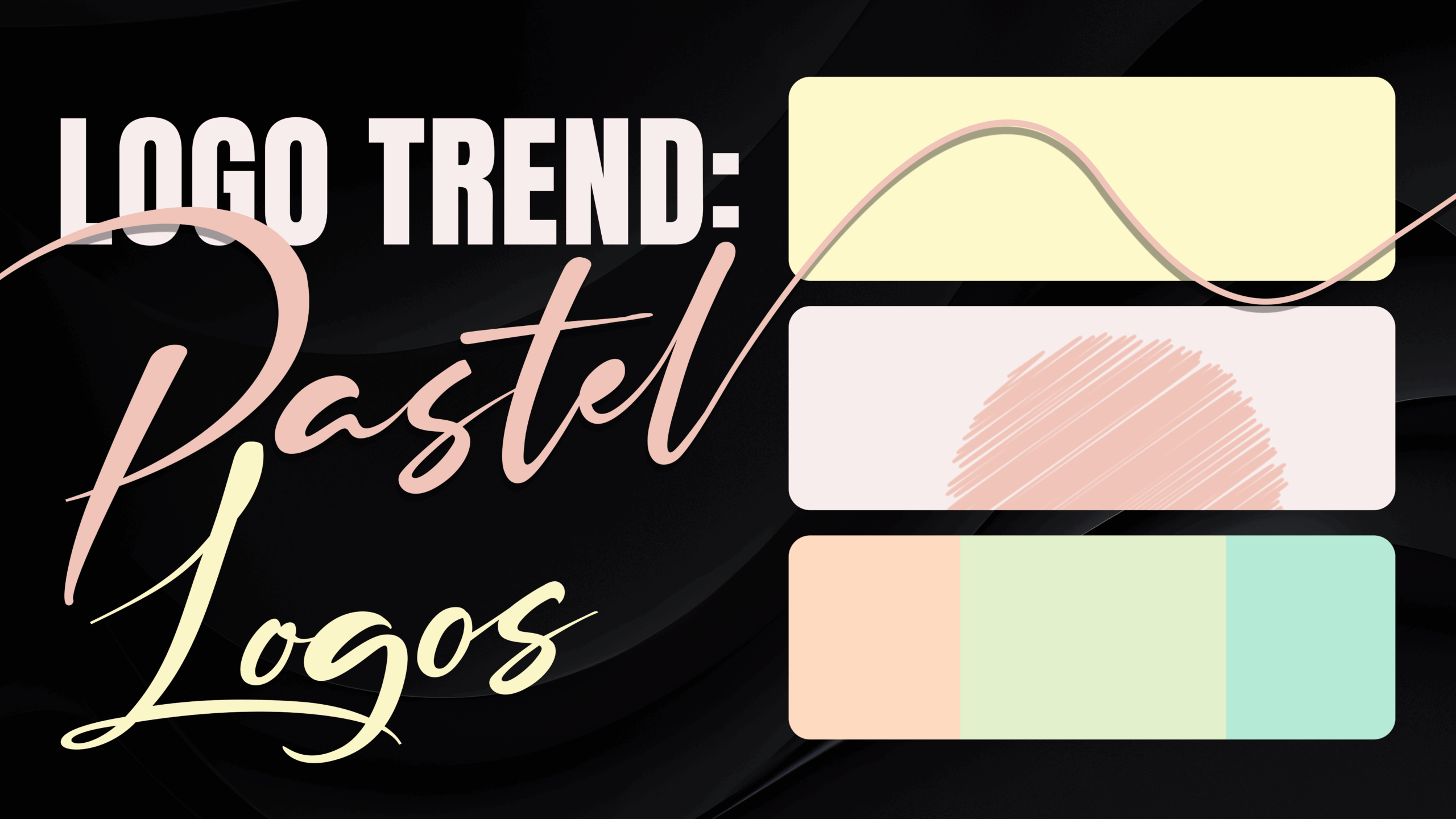
Logo Trends: Pastel Logos
Among the endless palettes of choices, pastel colors stand out for their soft, calming, and approachable appeal. These muted tones are perfect for businesses that want to create a soothing and inviting brand image, drawing people in without being too overpowering.
But pastel logos aren’t just for certain industries—they’ve become a versatile and stylish option for various types of brands. Whether you’re launching a wellness center, a wedding planning business, or a baby product line, pastel tones can help you stand out while still keeping things gentle.
Read on to learn more about what makes pastel logos special, why you should consider them, and how to design one that captures attention in the most subtle yet impactful way.
What Are Pastel Logos?
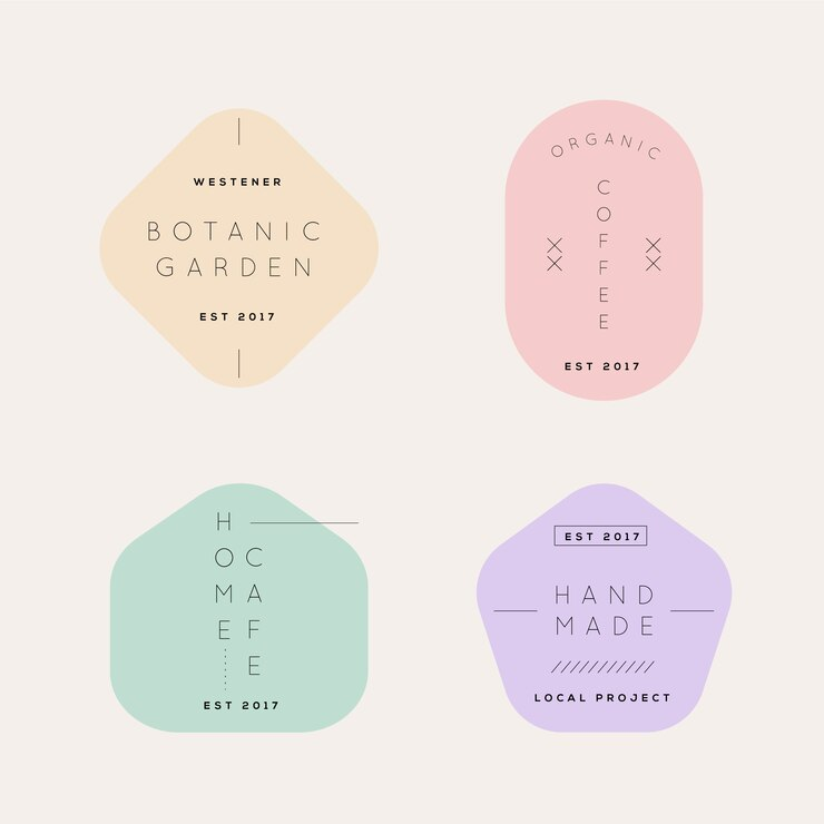
Pastel logos use a color palette of soft, muted colors such as baby pink, lavender, mint green, pale yellow, and sky blue. These colors have low saturation, meaning they aren’t as intense as primary or neon colors. Instead, they evoke a calm, peaceful, and often nostalgic feeling.
When used in logo design, pastels communicate warmth, tranquility, and a sense of approachability that’s hard to ignore.
These logos are ideal for brands expressing softness, friendliness, and subtle elegance. Pastels work because they don’t shout for attention—they invite it. The balance of understated beauty and modernity makes pastel logos popular for companies looking to create a lasting yet quiet impression on their audience.
Why Choose Pastels for Your Logo?
- Creates Emotional Connection: Pastel colors evoke calm, warmth, and nostalgia, making your brand more approachable and relatable.
- Timeless Appeal: Pastels have a timeless charm that feels fresh yet classic. Unlike bold, trendy colors that may fall out of fashion.
- Easily Versatile: These colors can represent a wide range of industries, from health and wellness to retail, making them versatile for various brand identities.
- Gentle but Memorable: While pastels are soft, they can still be highly memorable if used well, helping you create an impression without overwhelming your audience.
- Works with Minimalism: Pastel logos fit beautifully into minimalist design trends, offering a clean and modern aesthetic.
Industries that Benefit from Pastel Logos
1. Beauty & Skincare
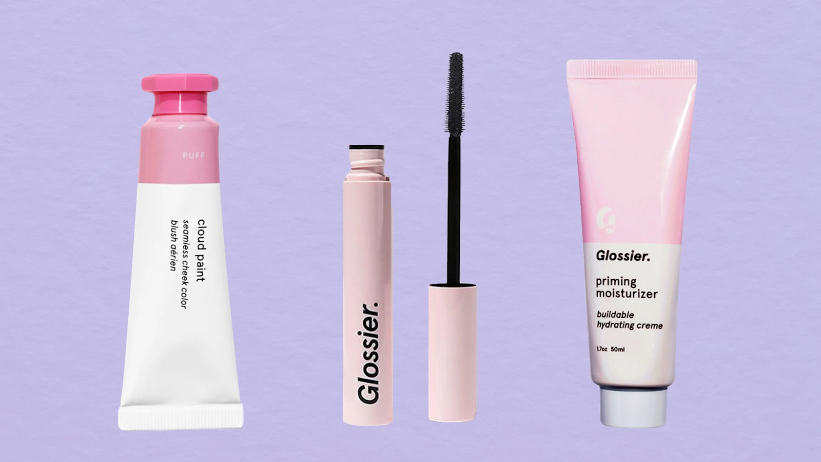
Pastel colors naturally fit beauty logos and skincare brands because they convey purity, softness, and elegance.
When customers look at a pastel logo in this industry, they often feel a sense of trust and calm, which is exactly what skincare brands want to evoke. Consider how brands like Glossier have used light pinks and whites to create a fresh, clean look.
Using pastels in beauty branding helps emphasize gentleness—something customers look for in products they use on their skin. The soft tones also make a logo appear less aggressive, which is perfect when your goal is to communicate care and nurturing.
2. Children’s Products
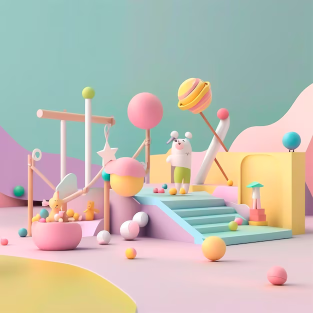
Pastel colors work beautifully in logos for children’s toys, clothing, or accessories because they appeal to kids and parents. Soft blues, pinks, and yellows are often associated with innocence and playfulness, and these colors create a fun, welcoming vibe for children’s products.
Pastel tones convey safety and softness for parents, making the brand feel trustworthy and reliable. Whether it’s a baby clothing line or an educational toy company, pastel color logos make perfect sense in this space.
3. Health & Wellness

In health and wellness, pastels offer a calming presence. Soft colors like mint green, pale blue, and lavender can bring a sense of tranquility, which is exactly what wellness brands aim for. Think of yoga studios, organic food brands, or meditation apps—pastel logos can visually reinforce the peace and well-being these businesses provide.
Customers in this space often want to feel relaxed and reassured, and pastel colors help achieve that emotional connection. The gentle hues suggest a natural, holistic approach, aligning perfectly with health-focused brands.
4. Wedding & Event Planning
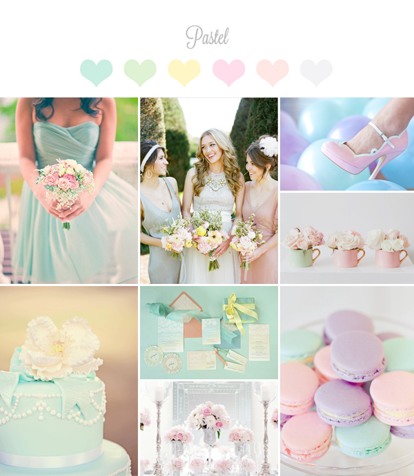
The wedding industry thrives on elegance and romance, and pastel colors are a match made in heaven for this. Whether it’s a logo for a wedding planner or a florist, pastels evoke feelings of love, joy, and tenderness.
Soft pinks, blush tones, and pale lilacs are incredibly popular in wedding branding because they symbolize new beginnings and beauty.
Event planning companies also benefit from pastel logos’ flexibility. They can easily adapt to different themes and moods, making them an excellent choice for diverse event types.
5. Cafes & Bakeries
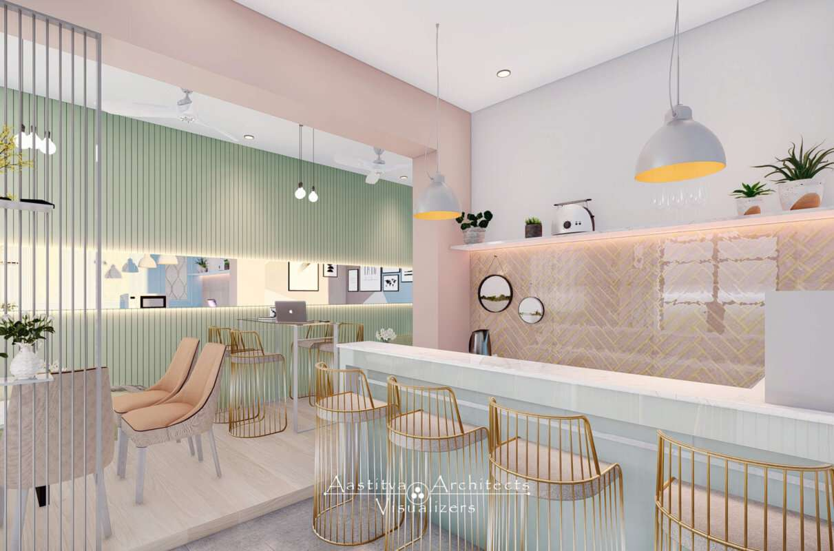
Pastels are commonly used in café and bakery logos because they evoke a sense of warmth and sweetness.
Picture a cozy bakery logo with soft pinks and pastel yellows that immediately make you think of freshly baked cupcakes or macarons. These colors invite customers in, making them feel like the brand offers a delightful, homemade experience.
For cafés, pastel tones create a relaxing environment, encouraging people to unwind, enjoy their coffee, and stay a little longer. The visual softness makes the brand feel friendly and inviting.
Design Tips for Creating Pastel Logos
1. Balance Soft and Bold Elements
While pastels are soft, pairing them with bolder typography or accents can create balance. This helps the logo remain eye-catching without losing its gentle appeal. Use a pastel background with a bold, dark-colored font for clarity and contrast.
This approach ensures that your logo remains readable and doesn’t get lost in the softness while still benefiting from the calming effect of pastels.
2. Play with Negative Space
Minimalism and pastels are a perfect match.
Using negative space in your pastel logo design can create a clean and modern look that keeps the focus on simplicity. Since pastel colors are naturally subtle, combining them with negative space can make your logo feel airy and uncluttered.
Negative space also allows the colors to breathe, preventing the logo from feeling too busy or overwhelming while maintaining a visually compelling design.
3. Layer Pastel Gradients
Using gradients within the pastel color family can add depth and complexity to your logo.
For example, transitioning from light pink to pale peach creates a soft but dynamic effect. Gradients make pastel logos feel more contemporary and layered without overpowering the design. This technique preserves the soft appeal of pastels while adding a subtle, modern twist that keeps the logo visually interesting.
4. Pair with Natural Textures
Adding organic elements, like watercolor textures or hand-drawn elements, can make your pastel logo even more unique. These natural textures work beautifully with soft colors, creating a harmonious, authentic look that resonates with audiences.
This approach is great for brands that want to communicate warmth, craftsmanship, and a personal touch.
Pastel Logo Trends
1. Minimalist Pastels
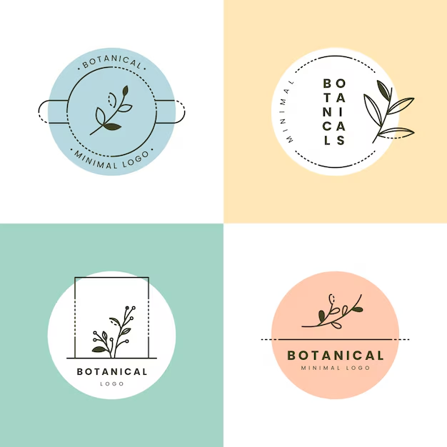
Minimalism in logo design continues to thrive, and pastel colors fit perfectly into this trend. Simple shapes and clean lines paired with soft colors create modern and timeless logos. The combination of simplicity and pastels makes the design fresh without being overpowering.
Minimalist pastel logos work well for brands that want to convey a refined, high-end image.
2. Vintage Pastel Aesthetic
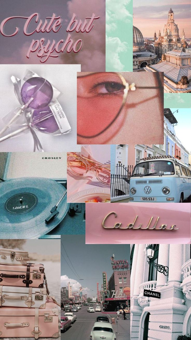
Vintage-inspired designs have made a big comeback, and pastels are a key component. Think retro, old-school logos with pastel colors that bring a sense of nostalgia. These logos are great for businesses wanting to evoke a sense of history or tradition while still appearing soft and friendly.
3. Pastel Hand-Drawn Logos
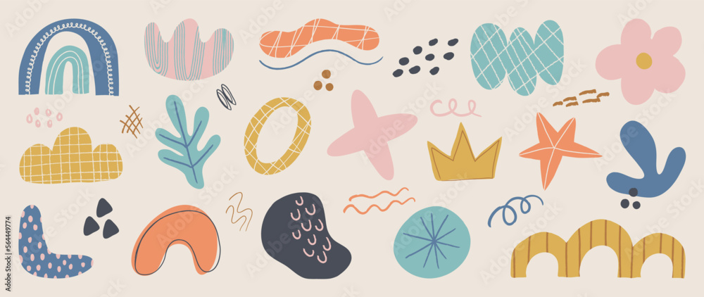
Hand-drawn elements combined with pastel colors give logos a personal, artisanal feel. This trend appeals to brands that want to appear approachable and authentic, like small businesses or creative ventures.
Bridges can communicate uniqueness and craftsmanship by combining pastel hues with imperfect, hand-drawn lines.
4. Bold Pastel Typography
Pairing pastels with bold typography creates a balanced contrast that’s eye-catching. Bold, thick fonts and soft colors make a logo stand out while maintaining a gentle tone. This trend is often used in beauty or lifestyle brands.
This approach is especially useful for brands that want to be noticed but still feel approachable and friendly.
5. Soft Geometric Shapes
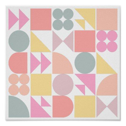
Geometric shapes in pastel tones can create logos that feel structured yet soft. Squares, circles, and triangles in muted colors give a logo a playful but organized look, making it both modern and approachable.
It works well for creative industries or brands wanting to show both structure and creativity.
Conclusion
Pastel logos offer a subtle yet powerful way to connect with your audience. These soft, muted colors communicate warmth, trust, and a timeless elegance that can elevate any brand.
Whether in beauty, wellness, or the wedding industry, incorporating pastels into your logo design can create a lasting impression.
BrandCrowd makes designing pastel logos a breeze, even if you don’t have any design experience. We offer many ready-made templates that you can easily tweak to reflect your brand’s vibe.
Do you want to play around with pastel colors, try different fonts, or adjust the layout? It’s all super simple with their user-friendly tools. Plus, you can see how your logo will look on business cards, websites, and more, so everything feels just right before you finalize it.