60 Color Combinations for Eye-Catching Brands
Hue or color brings our designs to life. Pair them with different elements like typography, images, icons, colorful logos, etc. You have a complete set for an effective marketing campaign.
Now, add the knowledge of color psychology to those elements, and voila! You’ve put more depth and meaning into your overall business design. Around 80% of consumers say that they recognize a brand because of its distinct color.
Thus, let us help you become an eye-catching brand with your chosen color palette.
Eye-Catching Color Combinations For You
We listed the top 60 combinations based on Pantone’s 2022 catalog of unique colors and harmonies. They’re every color that goes with Very Peri, and we’ll explain why they work.
We divided the 60 into 4 major categories to aid in your decision-making process:
Balance
According to Pantone’s palette, these color variations are a combination of warm and cool colors. Both color spectrums complement each other in that they look absolutely eye-catching.
Check out some of the combinations that could work well for your color scheme:
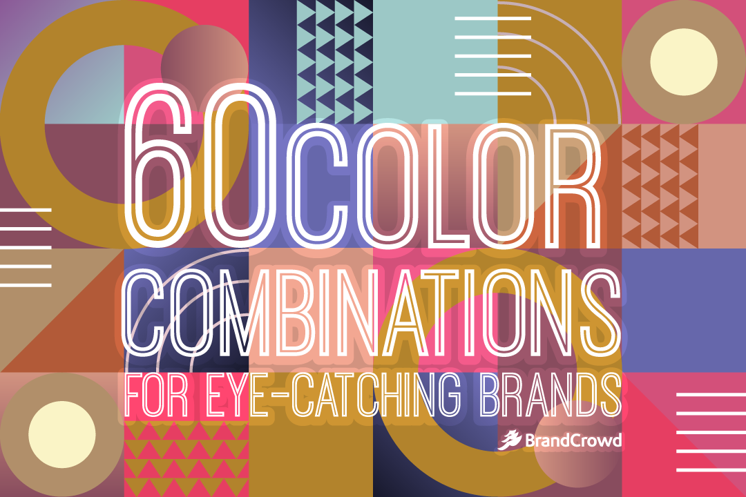
Muted Clay + Hawthorn Rose
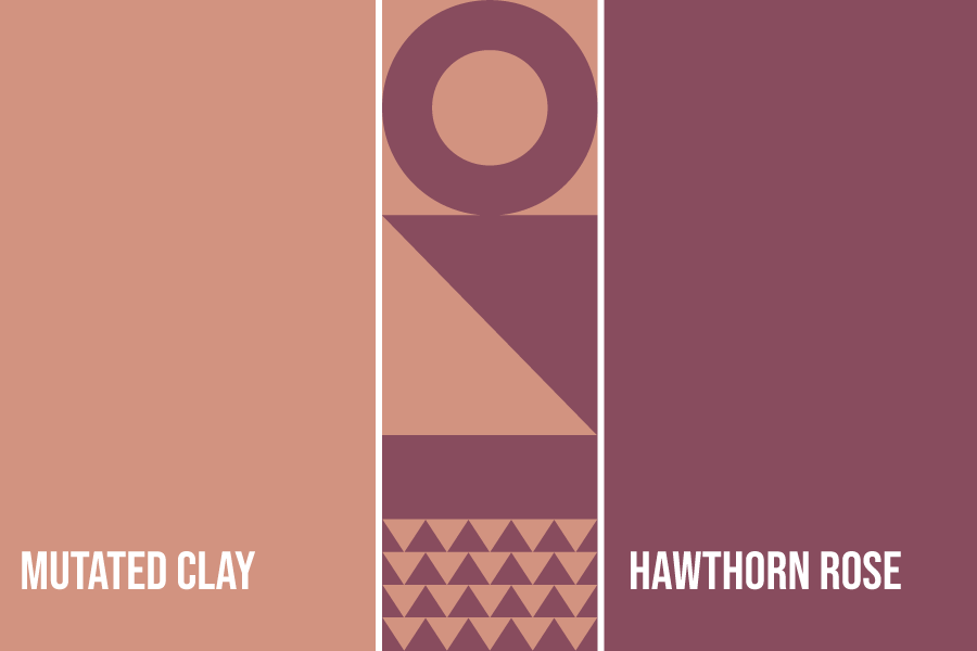
Burnished Lilac + Very Peri
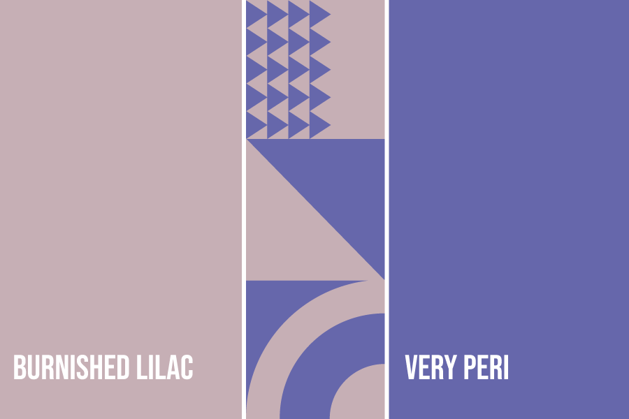
Elderberry + Very Peri
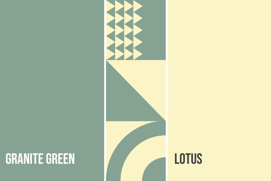
Granite Green + Lotus
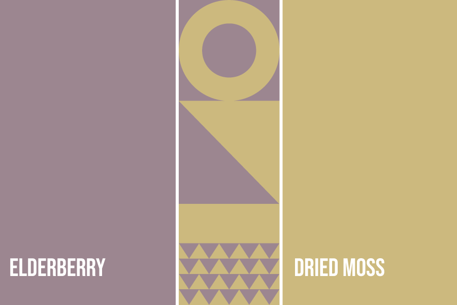
Elderberry + Dried Moss
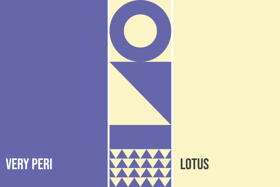
Very Peri + Lotus
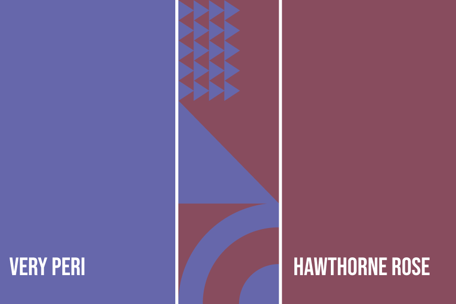
Very Peri + Hawthorne Rose
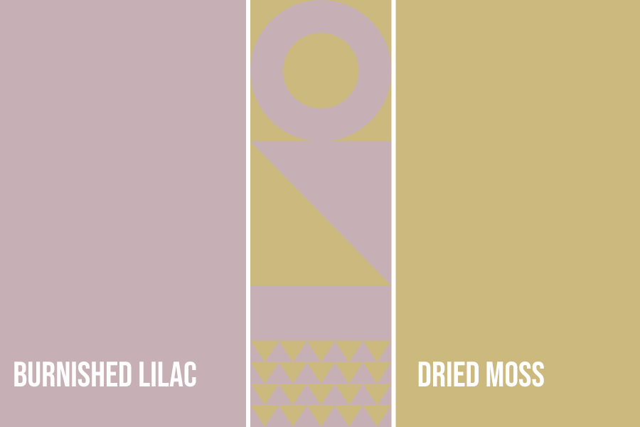
Burnished Lilac + Dried Moss
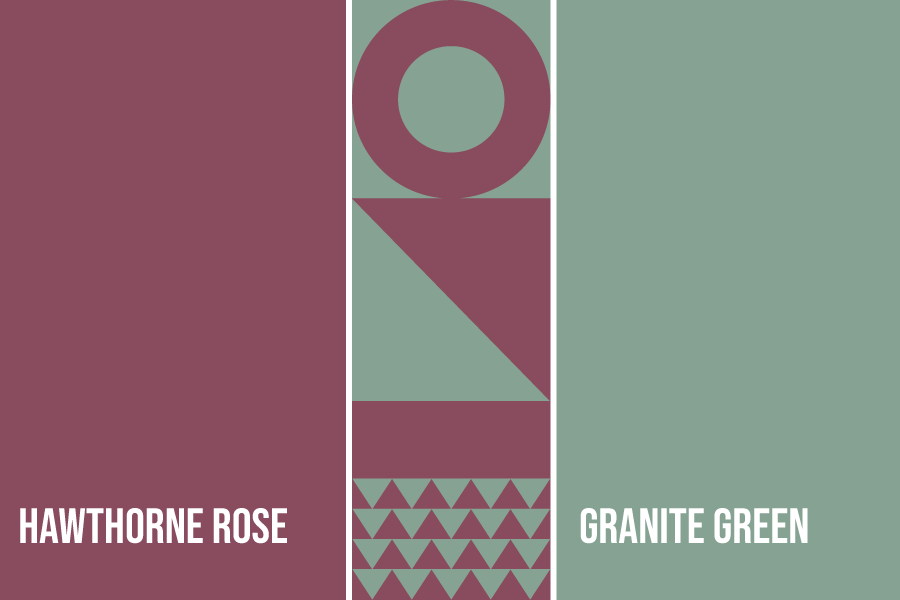
Hawthorne Rose + Granite Green
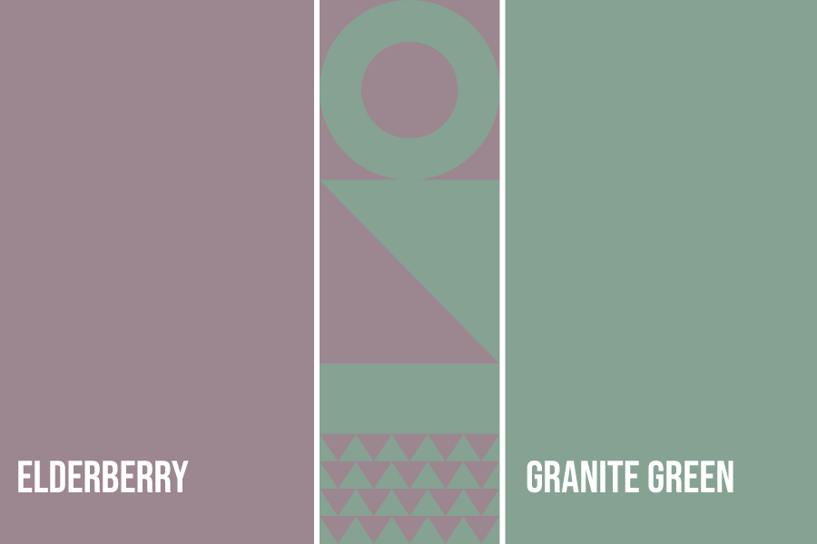
Granite Green + Elderberry
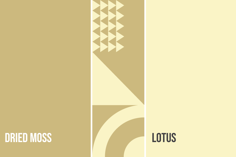
Dried Moss + Lotus
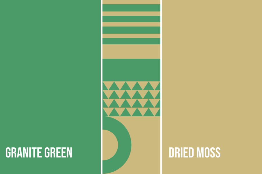
Granite Green + Dried Moss
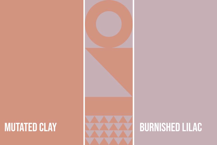
Muted Clay + Burnished Lilac
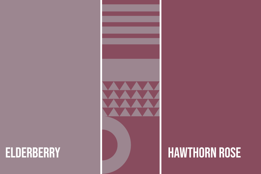
Elderberry + Hawthorn Rose
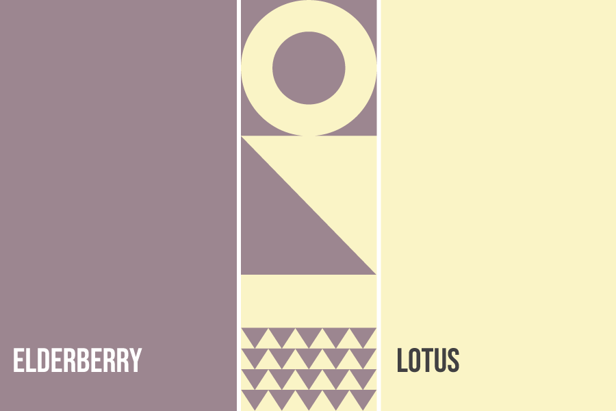
Elderberry + Lotus
Nature
As for this section, we’re looking into green tones that work well with periwinkle. It refreshes the eyes and works well for business websites and social media pages. If you want to show your customers that you value the environment, go with these combinations.
Choose your green-toned color below:
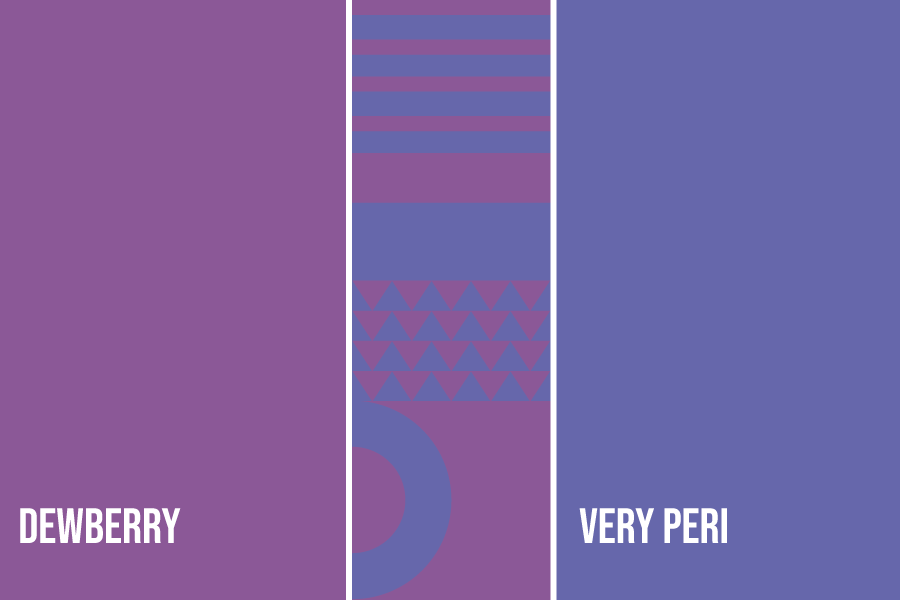
Dewberry + Very Peri
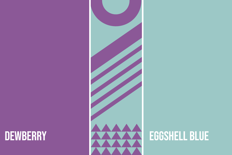
Dewberry + Eggshell Blue
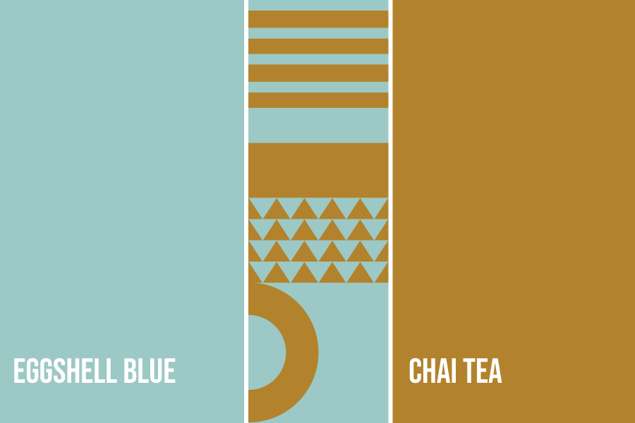
Eggshell Blue + Chai Tea
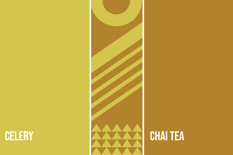
Celery + Chai Tea
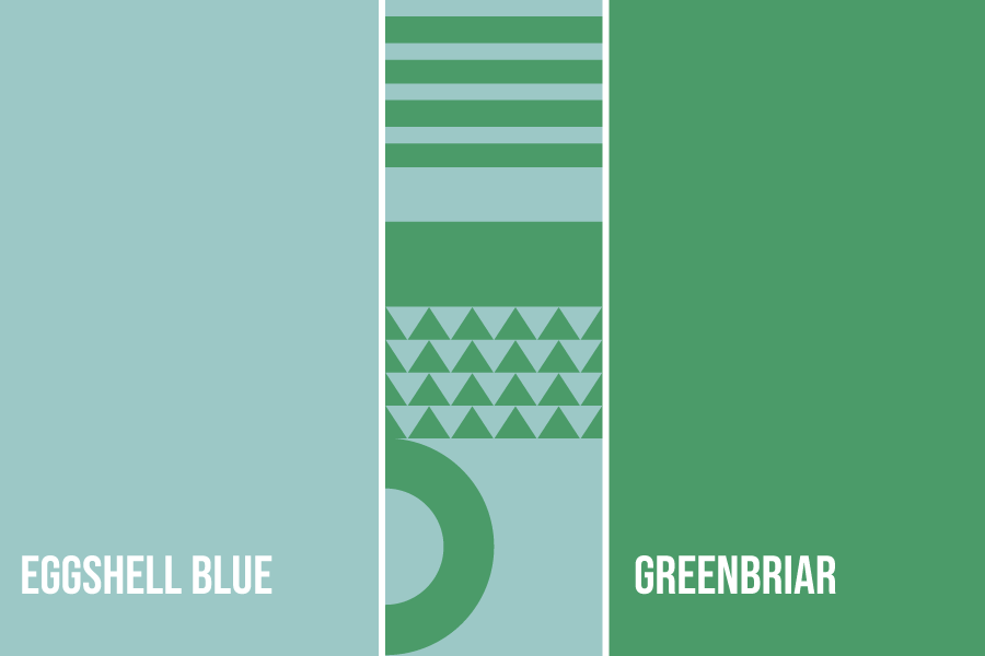
Eggshell Blue + Greenbriar
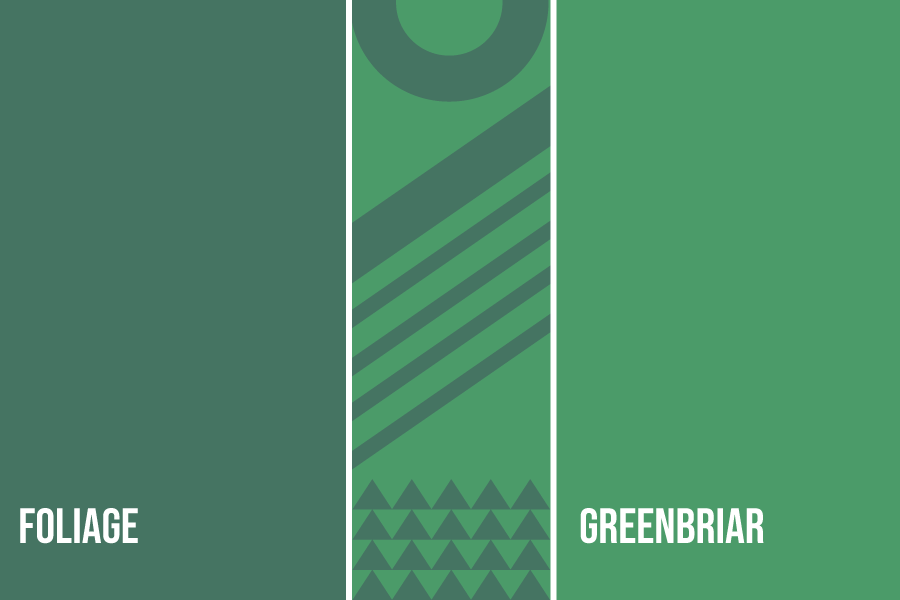
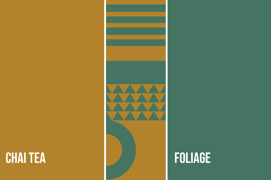
Greenbriar + Foliage
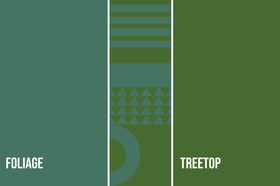
Foliage + Treetop
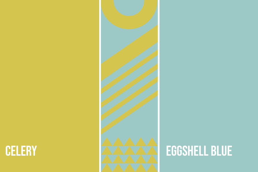
Celery + Eggshell Blue
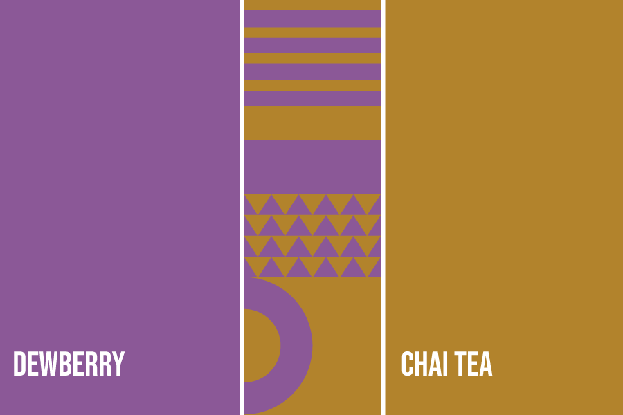
Dewberry + Chai Tea
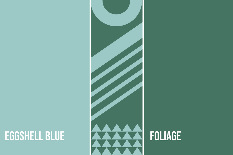
Eggshell Blue + Foliage
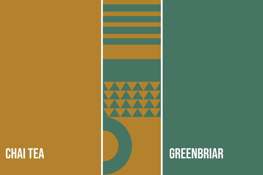
Chai Tea + Greenbriar
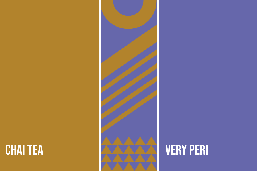
Very Peri + Chai Tea
Foliage + Chai Tea
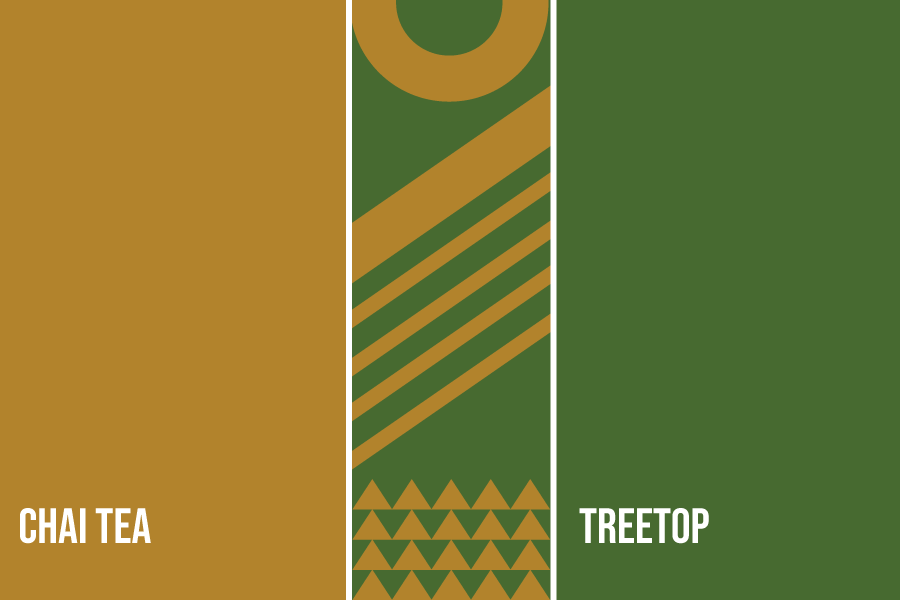
Chai Tea + Treetop
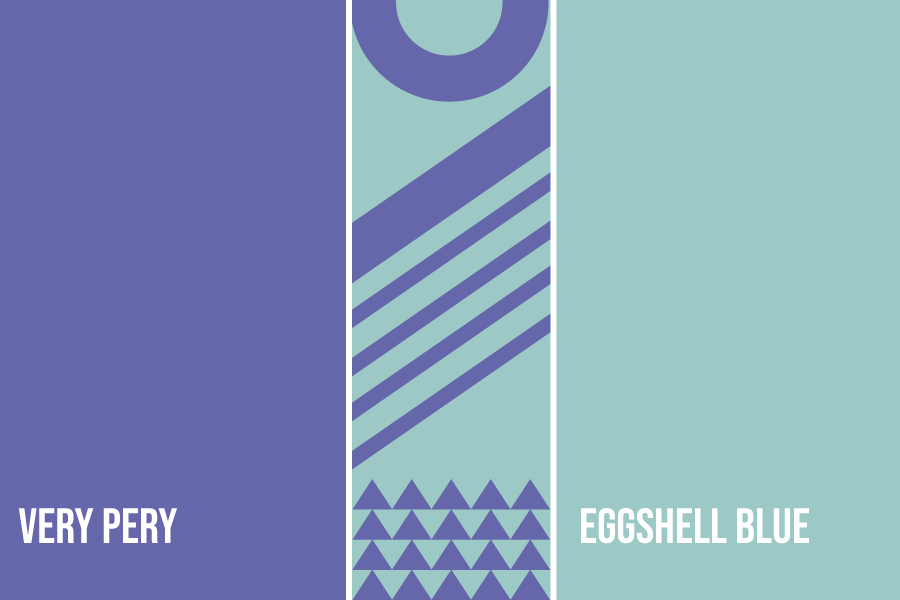
Very Peri + Eggshell Blue
Neutral Pairing
Sophistication is the word to describe this color palette. They work well with periwinkle since they exude happiness and elegance at the same time.
Neutrals are a great way to tell your customers that you mean business and want to give them a luxurious experience through your business.
Find your sophisticated palette below:

Cloud Dancer + Very Peri
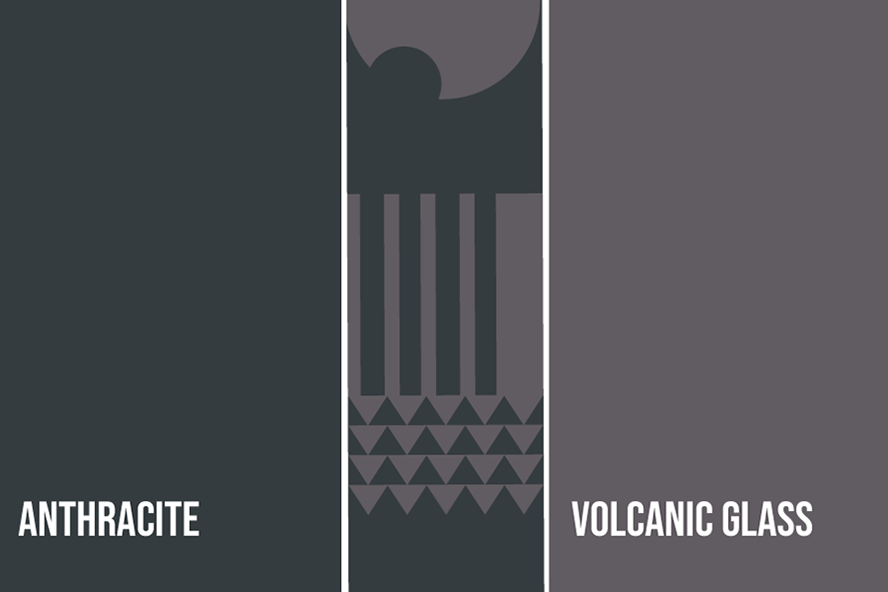
Anthracite + Volcanic Glass

Volcanic Glass + Cloud Dancer
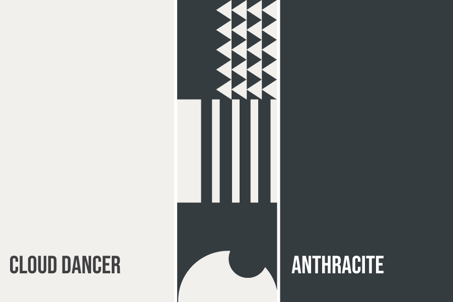
Cloud Dancer + Anthracite
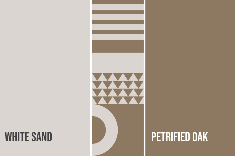
White Sand + Petrified Oak
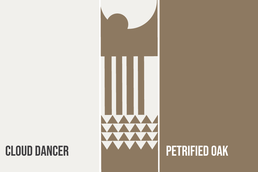
Petrified Oak + Cloud Dancer
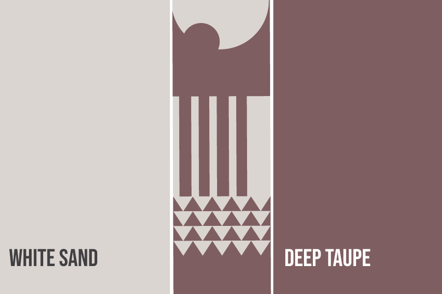
Deep Taupe + White Sand
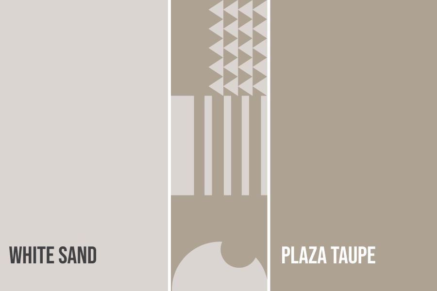
White Sand + Plaza Taupe
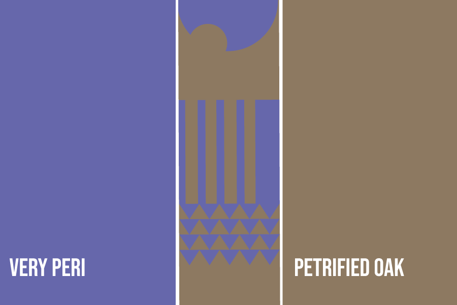
Very Peri + Petrified Oak

Very Peri + White Sand
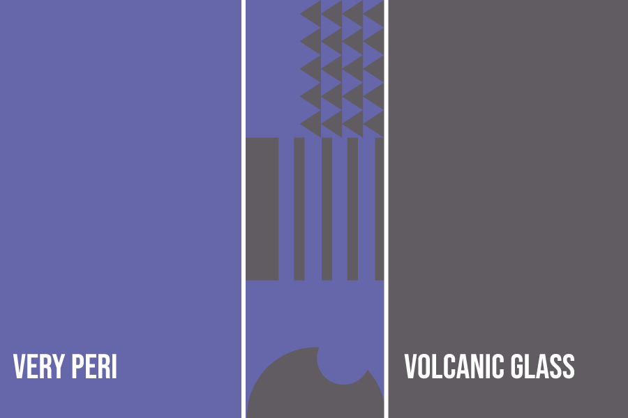
Very Peri +Volcanic Glass
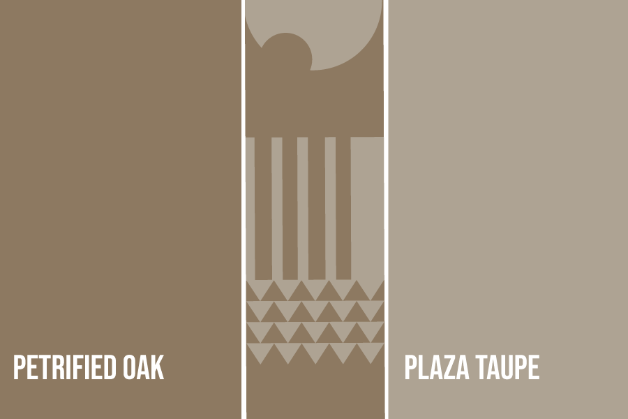
Petrified Oak + Plaza Taupe

Cloud Dancer + Deep Taupe
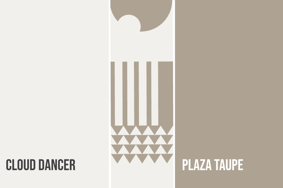
Plaza Taupe + Cloud Dancer
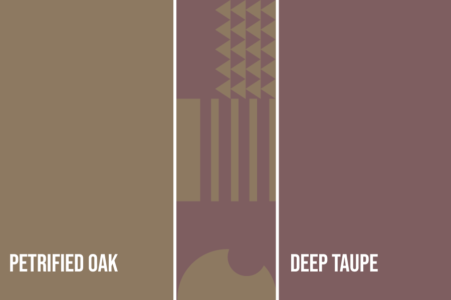
Petrified Oak + Deep Taupe
Whimsy
Lastly, we have the more fun tones. They exude joy and playfulness with the mixture of bright pinks and new blue hues.
Get inspired by the color combinations below:
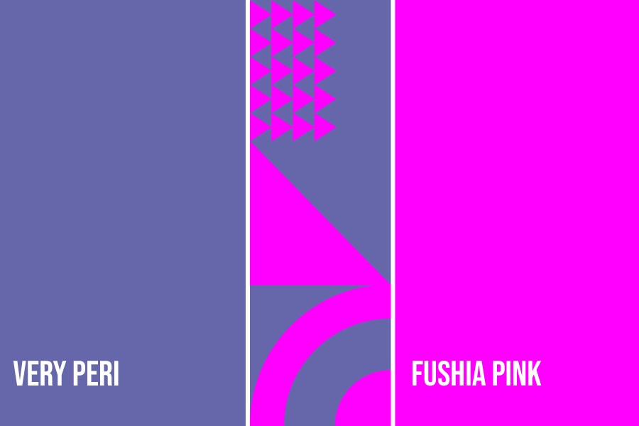
Very Peri + Fushia Pink
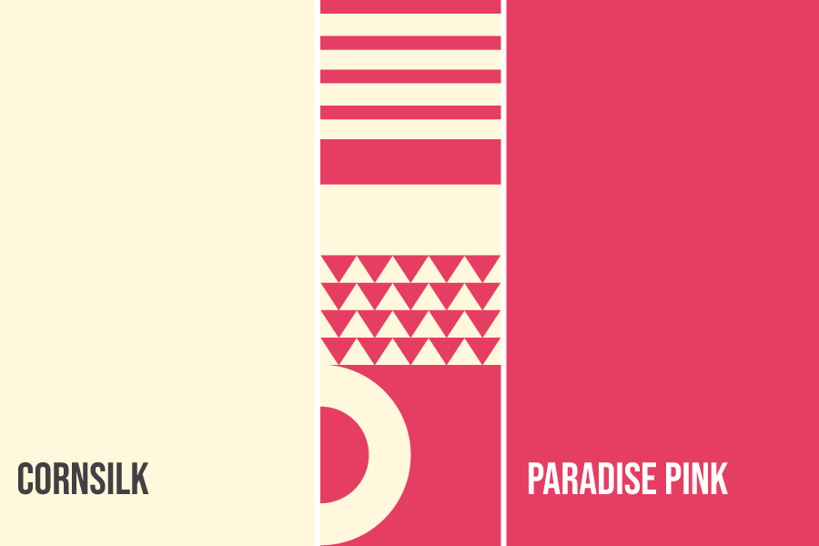
Cornsilk + Paradise Pink
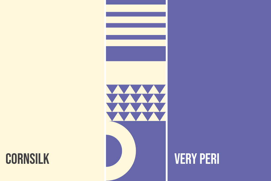
Very Peri + Cornsilk
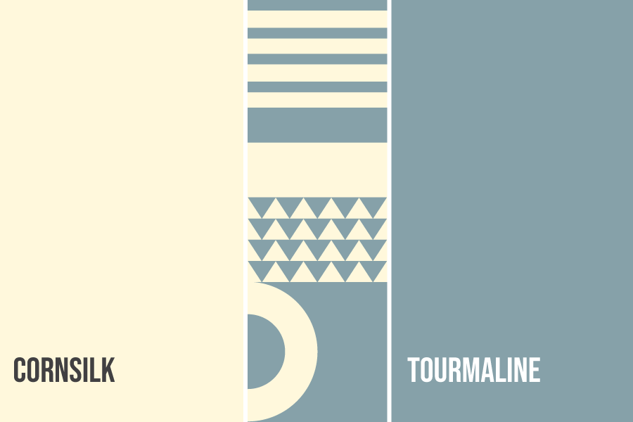
Tourmaline + Cornsilk
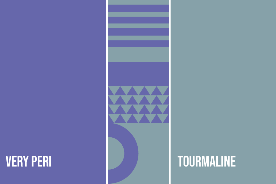
Tourmaline + Very Peri
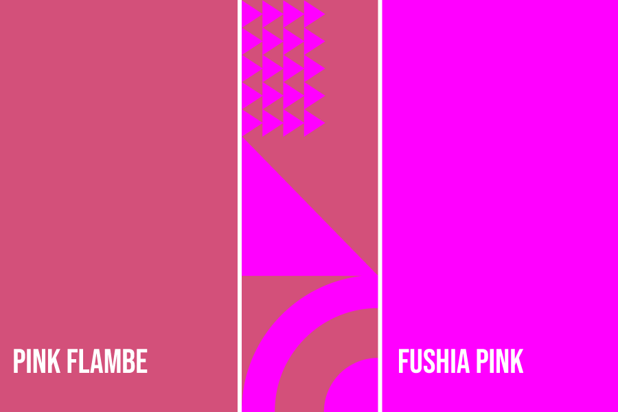
Pink Flambe + Fushia Pink
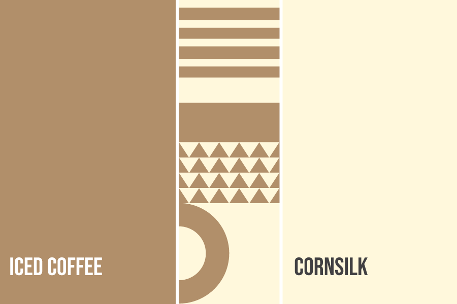
Iced Coffee + Cornsilk
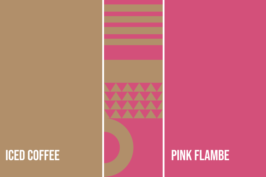
Iced Coffee + Pink Flambe

Paradise Pink + Cornsilk
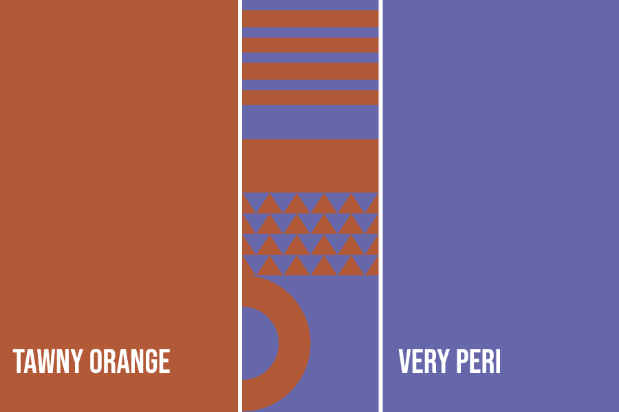
Tawny Orange + Very Peri
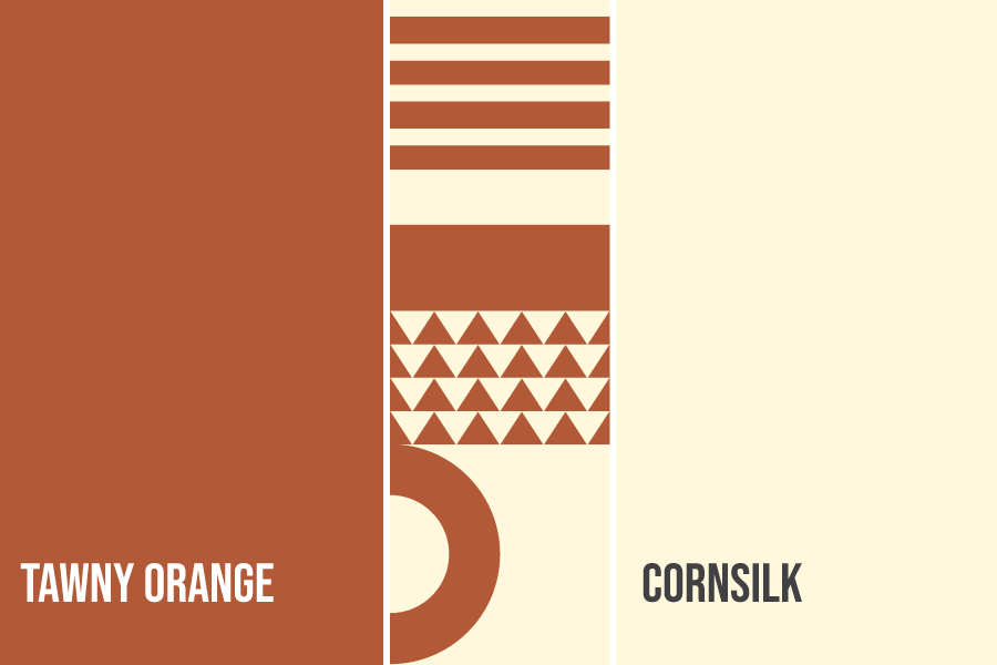
Tawny Orange + Cornsilk
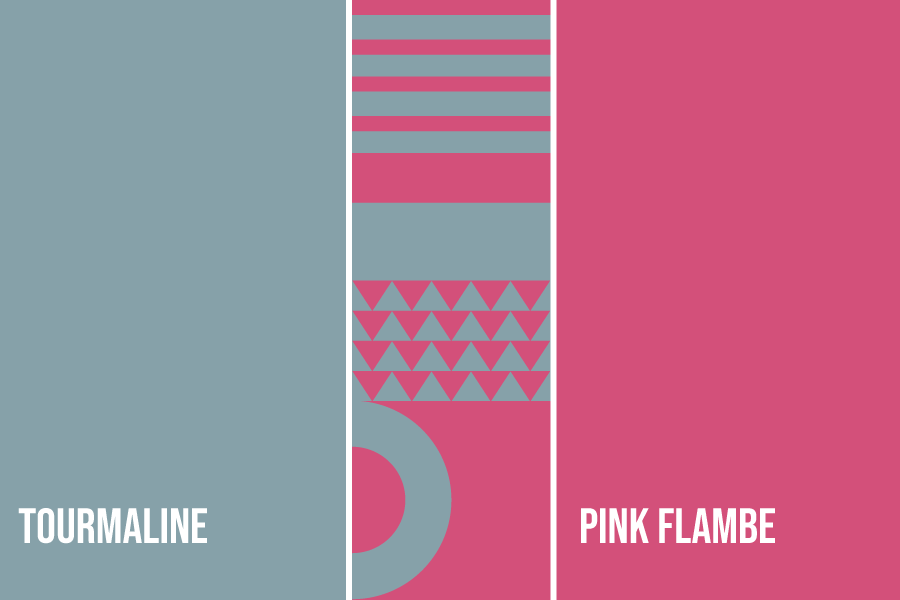
Tourmaline + Pink Flambe
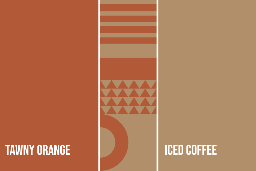
Tawny Orange + Iced Coffee
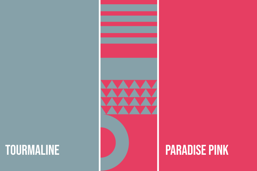
Paradise Pink + Tourmaline
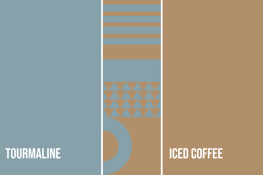
Iced Coffee+ Tourmaline
Brand Cooler With Color
And there you have it, our list of color combinations based on this year’s harmonies from Pantone. They’re mostly mixed with Very Peri, but aside from that, they all look groovy.
Create social media posts and logos with these color schemes through our services. BrandCrowd offers a wide array of graphic designs.
We have a logo maker, business card maker, social media design needs, and more. Just follow us to our website and pick any of our DIY design tools just for you.
Happy Designing!