Mood Board Construction: 12 Tips to Fuel Your Design
Sometimes, it’s hard to look for inspiration. As designers, this is one of our kryptonite. Thus, allow us to help you in that department through our tips for mood board construction.
Creating a mood board allows you to generate creative ideas since you see stuff that inspires you and gives you ideas on how to create graphics for your client’s branding endeavor.
Allow yourself to get inspired and use our logo maker to better help your clients’ branding.
Getting Into Mood Board Construction
Since we are creators, we need to make sure that our creative juices flow to create targeted graphic designs better. We prepared 12 tips to inspire you in your mood board creation.
- Tamper Your Environment
- Digital or Print?
- Organize or No?
- Frame Your Project
- Collect to Inspire
- Choose Thy Hue Palette
- Pick A Font, Any Font
- Listen to Contentrate
- Use Your Words
- Feel Your Design
- Know Your Software
- Explain Yourself, Designer
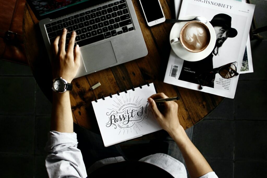
1. Tamper Your Environment
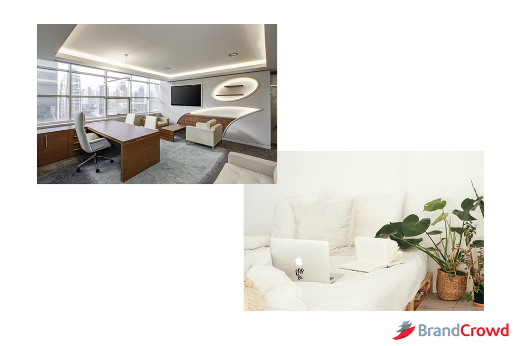
Like any artist, a designer needs to be in the zone. A great way to do that is to change your environment to create the perfect atmosphere.
From the lighting to the view you see, take those into account to better your process. Aside from that, think about noise.
Do you want it to be quiet, or are you listening to your self-made playlist, or maybe you like the sound of the people in a cafe? Take your pick and stick with it.
Though, you could work in an ever-shifting environment. The statement means that your workspace could be anywhere as long as you are comfortable, and it helps you get in the ZONE.
A study by Kathleen Vohs of the Association of Psychological science says that people who work in a chaotic environment are more likely to give out creative output. Though that is entirely up to you, it’s just food for thought.
2. Digital of Print?
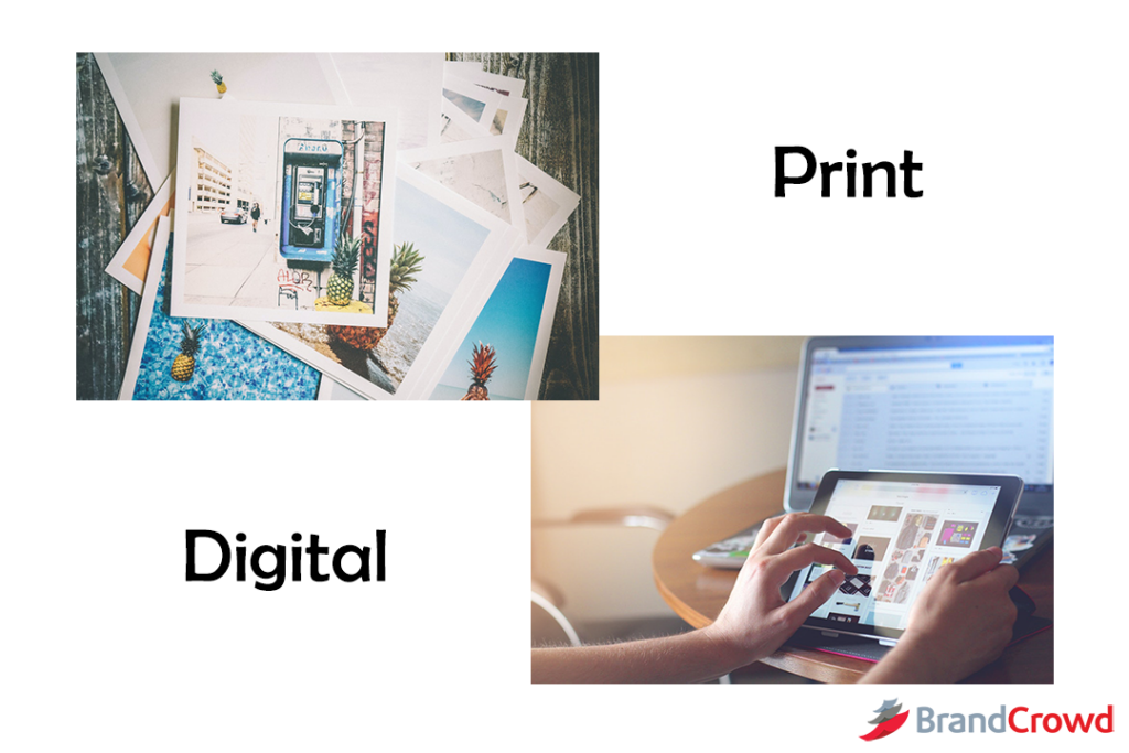
Every one of us has a different preference for creating mood boards. You have a physical copy of it in front of you for print.
For digital, it’s a compilation of photos and more that can be found either online or offline. You’re good to go as long as you have a copy on your device.
No pressure on deciding, though, since you get inspired by either medium you use to see your mood board
3. Organize or No?
Another head-turning question about mood board construction is whether to organize it or not. Some of us are okay with a cluttered mood board, and others want an organized one.
Even if you’re the messy type, organizing is the way. It’s critical since you can work with so much material and don’t know where to start. The organization demands time since its a gradual process.
But no worries, when you’re finished with this, you’d have a more exact goal in mind, especially with the due date.
4. Frame Your Project
Since you have already adjusted how you want to set up your mood board, let’s talk about how to set your goals for design.
Of course, you received the brief for the project. It consists of the name, elements wanted, and budget. Workaround these to create the design you have for the client. You need to answer the questions:
- Does the budget cover the materials required?
- What are common elements from the industry to incorporate into the logo?
- Is the logo I’m creating similar to another business’ logo?
- How long do I plan to make the design?
- What are the design trends for this year?
These are just some queries to help you frame your project so that you can pace yourself as a designer.
5. Collect to Inspire
Now you’re ready to start designing your mood board. You know the setup. Now visualize and get the materials you need.
Consider the vibe you want for your board: the colors, anything associated with the design you want. Let’s say we want to create a logo for an insurance company.
And client gave you their name and feel they want:
Name: Livin Essence
Budget: $$
Service: Insurance for Individuals ages 20 to 60. The client wants a Chrysanthemum as the logo’s center.
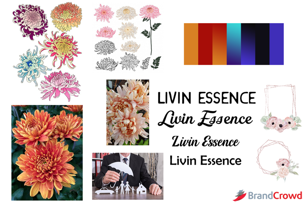
From those alone, you can collate your photos, color scheme, and possible fonts to use. We’ll get the Chrysanthemum photos. Aside from that, you can add a mix of warm and cool colors. And the typography may be more formal or quirky.
6. Choose Thy Hue Palette
We already mentioned that you need to procure this for your mood board. But the reason it needs its chapter is because of the many choices you can have.
You need to learn shading, tint choices, and color combinations you can pick. Some choices include:
- Color Psychology
- Gradients
- Saturation
Each of them gives you a guide on how to bring out emotion from viewers and direct where they should look. Color psychology gives meaning to colors. Gradients help with focusing the eyes. Lastly, saturation works with color psychology to inspire emotion from the viewer.
7. Pick A Font, Any Font
Another mention in number five is typography. Whichever font you use for your business aids in creating the feel you give to your customers.
You can either choose a serif or sans serif.
Serif font gives off that “We Mean Business” kind of feel since it’s plain text without the curves. Sans Serif is the exact opposite since it gives off the feeling of “We’re Fun, Join Us.” Though those two can be interchanged in meaning depending on how you present them.
You create a creative and exciting wordmark by adding fun colors and elements to serif fonts. Don’t overdo it if you do the same for sans serif since your design could look cluttered from time to time.
Either way, it’s pretty great to know the trends in typography, too, if you want an apparent reference of what works for any year.
8. Listen to Concentrate

This bullet discusses what you hear rather than your overall environment that optimizes creativity, similar to number one. It answers the question: what do you want to hear as you work?
Some of us can work better with background sound, whether it’s music, white, brown, or pink noise. Others want it to be quiet to help their concentration better. Either way, it’s your choice.
Let’s define white, brown, and pink noise better to help you choose and try if either work for you.
- White Noise: Represents all hearable frequencies. Examples are whirring fans, radio or television static, vacuum, and humming air conditioners, to name a few. When heard, this frequency drowns out other sounds, which also helps sleep.
- Brown Noise: Represent the frequencies on the lowest end. Examples are low roaring, powerful waterfalls, and thunder, to name a few. This kind of noise is said to promote concentration.
- Pink Noise: Lower frequencies are louder than higher frequencies. Examples are rustling leaves, steady rain, waves crashing, and heartbeats, to name a few. When heard, this kind of noise is also associated with having a deep sleep.
9. Use Your Words
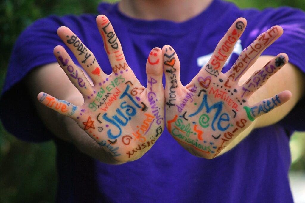
One of the essential parts of a mood board is the words you use to describe the business. So the example is insurance, right? The words we could use are:
- Security for the Future
- Future
- Professional
- Money
- Insurance
List down words that could help inspire you as you design your mood board.
10. Feel Your Design
Ensure that when people see your design, they understand what your client is saying. The simplest of things can do that.
They spark emotion from the arrangement of elements to the color scheme you choose. Create your design to give rise to feelings people didn’t know would have.
For example, a campaign for sea pollution and we should work together to clean our ocean. A photo of a turtle swimming with trash is a pretty strong message.
Thus, as the saying goes, a picture is worth a thousand words. Make your design precisely that.
11. Know Your Software
Second to the last on our list: software you can use to aid your mood board construction. Sometimes, we can’t create the board ourselves since we don’t have time.
Here’s a list of applications you can use to aid your design process:
- Adobe Photoshop or Spark: Under the Adobe suite, you can create and edit a mood board to your desire. You do need software expertise to use either of the software.
- Canva: You can edit templates, and they give you access to free stock photos and other elements you may need for your design endeavor.
- Moodboard: Edit mood board template without an account for free.
- Moodzer is a beta application that looks promising in creating mood boards
- Pinterest: Create an account and add photos to inspire you by adding them to your board. It can be a public or private board, depending on your preference.
12. Explain Yourself, Designer
Lastly, make sure your mood board describes your ideas well. The board’s very purpose is to be a visual representation of how and why you’re creating the design.
You are the designer. Your creation speaks for itself. Your output defines your style and what the client wants to say to their target market. Don’t confuse this last number with the number ten bullet point.
Ten describes how you can evoke emotion from your design. This bullet point talks about you as a designer. With one look, people get what you are trying to convey.
Mood Board Construction Done Right
And there you have it. Our long list of tips to aid in your mood board construction. No worries, you don’t have to follow all of them. Pick those that suit you best.
But if you want another platform to look at to get the design inspiration, or you are a business owner looking to create a logo yourself, you came to the right place.
Here at BrandCrowd, we have 75,000+ templates for your design needs. We have it right here from logos to social media posts and business cards.
Stay inspired, designer!