Samsung Logo History
Today, there are many phone brands available, and people have different preferences. However, many people prefer Samsung devices because they are known for their quality and innovative features. Samsung phones are famous for sleek designs, excellent cameras, and user-friendly interfaces.
One thing that makes Samsung stand out is its logo – it is easy to recognize and has become a symbol of quality and trust.
Just like other mobile phone logos, it has changed over the years.
If you want to modify your logo or create a new one, check out our logo maker tool.
Let’s look at the history of the Samsung logo and see how it has changed over time.
Brief History of Samsung
Samsung started as a small trading company in South Korea in 1938. Over the years, it grew into a big brand known worldwide. In the 1960s, Samsung began making electronics, and by the 1980s, it started producing mobile phones.
Samsung’s first mobile phones were basic, but the company kept improving them.
In the 2000s, this mobile phone logo introduced the Galaxy series. These smartphones became very popular because they had great features and stylish designs.
Today, Samsung is one of the top mobile phone brands and part of the list of famous logos. People love their phones for their high-quality cameras, long battery life, and innovative technology.
Samsung continues to create new and exciting devices that many people worldwide use and enjoy.
Samsung Logo History
The Samsung logo has changed a lot over the years, reflecting the company’s growth and evolution. Each version tells a part of Samsung’s story.
Let’s look at how the Samsung logo has developed over time.
1938

Samsung’s first logo was very different from the simple design we see today. Introduced in 1938, when Samsung was still a small trading company, it featured a complex circular emblem. Inside the circle were three star logos and three stripes, with Korean text around the border.
1958
In 1958, Samsung’s logo changed drastically. The detailed fish design was replaced with a simpler, cleaner look. The new rectangle logo has three stripes, similar to the earlier design, and the company name was written in Hangul (the Korean script).
This change shifted towards simplicity and legibility, setting the stage for Samsung’s future logo designs.
1969

In 1969, Samsung changed its logo to appeal to Western audiences as it expanded beyond Korea. The new logo featured “Samsung” in a Western-style, highlighting the company’s global ambitions.
The word “Samsung” was enclosed in a tilted ellipse, symbolizing dynamism and innovation.
1993
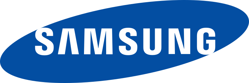
The most significant change in Samsung’s logo design happened in 1993. Reflecting its growing status as a global electronics giant, Samsung introduced the blue oval logo we recognize today. The word “Samsung” was stylized with a unique font and placed within a blue ellipse.
The blue color represented stability, reliability, and technology, while the ellipse symbolized the universe, highlighting Samsung’s global ambitions and vision.
The most interesting aspect of this logo is its minimalism. It does not use any symbol or emblem, just the company name. This reflects Samsung’s belief in the power and recognizability of its brand name, showing that the logo represents Samsung’s identity.
2015

In 2015, Samsung simplified its logo even further. The company removed the blue oval and switched to a simpler, 2D design. The 3D glossy effect was removed, making the logo cleaner, more modern, and better suited for digital use.
This updated logo reinforced Samsung’s image as a trendsetter in the tech industry, keeping it at the forefront of design trends.
Samsung Logo Elements
Check out the three main elements that encompass Samsung’s logo:
Shape
Did you know that the first Samsung store was so small that it didn’t display a logo on packaging or products until 1958. Before Samsung’s business boomed in the 1960s, they created a new logo to celebrate their growing success.
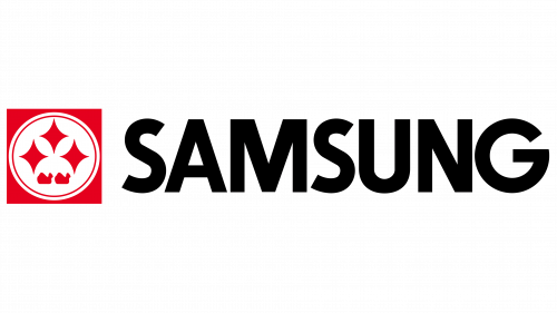
The new logo was rectangular. Inside the rectangle was a circle containing three four-pointed stars, and the name “Samsung” was written in English to the right of the emblem. This design marked a significant step in establishing Samsung’s brand identity.
Color
Samsung’s first three logos had a simple color theory, mainly shades of grey, black, and white, which were practical for printing and packaging.
However, in the 1980s, Samsung added more color to its logo. They made the shapes around their four-pointed stars red while keeping the rest of the logo black.
Later on, Samsung opted for a softer image. They changed the logo’s font from black to white and introduced the calming blue shade that is now iconic. This change reflected Samsung’s evolution and its desire to create a more modern and approachable brand image.
Font
Samsung’s initial logo was in Korean script, but when they expanded into English-speaking markets, they chose a straightforward, all-capital sans-serif font reminiscent of Helvetica. This font was modified to be thicker and broader for the 1980s logo before returning to a thinner style for the modern-day logo.
Samsung Logo’s evolution in font style reflects Samsung’s adaptation to changing design trends and its efforts to maintain a sleek and contemporary brand image.
Design Your Mobile Phone Logo Today!
As we’ve seen, Samsung’s logo has adapted to changing times, incorporating simplicity, modernity, and versatility while staying true to its core identity. Today, the blue oval logo symbolizes stability, reliability, and Samsung’s ambition to lead in multiple sectors on a global scale.
If you’re inspired to design your mobile phone logo, look no further than BrandCrowd. Our logo maker tool and social media templates are perfect for fulfilling your advertising needs, helping you create a distinctive brand identity that captures the essence of your product or service.
Join the ranks of successful brands like Samsung and make your mark with BrandCrowd today.