The 10 Typography Design Trends in 2021
Typography allows brands to take control over how their audience perceives them. It influences comprehension and the amount of attention that consumers will give you. It could even be one of the reasons why some people will ignore your brand.
Like anything in this world, the movements that surround typography change.
This article is going to tackle typography trends. It aims to help people become lettering champions in their own right.
Below you’ll find trending fonts and styles that you can use to polish your brand identity. You can use them for your text logo and various marketing materials. Take a look at the overview here.
- Outlined fonts
- Cyberpunk
- Stocky and short fonts
- Gradient
- Rounded fonts
- Minimalist
- Handwritten
- Custom made
- Glitch-effects
- Layered with images
The trends you are about to discover below present a ton of opportunities for your brand. Allow us to explain why that is.
Importance of typography trends
It is a well-known fact that design helps your brand grow, and it can even help you influence buying decisions. This is true for your logo design up to the smallest marketing collaterals like business cards and favicon.
Having a trendy and relevant design increases your brand’s appeal by making you look updated with the times. After All, who wants to work with a brand with an outdated appearance?
Remember that text and lettering are a massive part of your brand image. It is the very element that you use to display your brand name and message. A trendy appearance also helps you build a good first impression and helps you demonstrate your capability to keep up to date with the current practices and trends in your industry.
For functionality, you can use trends to create a design that is easier to use and understand, which is handy, especially if you’re trying to catch the wind of current web typography trends.
Top 10 Typography Trends in 2021
It’s exciting to discover new trends. They let you learn what design trends you should expect and let you incorporate them into your brand before other people do. This section will show you concepts and trending fonts for 2021.
Let’s get started.
Outlined fonts
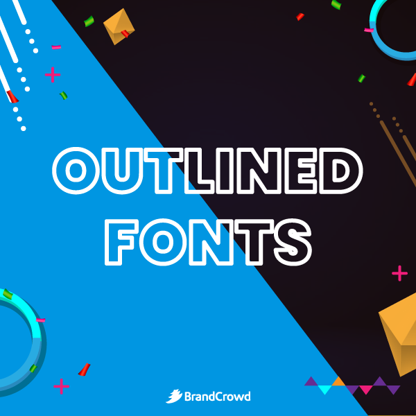
Brands like Toblerone have long used outlined fonts for their brand identity. It gives more emphasis to each letter and makes them less likely to be outshined in the design. However, this type of font is also great for headlines and other statements that need emphasis.
There are also outlined fonts with a transparent center, allowing you to set it on a picture background. This paves the way for more creativity and depth. However, you want to be wary of its readability by paying more attention to the color and font size. If applicable, you can even use a neon color scheme to pair with your outline typography to give it a more eye-catching look.
The fonts that you can use for an outline design are Elephant, Gibsons, Paralines, and more.
Cyberpunk
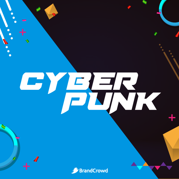
This futuristic and dystopian-inspired design is all the rage these days. You can see this art style in vaporwave music, movies, and video games. It provides an edgy look to any design. Some great cyberpunk-inspired fonts include Neuropolitical, Perfect Dark BRK, and Daggersqare, among others.
Graffiti, technology, and other urban-related subjects make for an excellent cyberpunk concept. It also helps to use colors like pink and bright shades of blue to create a futuristic look. This design is best for bars, tech, and entertainment.
Stocky and short fonts
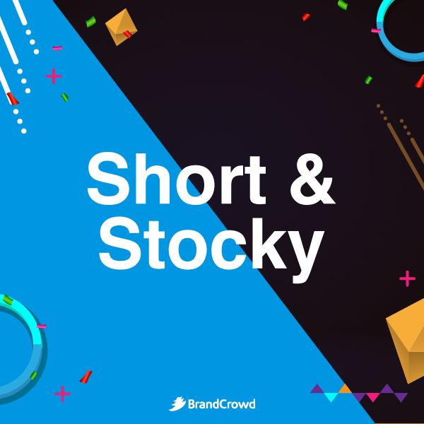
Short is in. Letters with low x-height are now trending for their dominant look and the silhouette it provides, making it suitable for statements and brand logos. Fonts such as Ulm Grotesk and Arquitecta make great choices if you are looking for a font with this style.
Be careful using this type of font as it may make your message hard to read. Designers recommend using this for headlines and small chunks of text that need emphasis. If you’re looking for font combinations that you can pair with this, you can opt for lightweight ones that will let you have a visually intriguing and contrasting combination.
Gradient
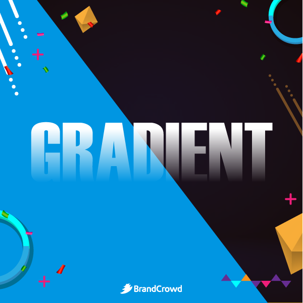
Not all brands strive to have a perfectly flat design. That’s why styles like gradients offer a fresh way to bring depth to your structure without sacrificing versatility. It is the gradual blending of different colors which you can liken to a sky during sunset.
Using gradient to text gives your typography an eye-catching quality. You can even switch it up and change the direction of the colors. Vertically, horizontally, or diagonally, the choice is yours. For font choice, it is possible to use any font you prefer and change the text color using an editing software or a logo maker.
Rounded fonts
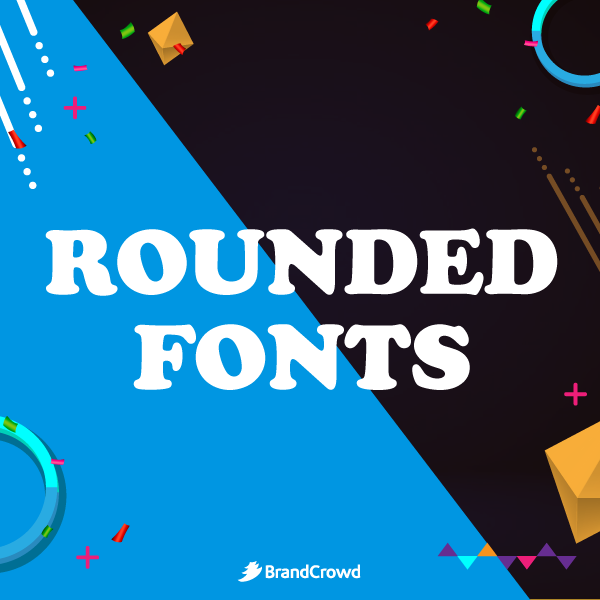
Brands are moving forward from edgy and spiky fonts. Rounded fonts are opening their arms to welcome brands looking to have a much more friendly look. It creates a more approachable design without using shapes that consumers that can perceive as intimidating. For example, curves are feminine shapes that reduce the look of being edgy.
You use this to create an inviting brand identity and encourage people to learn more about your brand. Cooper, GT Pressura, and Fonseca Rounded are just some of the rounded fonts you can use for your design.
Minimalist
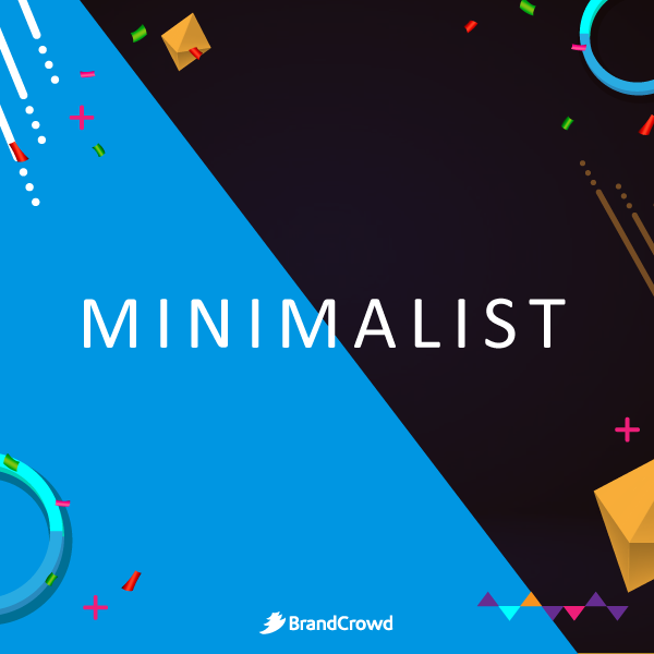
Minimalism has always been in style, and for a good reason. It takes away any busy element that may distract the audience and highlight the essential parts. Plus, this helps ensure that your design stays timeless.
When it comes to creating a layout for your minimalist text, keeping the space consistent and in order is essential. In addition, there are minimal elements in your design, so you want to ensure that you get all of these components right. To do this, you can use a grid to help guide you in the process.
For inspiration, fonts like Less Sans Minimal, Virtuous Slab, and Giraffey are some of the designs that you can use in your design. The simplicity of the minimalist type also makes it great as a modern font choice for logos.
Handwritten
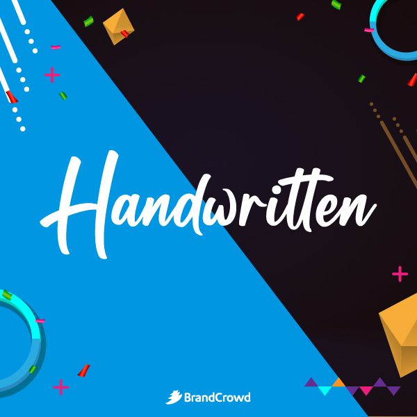
Achieve an authentic feel to your design with a handwritten font. It helps your brand create a more personal look. Plus, this design can help you stay away from the same fonts that people use over and over and become more remarkable.
Handwriting fonts like Autography and Reis go great for brands looking to apply this to their design. However, you can also convert your handwriting into a font to make it even more unique. It may take more time to create, but the applications for your font are endless.
Custom made
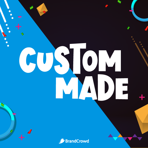
Brands with custom fonts include Netflix, BBC, Samsung. There is a good reason why established brands invest time and resources to create a bespoke font.
This creates a unique look that can be difficult for other brands to mimic, ensuring a distinct image. It may seem superficial, but this plays a crucial role in creating a more robust brand perception among your audience.
You can work alongside professional graphic designers and calligraphers to make sure that you have a great design to start with.
Glitch-effects
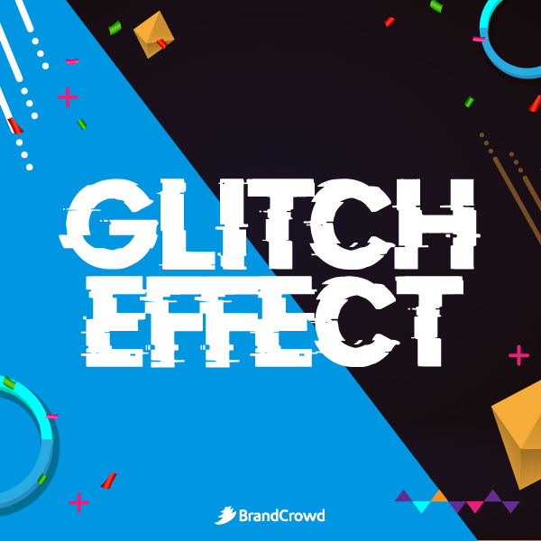
More designers are embracing chaos as glitches and failures take over the design. This distorted style is currently seen in videos, websites, logos, and other brand assets.
Think about TikTok and how its logo has a distinctive look with its blurry and theater-inspired design. This consists of a glitch-like effect that brings out excitement and entertainment every time you see it. This design is inspired mainly by pop art, performance, and not feeling the need to conform to standard design practices.
You can apply this look to your design today using glitch-inspired fonts like Debug, Son of a Glitch, and more. You can even add to the look of disarray by placing each letter in a wacky layout.
Layered with images
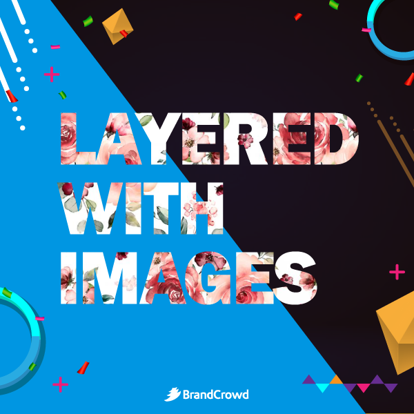
More and more people are merging text with images and illustrations to create a unique illusion. Audiences are so used to seeing a clear distinction between text and other design elements, but this style disregards the norm.
Layering images on type creates an eye-catching effect and makes it seem like the elements interact with one another. You can also try using this to contrast real-life objects and 2D text for a contrasting look. But you don’t have to stop there as there are different styles of overlapping text and images that will enable you to develop creative concepts.
Conclusion
Brand typography is a way for you to shape the way your audience perceives your image. Whatever typography design you choose, it is a way for you to show your personality, whether it be romantic, edgy, masculine, and more. This component of your visual identity is a massive part of your image.
Make sure the text in your brand collaterals is on point by trying the options below.
DesingCrowd is a crowdsourcing platform enabling you to launch design contests. Brands can use this to find a custom logo, t-shirts, and other graphic design needs. The freelance graphic designers in its community can submit up to 50 design submissions that you can choose from. Learn more about it today.
Another option that you can opt for is to DIY. BrandCrowd is a tool that will let you make your own design in minutes. It is perfect for logos, business cards, social media posts, and other brand assets, be it online or print. Try it right here.