Geometric Edge: Triangle Logos Are 2025’s Sharpest Trends
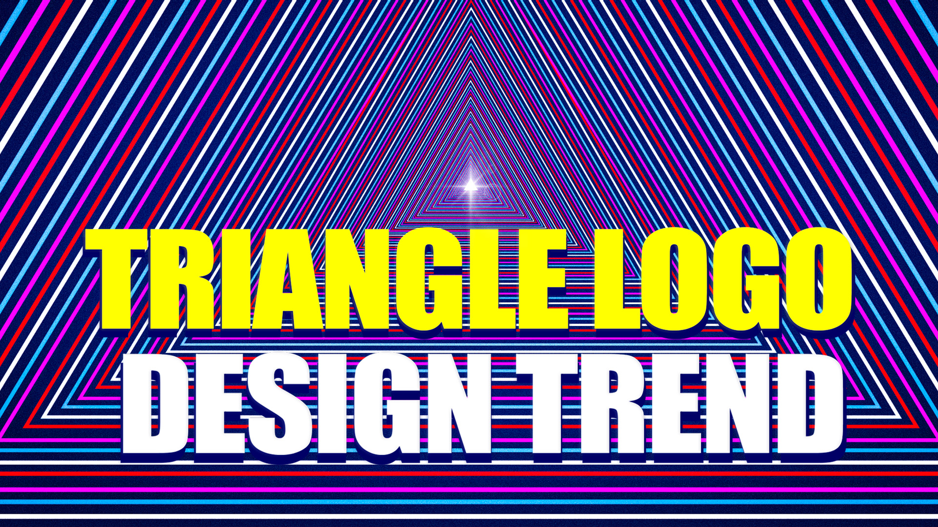
The biggest logo trend of 2025 isn’t what you’d expect. It’s not flashy animations, complex illustrations, or expensive custom artwork. It’s triangles!
Triangle logos have taken the design world by storm because they deliver what most logos struggle with. They look professional, memorable, and versatile all at once. Plus, they are sophisticated enough for luxury brands and approachable enough for local businesses.
In this article, we’ll explore why triangle logos are a wise branding choice for 2025 and show you how to create your own using a user-friendly logo maker like BrandCrowd. Get ready to transform your brand with geometry that actually works.
Why Triangle Logos Are a Key Trend in Logo Design
Triangle logos have exploded in popularity because they perfectly capture what modern brands need most. Their simple yet powerful geometry cuts through the noise in a marketplace flooded with complex designs.
The appeal of triangle logos comes down to three fundamental advantages:
Geometric minimalism
Clean shapes like triangles reflect the clarity and modernity consumers crave. When everything else feels overwhelming, geometric minimalism offers a breath of fresh air.
Triangle logos also strip away the unnecessary and focus on what matters most. They deliver clear communication that looks great everywhere without any visual clutter.
Symbolism
Triangles have meaning that speaks directly to what brands want to communicate. They naturally point upward, suggesting growth and ambition. Their three sides create perfect stability, making them ideal for brands that want to communicate reliability.
Tech companies love them for their forward-thinking vibe, luxury brands use them for their sophisticated geometry, and bold startups choose them to signal innovation and momentum.
Adaptable across mediums and scales
Triangle logos work everywhere, whether you need a simple outline for a minimalist approach or a filled shape for maximum impact.
They scale down beautifully for favicons, app icons, or social media profile pictures. They also scale up perfectly for flyers, posters, and billboards.
This adaptability makes them incredibly cost-effective for brands with diverse touchpoints.
Spectrum of Triangle Logo Styles in 2025
The beauty of triangle logos lies in their versatility. From ultra-minimal designs that whisper sophistication to bold, complex compositions that demand attention, triangles can be styled to match any brand personality.
Let’s explore the most popular approaches to defining 2025’s triangle logo landscape.
Minimalist and monochrome
Less is definitely more with these understated designs. They pack a powerful punch by pairing simple triangle shapes with neutral color palettes. Black-and-white combinations work especially well, creating timeless, classic, and contemporary designs. This style is perfect for brands that want to appear confident without being flashy.
Check out our minimalist triangle logo examples below to see how simplicity creates maximum impact:
Generic Triangle Business by BrandCrowd
Arrow Gaming Triangle by Design.com
Triangle Block Studio by BrandCrowd
Geometric abstraction and patterned triangles
Geometric abstraction offers endless possibilities for brands that want more visual complexity. Multiple triangle outlines, repeating patterns, and clever use of negative space create designs that reward closer inspection. These abstract logos work beautifully for creative industries, tech companies, and any brand that wants to showcase innovation and thoughtful design.
Explore our geometric abstraction triangle logos below to discover creative possibilities:
Triangle Tech Professional by BrandCrowd
Futuristic Triangle Shape by Design.com
Consultant Company Triangle by BrandCrowd
Gradient or 3D depth
Modern digital tools have made gradients and 3D effects more accessible than ever. Triangle logos enhanced with subtle gradients or dimensional depth feel contemporary and eye-catching without being overwhelming. These effects work particularly well for tech brands, apps, and companies wanting to emphasize their cutting-edge nature.
View our 3D and gradient triangle logo examples below to see modern depth techniques:
Triangle Prism Geometric by BrandCrowd
Triangle Geometric Media by Design.com
Geometric Prism Triangle by BrandCrowd
Hybrid styles
The most interesting triangle logos combine geometric precision with unexpected elements. Retro-futurist designs merge triangles with vintage color schemes and fonts, while nature-inspired versions integrate organic textures or natural imagery. These hybrid approaches help brands stand out by adding personality to geometric foundations.
Browse through this hybrid triangle logo collection below to find unique style combinations:
Colorful Rainbow Triangle by BrandCrowd
Tech Triangle Company by Design.com
Modern Generic Triangle by BrandCrowd
How to Leverage Triangle Logo Trends Using BrandCrowd
Creating a professional triangle logo doesn’t require design expertise when you have the right tools. BrandCrowd‘s intuitive platform puts professional-quality triangle logo design at your fingertips.
Whether starting from scratch or refining an existing concept, BrandCrowd’s tools help you create logos that perfectly capture your brand’s triangle vision.
Start with triangle-focused templates
Begin your logo journey by browsing BrandCrowd’s curated triangle logo page. This specialized collection showcases dozens of triangle-focused templates across multiple styles and industries.
You’ll discover everything from minimalist outlines to complex geometric patterns, giving you inspiration and solid starting points for your design.
Customize with geometry, color, typography
Once you’ve found a template that speaks to you, BrandCrowd’s customization tools let you make it uniquely yours. Experiment with different triangle arrangements, adjust colors to match your brand palette, and pair your geometric elements with fonts that complement your design’s personality.
Keep in mind that neutral color palettes create timeless appeal, while bold gradients add modern energy to your brand.
Test for consistency and scalability
Before finalizing your triangle logo, put it through its paces using BrandCrowd’s preview tools. Check how it performs as an app icon, on business cards, and across social media formats.
Your triangle logo should remain clear and impactful whether displayed at 16 pixels or scaled up to billboard size. This testing phase ensures your triangle design investment pays off across every brand touchpoint.
Export and implement everywhere
BrandCrowd’s flexible export options make implementation effortless. Download your triangle logo in vector formats for crisp scaling, grab transparent background versions for versatile placement, and access complete brand kits that include color codes, fonts, and usage guidelines.
This comprehensive approach ensures your triangle logo maintains its visual impact everywhere it appears.
10 Famous Triangle Logo Samples and What They Teach Us
Real-world examples offer the best lessons in effective triangle logo design. These famous brands show how geometry can communicate complex ideas with a simple shape.
Prada
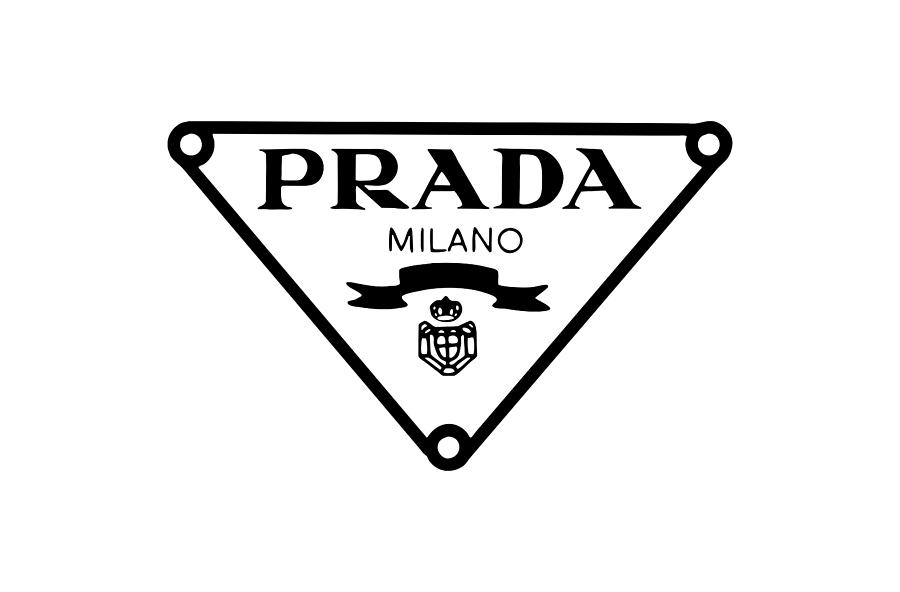
The iconic Prada logo triangle is an inverted black and white image, a symbol central to the brand since 1913. This shape conveys high fashion, timeless elegance, and a hint of intrigue. Its unique inverted form suggests a distinct perspective, matching the brand’s exclusive identity.
This logo shows how a simple shape can build a brand’s prestige. Brands with a high-end feel can use an inverted triangle to add sophistication and tradition. It signals exclusivity and breaks from typical design.
Kenwood
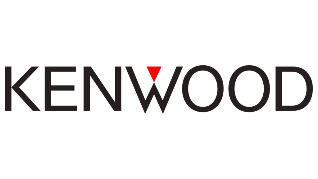
Kenwood’s logo places a sharp red triangle inside the letter “W” of its name. This design hints at precision, clarity, and forward motion. Embedding the triangle within the letter subtly reinforces the brand’s commitment to quality and technical excellence.
This approach proves that meaning can be part of a logo’s text. For designers, it shows how geometric elements can be a core part of typography. This makes the logo feel both modern and strategic.
Adobe
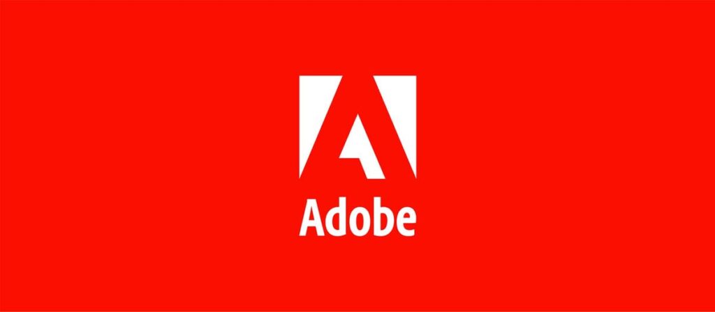
The Adobe logo features a stylized letter “A” that forms a triangle. This design symbolizes creativity, direction, and innovation. The strong triangle shape communicates reliability and a foundational presence in the digital world.
Adobe’s logo is a perfect example of a triangular letter that works as both a recognizable symbol and a brand initial. It proves a single geometric shape can stand for both a letter and a larger idea, making it simple and powerful.
Fila

The Fila logo also uses a slant in its letter “A” to create a sense of implied triangles and motion. This design brings to mind energy, speed, and athleticism. Using angles gives the logo a dynamic feel without needing an actual triangle shape.
This logo teaches a lesson in using implied geometry to add motion. Brands wanting to convey movement can use slanted lines and angles to create a subtle sense of energy. This makes the design feel active and purposeful.
Quiksilver
The Quiksilver logo features a mountain and a wave that form a large, stylized triangle together. This design represents the brand’s focus on adventure and outdoor life. It merges snow sports heritage with surfing roots into one powerful shape.
This logo is a masterclass in using triangles to tell a story. Combining triangles with other images can create a compelling logo for brands with a varied identity. It instantly connects with a target audience.
Many successful brands have leveraged triangle-based designs to establish strong visual recognition. When consumers think of a clothing brand with a triangle logo, they often develop immediate associations with its values and aesthetics, demonstrating the power of geometric shapes in creating memorable brand identities.
HSBC
HSBC’s logo is made of several red and white triangles that form a larger hexagon. The interlocking shapes show the brand’s interconnected financial services and worldwide presence. This design shows how multiple triangles can create complex yet balanced patterns.
For financial companies, a balanced geometric logo can build a sense of trust and order. It proves that a simple design can effectively communicate complexity.
Delta Air Lines
Delta’s logo, known as the “widget,” is a three-dimensional red triangle logo representing the Greek letter delta. The symbol communicates upward movement, progress, and ambition. Its angled design feels dynamic, suggesting flight and transformation.
The Delta widget shows the power of a single, angled triangle to signal growth. An angled triangle is a strong choice for brands wanting to convey progress and innovation. It proves a logo can be a visual sign of a brand’s mission to move forward.
Google Drive
The Google Drive logo has three interlocking triangles in the brand’s signature red, yellow, and green colors. This design represents the platform’s core values of collaboration, connectivity, and many functions. The shapes show how users’ files and ideas come together.
This logo shows how colorful, interlocking triangles can communicate multiple brand values. For brands with many services or a focus on community, a logo with connected geometric shapes can be very effective. It visually represents how all parts of a service work together.
Adidas
The Adidas “three-stripe” logo features three rising angular stripes. They symbolize overcoming challenges and reaching peak performance. The upward slope of the stripes conveys aspiration, while the simple design communicates resilience. This minimalist approach represents athletic achievement and a commitment to excellence.
This design shows how simple, stacked triangles can suggest resilience. For athletic brands, this logo proves that a design doesn’t have to be complicated to be meaningful. Simple shapes can tell a profound story.
Mitsubishi
When people search for a triangle car logo, Mitsubishi’s distinctive three-diamond design is often one of the first that comes to mind, showcasing how geometric simplicity can create lasting brand recognition
The Mitsubishi logo is one of the oldest logos in the world. It consists of three joined diamonds formed by three symmetrical triangles. The name itself means “three diamonds,” linking the logo to the company’s long history. This design reflects the core values of tradition, reliability, and unity.
Mitsubishi’s logo is an excellent example of how symmetrical triangle layouts create strong heritage branding. This approach works well for established companies aiming to show a history of trust. It proves that a logo can directly represent a brand’s name and legacy using simple geometry to build a deep sense of tradition.
The Power of a Triangle’s Point
Triangle logos are everywhere in 2025 because they blend modern design with deep symbolism and flexibility. Whether starting a new tech company, refreshing an old brand, or creating a luxury identity, triangles provide a strong base for logos that look good anywhere.
Ready to join this trend? Visit BrandCrowd to explore a variety of styles and experiment with designs that capture your brand’s unique personality. With the right triangle logo, you’re not just following a trend. You’re building a bold, forward-thinking visual identity that will last for years.
Read more on logo design here:
- How Tic Tac’s Logo Design Evolved With Time
- 7 Reasons AI-Generated Logos Are Perfect for Small Businesses
- 50 Hero Logos to Supercharge Your Brand
Hannah Suroy suroy brings clarity to complex topics across entertainment, business, and creative industries. She specializes in translating industry trends and innovations into engaging content that helps readers understand the creative process behind the work they love.
Original Artwork by Selwyn Legaspi