What Makes a Great Text Logo
46% of the top brands today have a text logo to stand as the symbol of their company.
Some might say that it’s a fad or a passing trend, but it’s more than that.
Old brands such as Coca-Cola have kept their type-based brand mark since 1887. This seemingly simple design concept has the potential to help brands establish a solid foundation.
So if you want to get a trusty graphic mark for your business, this article will teach you what makes an effective logo and how you can make one for your brand. This article will tackle the basics and help you take on the design process with success. We’re discussing the following matters to help you become more confident in making a letter logo.
- What is a text logo?
- Types of text logos
- Parts of a text logo
- Traits of a good logo design
- How to make a text logo
What is a text logo?
People may perceive logos as a superficial way to decorate marketing assets like a web design or a store sign. But this simple piece of graphic design is more than that. It is one of the most effective tools for visual communication that lets you express yourself as a brand and attract your target audience.
A text logo uses typography as the main focus of the design. It uses space, lines, shape, and letters to create a compelling composition. This means that it is more direct than other logo styles like illustration logos and mascot logos.
Typically, there is little to no illustration in this design, which helps minimize visual distractions and makes the audience focus more on the company name.
Below are some of the benefits of having a lettering logo.
- It lets people focus more on your brand.
- It doesn’t have illustrations that may confuse your audience.
- This helps retain the simplicity of your design and makes it easy to use.
- Allows you to show your personality with minimal design elements.
- It is adaptive for companies in different industries
Types of text logos
There are a ton of variations that you can make with a text design. You have three main options that you can choose from, and this section will walk you through each one. We will show you how to make the best decision for your brand and choose the right design.
Lettermark logos

Playful Lettermark by BrandCrowd
Also known as initial logos, this alphabet logo design creates a visually compact design by featuring the acronym or initialism of a brand name. The lettermark is a popular choice for companies that have long names and wish to shorten them. Hulu, NBC, and LG are some of the brands with this design as their brand mark.
Wordmark logos
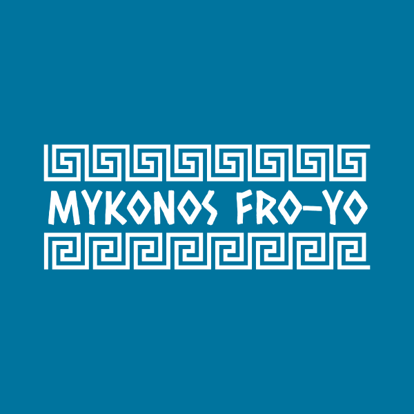
White Greek Wordmark by BrandCrowd
Wordmark logos depict the entirety of a company’s name. Experts recommend this design concept for small businesses as it helps their audience be more familiar with their unabbreviated name.
Combination mark
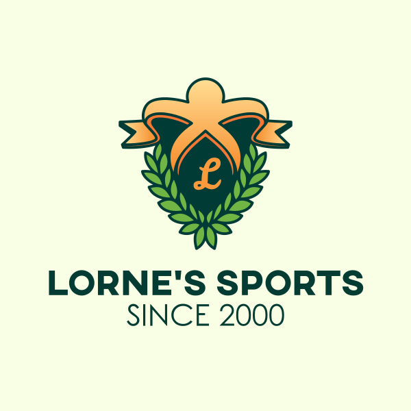
This design is an amalgamation of the two typographic concepts mentioned. The complete brand name is featured with the monogram included as a decorative element. Companies like Chanel, Fendi, and Aldi have this same design concept for their brand identity. This design is a way for brands to make the best out of both options.
It is essential to think about your objectives and priorities as a brand before you decide. Each typographic design concept has different strengths and weaknesses that you can use to help grow brand awareness.
Parts of a text logo
A lot goes on to build a brand identity that sets the right impression. The different features of a logo help create a more communicative design. It enables you to use graphic design to capture the personality and mood of your business.
People may become wary of text logos as they don’t have that much going on without illustration. But this section will show what you can use to make an impressive logo. Being familiar with each one and how to use each component will help you achieve your vision.
This section will delve into the essential elements of typographic logo design. You will learn the design elements you need to create a balanced mark.
Brand name
One of the primary purposes of a logo is to introduce yourself to people briefly and remarkably. That’s why brand marks feature the company’s name. This helps inform audiences of your name and helps them remember it. They can use your name to search for you, leading down further to the path to purchase.
Another thing that you can add to your brand mark is your slogan and foundation date. This information may help your consumers get to know you more and make you more discernible from the competition.
Space
White space is crucial for any graphic design, be it for invoices or web design. It is the blank area that you can add to your logo to organize the other elements. It’s an overlooked element that achieves contrast, emphasis, and balance.
Leave enough space in your design, and don’t leave the components too near each other. Keeping this in mind will make your design easier to understand and read.
Color
Bring energy to your design with color. It allows you to give personality to your design and do it in an eye-catching way. Choosing your brand’s colors is achievable by using colors that are related to your brand traits using color psychology. It is another way for you to shape how consumers perceive you.
One way you can find the right color that will let you do this is to define your brand personality. Get a clear idea of what qualities you want your brand to evoke before starting with this. Next, you want to think about what will resonate with your audience and help your brand become unique.
Font
The typeface and size of your text matter. It is another way for you to talk to your audience and introduce yourself. You have two standard choices when it comes to fonts. Serif fonts or letters with a tailed ornament at the end of its stroke are best for traditional brands. On the other hand, laidback brands often opt for the sans serif typeface, which has a modern look.
Keep in mind that you should choose a font that excels in form and function for maximum effectiveness. In addition, the right font for your design must be decorative and easy to read.
Frame
This part is optional, but this is a fine addition to your type logo if you feel it is too plain. It’s a decorative element that provides excellent value to design. Frames emphasize your logo and allow it to pop. This also makes your brand mark less likely to be overshadowed by other elements in different applications. Plus, you can do this by encasing your design in simple shapes such as circles or squares.
Taking a more creative approach to this is possible. For example, you can embellish your frame with illustrations like wreaths, ribbons, or lights.
Traits of a good logo design
Understanding what makes a good text logo is critical if you want to have a design that will help your business grow. Learn more about it in this section. In addition, you will discover what qualities a logo should have to best suit your business goals.
Simple
Renowned logo designer Paul Rand once said that “Simplicity is not the goal. It is the by-product of a good idea and modest expectations.” This quote proves that you don’t have to have a busy design to create a good one.
Being more mindful of the ornaments you add to your logo only makes it better and more adaptive. However, it is important to make sure that you still end up with a relevant design that people can identify you with.
Memorable
Effective logos are easy to identify, not just because they are simple, but they are creative too. You don’t want to have a design that looks uninspired and cliche. You still want to create a design that is relevant to your field of work.
One way that you can do this for your text logo is to use colors to your advantage. Incorporate colors that are related to what you do. For example, suppose you have an organic food service company. In that case, you could decorate your design with natural colors such as green and yellow to help associate your brand with wellness-related traits.
Timeless
Effective logos are ones that you can use for a long time, regardless of the changes that may occur for your company. Timelessness will help you avoid redesigning your logo in the future. Plus, having a lasting design will help you save money in the long run.
To create a timeless identity, it is vital to have a logo that captures your essence as a brand. It is best to keep away from using too many trendy designs. These trends come and go and may make your brand identity look dated in the future.
Legible
Any graphic design needs to be legible, even more so with logo design. This trait makes every text in your logo easy to read, including your company name, slogan, and establishment name. The letter should be well-written and spaced so as not to confuse readers.
Another workaround that you can do to improve your design legibility is to use color contrasts since color helps improve legibility. The color wheel is a great tool to help you identify effective combinations. From the wheel, you can map out varieties such as triadic, analogous, and complementary, among others.
Scalable
Whether it’s displayed on a billboard or a pocket-sized business card, a good brand mark should look good on either application. This aspect is a vital characteristic that your logo should carry if you want to achieve brand consistency.
So before you download your logo, try putting it on mockups. It is best to try envisioning it on store signs, favicons, and social media, for starters. Ensuring your logo is scalable requires some tests, but this will help you gauge how well it will translate when put on different applications.
How to get a text logo
“How do I get a text logo?” The answer to this question varies depending on your business. That’s why we are going to explore different ways for you to get a logo. Below are some ways that you can use to find the right typography for your brand identity.
The section will allow you to find the most appropriate solution and learn which option is ideal for your current situation.
Pro Tip: Watch this short clip on how to create your Text Logo
Work with a freelance designer – Hiring freelance designers is excellent for brands with an in-house design team. This is popular for small businesses because it is flexible. Websites and recommendations are some of the ways that you can find independent contractors to work with.
Launch a design contest – Crowdsourcing lets you have access to various design options from freelance graphic designers. This option lets you explore more options and find different ways to present your brand. Websites such as DesignCrowd are platforms that you can use to launch your logo design contest.
Take a DIY approach – If you’re interested in learning how to make a text logo, this is an excellent option for you. You can use a raster graphics editor or an online logo maker to create one. It gives you complete control over the way your design looks and helps you express your brand’s personality.
Conclusion
When done right, a text logo can be one of your brand’s best weapons. It is a great way to present your brand to the public without frills and fuss. This versatile design also provides businesses of different industries to find a brand mark that will let them develop a distinct identity.
Find a suitable logo for your brand today. With the BrandCrowd text logo maker, you’ll get access to one of the most extensive design libraries and personalize them. Browse different designs from monogram logos to script logos. It has an easy-to-use editor that lets you change the color, font, and layout to fit your brand personality best. Try it right here.
