40 Famous Minimalist Logos
There has been a non-stop stream of brands redesigning their logos to a flat or minimalist logo design. This type of brand identity has been a hit in terms of form and function.
Today, we are looking at famous brands with a minimalist logo design to serve as your inspiration.
Find out what makes this design movement a force to be reckoned with. First, let’s talk about what makes this design so good. Find out why it’s a well-loved strategy.
- It retains simplicity. This is one of the most essential traits of a practical design as it makes the brand mark adaptive and timeless. Plus, it also helps you keep the design legible.
- Flat is good. Flat design or the use of two-dimensional elements is a type of minimalist design. It is much easier to read and apply for digital purposes. Looking good online should be a top priority now that digital transactions are becoming more prevalent in our daily lives.
- You can lessen distractions. Keeping your design elements to a minimum also helps people focus more on the content than other visual distractions.
Apple
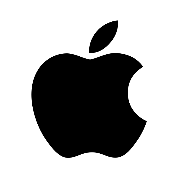
Designed by Rob Janoff, the Apple logo you see now has a bite to it. Janoff said that this was to make the fruit more distinct, lessening the likelihood of other people looking at it as another fruit. The bold and flat logo goes hand in hand with the brand’s ultra-minimalist philosophy.
However, this logo has a pretty interesting history. It didn’t always look like a modern piece of corporate design when it first launched in 1976. You can learn more about the Apple logo history here.
Target
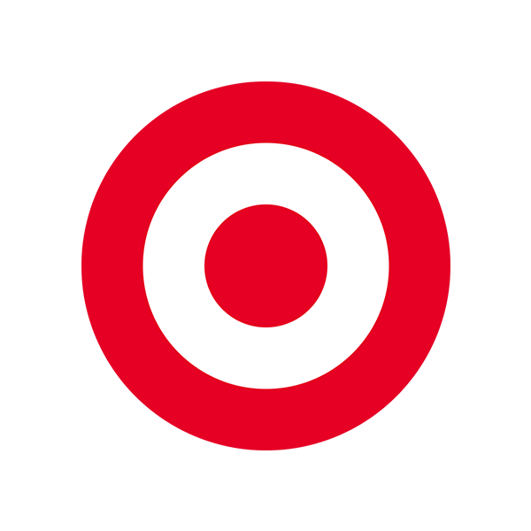
Even without the use of text or lettering, people can tell what brand logo this is. Target uses a self-explanatory illustration to represent their brand, using only red and white circles. It uses white space wisely, which makes it eye-catching and simple. The circular shape they chose also created an image of harmony for the brand.
NASA
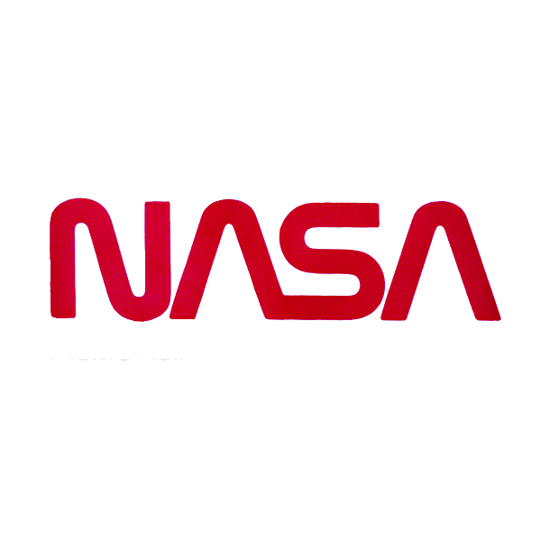
The space administration has different logos, with The Meatball being its primary logo and The Worm being its secondary logo. We all know the classic blue logo of NASA, which has a chevron wing detail and illustrations in the background.
The detail-packed logo contrasts with this text logo, which features sleek typography of the organization’s initials and nothing else. The font they used also doesn’t feature a crossbar, which keeps it looking futuristic.
Uber
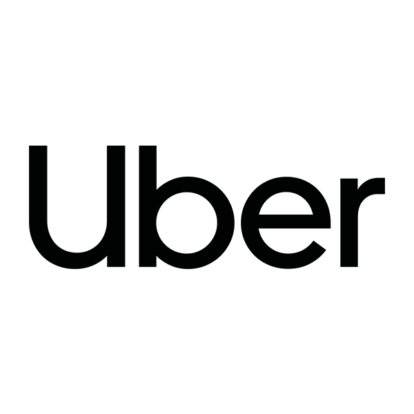
The ride-hailing app has been around since 2010. The software’s logo has been through different redesign projects, which only seem to get more modern every time. Its current logo, however, features proper capitalization and a clean sans serif font. The monochrome text logo is also spaced closely to create a compact look.
Nike
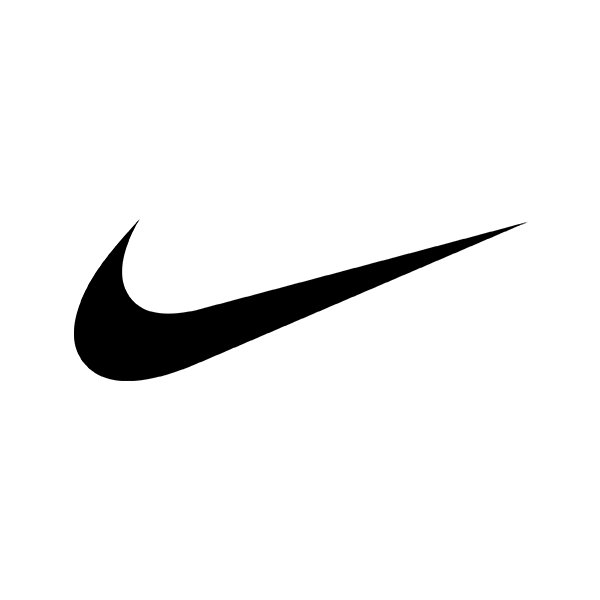
Best known as the swoosh, the Nike logo was designed by Carolyn Davidson. In 1971, the company commissioned the designer for $35. Looking back, the iconic logo was bought at a modest price, but don’t worry, the designer now has shares in the company.
This simple checkmark communicates activity and speed, which is what the athletic brand is all about. It is memorable as it is simple.
MasterCard
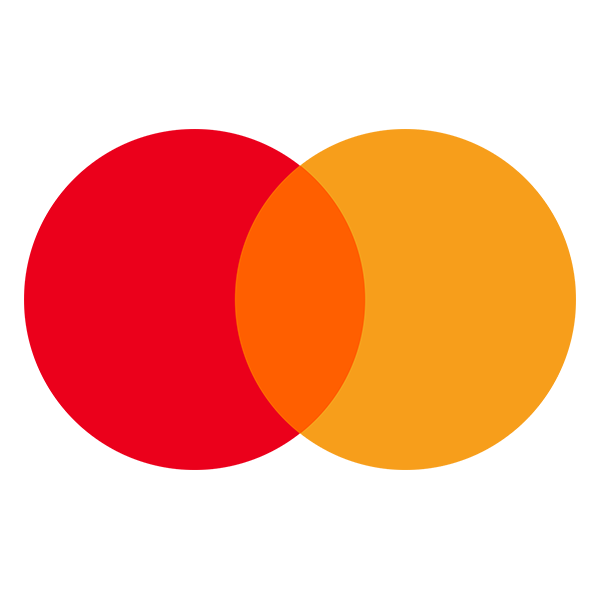
The two circles in the financial services company stand for the East and West. The company uses a Venn diagram to represent the future of spending. It uses three colors to represent unity and seamlessness. In 2018, the company redesigned the logo with the help of design firm Pentagram. MasterCard dropped the text and went with a bolder Venn diagram for its brand mark.
Windows
The Windows logo is another work by Pentagram. Led by designer Paula Scher, the company left its flag-like design in the past and opted for something. You may also notice that the logo is slanted. This is done because it symbolizes perspective and depth.
Another element that the new Windows logo has is a singular color scheme, which is a significant change from its old version that features red, green, blue, and yellow.
Uniqlo
Uniqlo makes its logo available in two different languages, Japanese and English. It frames the typography in the English Alphabet and Katakana, which is a form of syllabary in the Japanese writing system. It aims to represent the coolness of Japanese culture, which is why it uses the same color scheme as its origin country’s national flag.
The social media giant has a straightforward lettering logo in a techy color scheme of white and blue. It also uses lowercase typography, which is done by many tech brands such as Amazon, Airbnb, Beats, and more. It has little to no visual distractions that may take the audience’s attention from the company name.
Dunkin
The donut company’s rebrand in 2018 was one of the most significant moves of the decade. It dropped the “donut” in its name and went with just Dunkin. The logo, of course, accordingly went with changes. It got rid of the coffee cup illustration typically found at its left. However, the font was retained, keeping the typography familiar.
Louis Vuitton
Cisco
Animal planet
MINI
BMW
Starbucks
Mcdonalds
Netflix
Volkswagen
Audi
Nissan
Android
Subway
FedEx
Dropbox
Braun
Oris
Girl Scouts
ABC
VEVO
eBay
WWF
Cartoon Network
Nintendo Switch
Nine Inch Nails
Spotify
Glassdoor
Calvin Klein
IHOP
Conclusion
The famous logos above chose simplicity and directness to achieve a concise approach to brand identity.
If you’re ready to take the same route as them, we’re here to teach you how to source a game-changing logo.
Sourcing a minimalist logo is easy with the help of crowdsourcing. Platforms like DesignCrowd allow you to run logo design contests and receive up to 50 original design proposals. This is an excellent way for brands to collaborate with a broad community of freelance designers and a vast pool of designs to choose from. Learn more about it today.
Use the BrandCrowd minimalist logo maker. It’s the quickest way to learn how to make a minimalist logo. The easy-to-use interface gives you all the tools you need to customize the logos and express yourself through colors, typography, and shapes, among others. You can browse different designs such as modern logos or even vintage logos to choose from. Try it here.