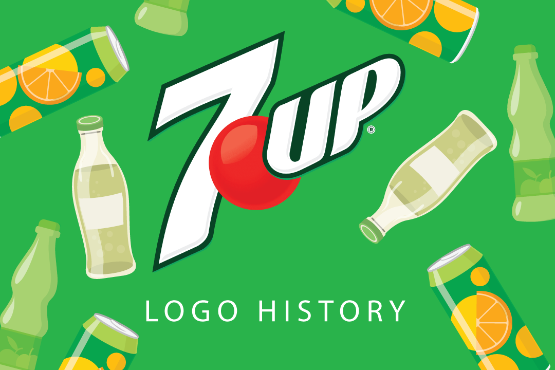
7UP Logo History
Please close your eyes briefly and imagine the sound of that familiar hiss as you crack open a can of 7UP, the anticipation building as you lift it to your lips.
With each sip, you’re transported to a world of crisp, citrusy goodness, a refreshing oasis in a sea of ordinary beverages. At the heart of it all is the 7UP soda logo, an emblem of quality and satisfaction that instantly catches the eye.
Since its introduction, the 7UP logo has undergone several transformations, evolving to reflect changing tastes and trends while staying true to its timeless essence.
Thanks to advanced logo maker tools, every version of the logo has been carefully designed to connect with consumers, keeping 7UP as a symbol of quality and satisfaction in the changing soda industry.
Join us as we take a stroll through the history of the 7UP logo, prepared to be delighted by its evolution and inspired by its enduring popularity.
Let’s get started!
7UP Logo and History: Brief Overview
The company is famous for making lemon-lime flavored soft drinks, and it’s now owned by Keurig Dr Pepper and distributed by PepsiCo.
The drink was created in 1929 by Charles Leiper Grigg, known for his innovative ideas. At first, it was called “Bib-Label Lithiated Lemon-Lime soda,” which described exactly what it was made of. It even had a mood-managing drug called lithium citrate in it for a while.
Eventually, the name was changed to 7UP Lithiated Lemon Soda, and in 1936, it was shortened to just 7UP. Today, 7UP is a globally recognized soda with many flavors, including diet and cherry versions.
The initial name of the 7UP company aimed to indicate what consumers could anticipate from the beverage transparently. It adopted a somewhat “clinical” naming convention during an era when numerous drinks were marketed as remedies for mood issues and other ailments.
However, some experts propose that the name and the accompanying 7UP emblem may allude to the primary ingredients in the drink. Others suggest that the name might have been a nod to the lithium content in the original beverage, which has an atomic mass of 7.
There are conjectures that the 7UP moniker could have responded to the fact that many 7UP drinks were packaged in seven-ounce bottles, potentially as a competitive move against Coca-Cola beverages, often sold in six-ounce bottles.
7UP Logo Evolution
The evolution of the 7UP logo showcases its journey from its humble beginnings to its recognizable symbol today.
Like the Pepsi logo, over the years, the logo has changed, reflecting shifts in branding and design trends.
Check out the evolution of this famous logo:
- 1929
- 1929-1930
- 1930-1931
- 1931-1939
- 1939-1969
- 1969-1980
- 1980-1987
- 1987-1989
- 1989-1995
- 1995-2000
- 2000-2010
- 2010-2015
- 2015-Today
1929
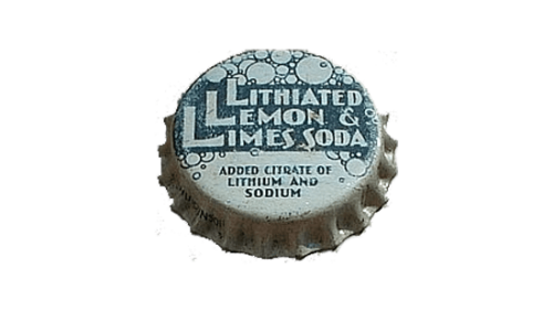
In 1929, the first logo for 7UP appeared on the metal caps of the bottles. Initially named Lithiated Lemon and Limes Soda, the emblem featured thick white letters on a dark green background, accented by outlined bubbles. This logo was only used for a few months before the drink was renamed 7UP.
1929-1930
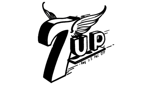
In 1929, a new logo for 7UP was introduced. It showcased a stylized “7” with tiny wings outlined in thick black lines and an underlined uppercase “UP.” The logo had a three-dimensional look and was tilted at a ¾ angle, adding dynamism and vibrancy to the design.
1930-1931
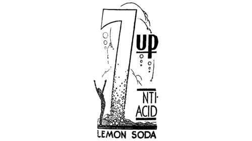
In 1930, 7UP underwent a redesign, adopting an art-deco-inspired look. The new badge featured a tall and stylish “7” adorned with outlined bubbles of varying sizes. To the left of the digit, a figure with raised hands was drawn in black, while to the right, the bold black “UP” was displayed in a modern and chic sans-serif font with outlines.
1931-1939
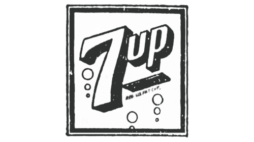
In 1931, a new concept for the 7UP logo was introduced, serving as the precursor to the iconic badge we recognize today. The logo featured a three-dimensional, diagonal inscription set against a white background and framed within a square. Bubble logos were added at the bottom of the image.
This logo remained in use for eight years.
1939-1969
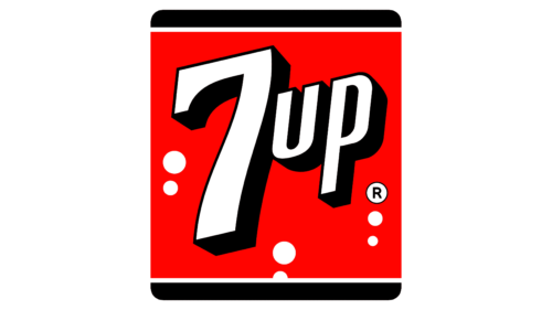
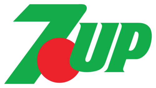
Introduced in 1943, the initial logo for 7UP showcased a square badge with rounded corners. The emblem had a red background, with the top and bottom edges thickened and painted black. The wordmark, in white with a thick black outline, was centered within the badge, creating a balanced frame.
Seven white circles surrounded the inscription, symbolizing the bubbles of the drink.
1969-1980
In 1968, the logo underwent simplification and refinement. It became a white wordmark on a plain red background, devoid of frames or extra graphics, creating a minimalist and modern appearance.
1980-1987
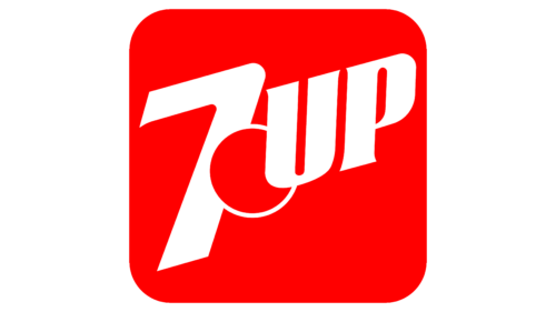
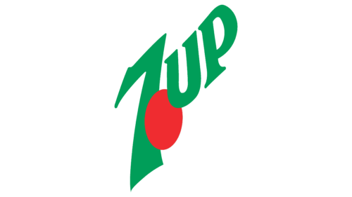
In 1980, the wordmark’s typeface was updated to be sharper and more stylish. A large red dot with a white outline was introduced between the number and the text, marking the beginning of the iconic 7UP logo we know today.
1987-1989
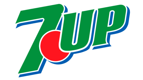
The logo unveiled in 1987 showcased a fresh color scheme. It included a green inscription outlined in double blue and white, with a solid red dot on a white background. The dot overlapped the “7”, while the “UP” parts overlapped the dot, giving the logo a three-layered appearance.
1989-1995
In 1989, the redesign straightened the direction of the inscription and simplified its style by removing the blue shadows. The green and red shades were brightened up. The brand has used this version of the logo for over five years.
1995-2000
In 1995, another redesign of the 7UP badge took place. While the color palette remained unchanged and no new elements were added, the characters and numbers were stretched, with the “7” becoming much taller. The logo was placed diagonally in an upward-right direction, and the red circle was enlarged and compressed.
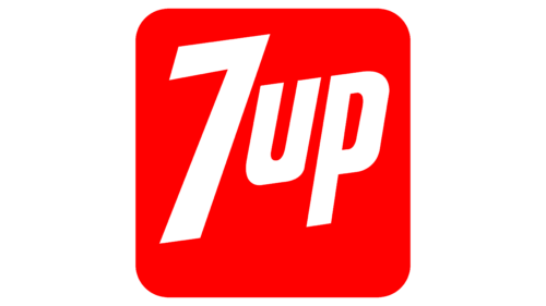
2000-2010
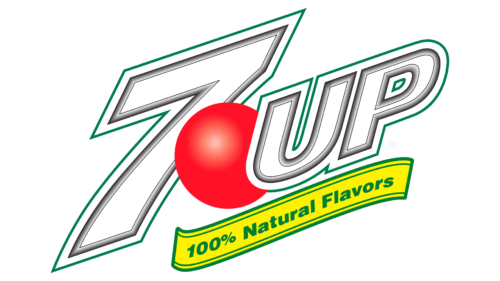
In 1993, the green color was swapped for white. Additionally, the typeface of the logotype became more elegant and italicized. The letters gained small, sharp serifs, which added a sleek and stylish vibe to the emblem.
2010-2015
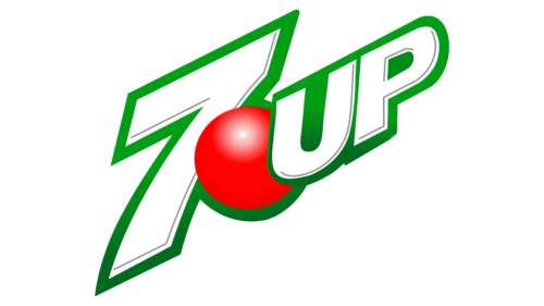
In 2007, a new three-dimensional logo emerged. It consisted of three layers: a white “7” outlined in green and black at the bottom, a shiny red dot above it, and the word “UP” with slightly curved serifs on top. Although this logo was used for only three years, it’s widely regarded as one of the most recognizable in 7UP history.
2015-Today
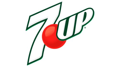
In 2015, the design of the 7UP badge was polished and made more professional. The green outlines were simplified and darkened, giving the logo a sleek appearance. The red sphere retained its three-dimensional look but with deeper shades and a glossier surface, enhancing its visual impact compared to the previous version.
Design Your Soda Logo Today!
Designing your soda logo, like 7UP, involves a thoughtful process of creativity and refinement. From considering color schemes and typography to incorporating unique elements that reflect the essence of your brand, every aspect plays a crucial role in creating a visually appealing and memorable emblem.
As demonstrated by the evolution of the 7UP logo over the years, simplicity, clarity, and consistency are vital principles that contribute to enduring brand recognition. Comment below on which famous logo you would like us to feature next!
Are you seeking the best partner to boost your branding through stunning logos and advertising templates? BrandCrowd has your back! From flyers, Twitter headers, Facebook ads, and many more – we’ve got you covered!
