Fantastic Logos and Their Hidden Meaning
Updated October 6, 2025
Every successful logo is far more than just a pretty picture. It’s a carefully crafted piece of visual communication that speaks directly to our subconscious minds. The messages that we can derive from brand symbols reveal fascinating insights about company values, target demographics, and marketing psychology.
Whether you’re a business owner working with a free online logo maker to develop your brand identity or simply someone curious about the visual world around us, understanding these hidden meanings can be both enlightening and entertaining.
In fact, unlocking the secrets behind famous logos has become a popular form of digital entertainment, spawning countless social media discussions, viral TikTok videos, and “mind-blown” moments when people discover what they’ve been seeing all along but never truly noticed.
Here are some explanations about the different meanings of these famous logos that will change how you see the brands around you forever. Check them out.
Sony VAIO
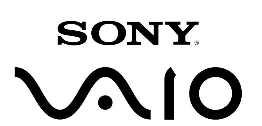
At first, all you see is sleek and modern typography. However, there is actually a hidden meaning of Sony’s VAIO logo. You’ll spot the analog signal being formed in the first two letters.
FedEx

This design has won over forty different awards worldwide. The logo features an arrow hidden between the letter E and letter X. It was designed by Lindon Leader 1994 as a Senior Design Director at Landor Associates. The team supposedly ran through 200 different designs before going with this logo.
Eighty 20
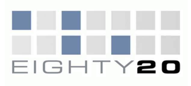
The firm Eighty-20 is relatively small. But the meaning in their logo is big. The squares are actually a binary code for the name. The top line reads 1010000 and on the bottom reads 0010100.
Toblerone

Toblerone is a chocolate company from Bern, Switzerland. The are is known for its high mountains and is often referred to as “The City Of Bears.” This explains the hidden silhouette of a bear in the mountain illustration.
Baskin Robbins
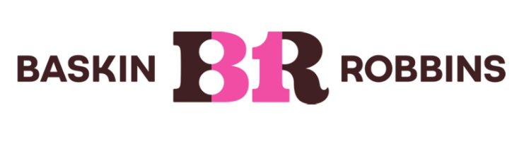
There are 31 different flavors of ice cream on the menu of Baskin-Robbins. If you look at the design, the number 31 is visible in the logo. You’ll see it in the letters B and R.
Northwest Airlines
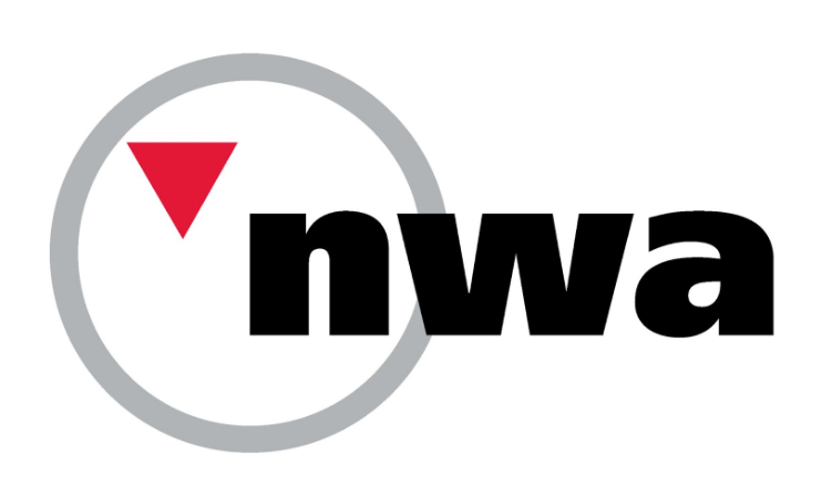
The Northwest Airlines logo hides two secret meanings. First, it has the letters N and W in positive and negative spaces. There is also another less apparent idea in there. The red triangle points to the north-west within the circle as if it were a compass.
Amazon
The yellow arrow is not just a smiley. Besides friendliness, it also suggests that you can buy everything A to Z on Amazon.
Tostitos

The Tostitos logo also has a hidden message. Have you seen this before? The letters “TIT” are actually two people enjoying Mexican food at a table. The two appear to be sharing chips and salsa.
NBC
NBC is a company with six different divisions. Those divisions are each represented by the feathers seen on the peacock illustration. The head is visible, which suggests that the peacock is looking toward the viewer.
Carrefour
The brand is one of the leading retailers in Europe. In French, the brand name means “crossroads.” The lettermark logo symbolizes this word with two opposite arrows. Additionally, the brand added the first letter of the name. When you look close enough, you will spot the letter C between the two arrows.
Continental
The C and O letters at the beginning of the word represent tires, the brand’s main product. Continental is the fourth-largest manufacturer of tires.
Unilever
Unilever produces thousands of different products. As a reference to this, the letter U is made up of different symbols that represent their products. You can learn more about different food business logos here.
Goodwill
Goodwill is a nonprofit organization that helps less privileged people in North America. The design features a smiley face in the letter G, communicating the happiness and relief that the organization aims to provide.
Bronx Zoo
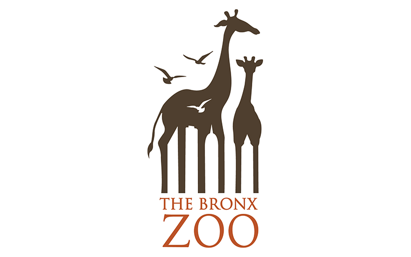
This Bronx Zoo logo shows the animals within a city with tall buildings. Smart play with positive and negative spaces.
Hartford Whalers
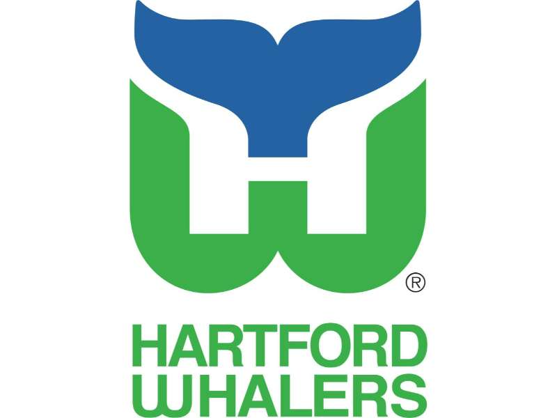
The Hartford Whalers logo shows three concepts at the same time. A whale’s tail, letter W in green, and the white space form an “H” for Hartford.
Yoga Australia
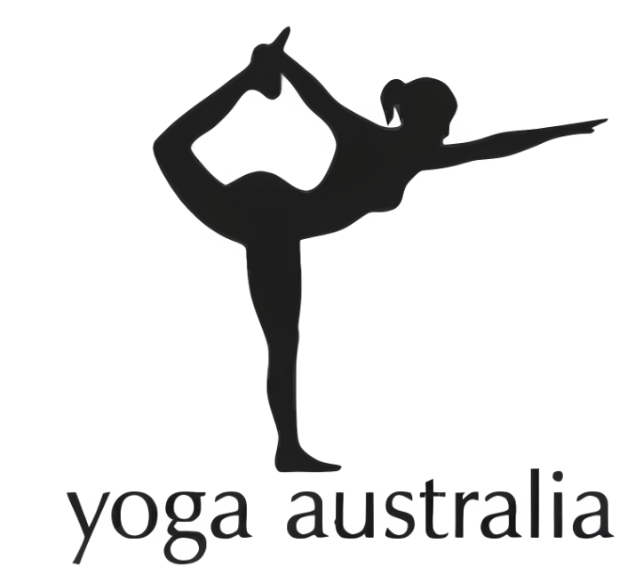
You can discover Australia’s shape in the negative space. It forms between the woman’s raised leg and back. This Yoga Australia logo certainly fits the brand.
MyFonts
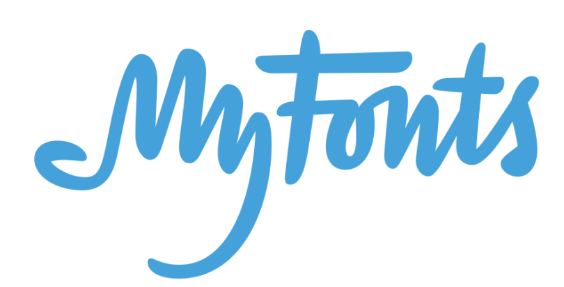
Notice the palm of a hand? This MyFonts logo forms the shape using the letters M and Y.
Wendy’s

The Wendy’s logo is said to contain a subtle “hidden” message: the ruffles in the collar of the girl’s shirt appear to spell the word “MOM.” While Wendy’s has not officially confirmed this as intentional, some interpret it as a nod to home-style cooking and comfort food, reinforcing the brand’s family-friendly image. It’s a small detail that fans often point to as clever branding.
IBM

Lastly, we have this computer company. This is a logo designed in-house for an internal event at IBM. This symbol, designed by Paul Rand, took in a more playful design with visual comedy. Instead of using the actual letters of I and B, this logo used an illustration of an eye and a bee.
Conclusion
Did you learn anything new about the logos above? Hopefully, this list of clever logos with genius hidden meanings has made you into a logo decoding master of sorts.
Get creative and try designing your own logo. You can pepper in secret messages that people will enjoy interpreting.