How Tic Tac’s Logo Design Evolved With Time
That tiny plastic container sitting in your pocket right now? It holds one of the most recognizable brands on the planet. Tic Tac didn’t just win over taste buds; it mastered the art of visual branding.
What started as a small Italian mint in 1969 became a global phenomenon in over 100 countries. Behind this success lies a simple but brilliant logo that any logo maker would admire. Ferrero, the house of brands that includes Nutella and Ferrero Rocher, knew something important when they launched Tic Tac. Small products need a significant visual impact.
How did they do it? This article reveals the smart design moves and brand strategies that built a logo people love worldwide.
The Origins of Tic Tac and Its First Logo
In the late 1960s, breath mints were messy, bulky, and inconvenient. Ferrero spotted this gap in the market and created something completely different.
The launch of Tic Tac in 1969
Ferrero launched “Refreshing Mints” in 1968, testing the product across select European markets. Two years later, the company adopted the Tic Tac name after noticing the distinctive rattling sound mints made inside their plastic containers. This simple observation became the foundation of the brand identity.
The original concept focused on three key benefits: The tiny mints fit easily in pockets and purses, the intense mint flavoring provided instant freshness, and the flip-top container allowed one-handed use and controlled portions.
The first Tic Tac logo
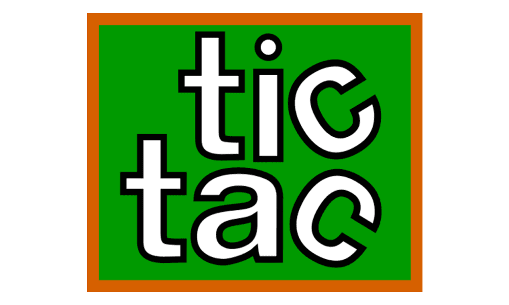
The ’69 design started as a green square with orange framing elements. The brand name was divided into two lines of text, with lowercase serif characters in white featuring distinctive black outlines.
Interestingly, the ‘C’ at the end of each word was rotated in different directions, creating a playful visual element that hinted at the fun personality the brand would later embrace.
Design philosophy behind the logo
Ferrero built their original logo around three core principles: clarity, geometric simplicity, and freshness.
Clarity was essential because the logo needed to work on very small packaging while standing out in crowded stores. The clean, geometric style matched popular late 1960s design trends that favored bold, simple graphics. The logo also communicated freshness, hygiene, and modernity to match changing consumer habits.
As people became more mobile and concerned with personal grooming, Tic Tac positioned itself as the modern solution, and the logo reinforced these values.
Major Logo Changes Through the Decades
Most brands change their logos and lose their identity. Tic Tac did the opposite. Over 50 years, they kept what worked while adapting to new times.
From supermarket growth in the 1970s to smartphone screens today, Tic Tac has faced every challenge by staying smart about change.
1969-1970: The heart-shaped beginning

During the launch, Tic Tac experimented with different logo designs, transitioning from “Refreshing Mints” to the Tic Tac name. One early version featured a heart shape with white letters. The short-lived heart design included details like an oval-shaped dot above the letter “i” that mimicked the mint candies and rounded letters that echoed the product’s oval shape.
1970-1980: Simplification and green focus
The 1970s brought the first significant change. Tic Tac kept the same letters but ditched the decorative elements. Out went the blue heart, and in came the same green square background as its first logo.
This design wasn’t just about following design trends. Green meant freshness and mint flavor to shoppers. Printing a single color also costs less as Tic Tac spreads to new countries. Plus, that bold green square stood out better on supermarket shelves where customers shopped faster.
1980-1998: Introduction of the green leaf
The 1980s introduced the shape that made Tic Tac famous. The new leaf design started as a rectangle with innovative corner treatments. Two corners stayed sharp and pointed, while two became smooth and rounded. This design created an organic leaf shape that still worked at tiny sizes.
The genius was in the metaphor. Mint comes from plants, and the leaf instantly connected the logo to nature. White letters on the green leaf background created maximum contrast for easy reading, even on shiny packages.
1998-2006: Adding dimension and depth

Computer graphics changed everything in the late 1990s. Tic Tac jumped on the trend by adding depth and shine to its leaf. Gradients made the logo pop off packages, and shadow effects made letters look fresh and dimensional.
This change wasn’t just about looking cool. The new depth helped the logo stay visible under bright store lights and on different package materials.
2006-2012: More realistic and natural

As people started caring more about natural products, Tic Tac made its leaf look like a real mint leaf. The shape became longer and more detailed. Careful shading in white, light green, and grey made everything feel fresher and more authentic.
The change worked perfectly. Longtime customers still recognized their brand while health-conscious shoppers saw something connected to nature.
2012-2022: Volume and modern polish

The smartphone era demanded logos that looked great on screens. Tic Tac responded with more volume and gloss effects. The background became lighter and more vibrant. Letters got sharper outlines and better contrast.
Light reflections on the left side made the logo glow with energy. These effects translated beautifully to websites and apps, helping Tic Tac stay relevant in the digital age.
2022: Flat and functional
The newest version embraces flat logo design while keeping what people love. The basic leaf shape and letters stayed the same, but surface treatments got modernized entirely.
White outlines disappeared to help the logo work at tiny digital sizes. Instead, a green gradient mimics natural leaf texture through color alone. Letters got slightly bigger and cleaner for perfect readability on every screen, from phones to social media.
The Psychology Behind the Tic Tac Logo
The color and design choices in the Tic Tac logo aren’t random decisions made in boardroom meetings. Every visual element serves specific psychological purposes that connect with consumers on emotional and subconscious levels, driving recognition, preference, and, ultimately, purchase behavior.
Understanding the psychological impact of logo design helps explain why Tic Tac has maintained market leadership across multiple generations of consumers. The brand’s visual identity taps into universal human responses to color, shape, and pattern that transcend cultural and linguistic boundaries.
Why white and green work like magic
White and green together create instant mental connections. White screams clean, pure, and fresh in every culture on Earth. Your brain automatically links it to medical cleanliness and hygiene. For a breath mint, this connection is pure gold.
Green does double duty. First, it shouts “mint plant” so loudly that you taste the freshness before opening the container. Second, green means natural health and renewal. Your subconscious decides that a Tic Tac isn’t just candy but something good for you.
Together, these colors make one powerful promise. Natural freshness from pure ingredients. No artificial junk. Just clean, healthy breath confidence.
How the letters shape your feelings
The Tic Tac letters have gotten skinnier and more angular over the years. This decision wasn’t random. Fat, rounded letters suggested indulgence and treats. Thin, angular letters suggest low calories and staying fit.
As people became more health-conscious, Tic Tac’s typography followed. The change was so subtle you probably never noticed, but your brain did. Modern Tic Tac letters promise you can enjoy freshness without guilt.
One detail never changed, though. That oval dot above the “i” still resembles a tiny mint. Some connections are too perfect to mess with.
The leaf that conquered the world
The leaf shape created something remarkable. People recognize a Tic Tac from across crowded stores even when they can’t read the name. This instant recognition turns into instant sales when shoppers make split-second decisions.
But recognition is just the start. Familiar logos create comfort and trust. Your brain chooses known brands over strangers almost automatically. Tic Tac’s leaf has become so familiar that it feels like an old friend on the shelf.
Packaging Design and Logo Integration

The Tic Tac logo never works alone. It teams up with that famous clear container to create something bigger than both parts. This partnership changed how small products get designed and sold.
Most brands design logos for business cards first. Tic Tac designed for the flip-top container first. This simple switch made all the difference.
The clear container challenge
That transparent plastic box created a unique design problem. The logo had to stay visible and readable even with mints blocking parts of it. It needed to work when the container was tilted, half-empty, or under harsh store lights.
The solution was brilliant. The colors stayed bright and distinct through the plastic. The letters got thick enough to compete with the visual noise of individual mints showing through the walls. The logo placement maximized visibility from every angle a shopper might see it.
The clear container also built trust. Customers could see precisely what they were buying. No hidden surprises or cheap fillers, just uniform, quality mints that matched what the logo promised.
One logo, dozens of flavors
Tic Tac cracked the code on flavor variety without brand confusion. The leaf shape and letters stay identical across orange, cherry, spearmint, and every limited edition. Only the color changes to signal different flavors.
This system teaches customers how to shop. Learn the leaf shape once, and you will recognize the Tic Tac quality forever. Use color coding to pick your flavor. New flavors inherit all the trust built by previous ones.
That consistent leaf shape means instant brand recognition, whether it’s Halloween orange or Valentine’s Day cherry. Variety with zero confusion.
Lessons Small Brands Can Learn from Tic Tac
Tic Tac’s logo success didn’t happen because they had unlimited budgets or fancy design teams. They just made wise choices and stuck with them. Any brand can use these same strategies, whether you’re launching a startup or refreshing an established company.
The best part? These lessons prove that consistency and strategic thinking beat dramatic design changes every single time.
Evolve without losing identity
Most brands think evolution means throwing everything away and starting fresh. Tic Tac proved the opposite works better. They made minor, innovative improvements that enhanced what people loved about the brand.
Each logo update solved a real problem without confusing loyal customers. New shoppers were attracted to fresh design elements, while longtime fans still recognized their favorite brand. This approach built brand value instead of destroying it.
The key is thinking like your customers. They want you to stay recognizable but also stay current. Give them both.
Use simplicity to your advantage
The Tic Tac logo works equally well on a tiny container and a giant billboard. That’s the power of simplicity. One leaf shape, clean letters, and two primary colors. Nothing fancy, everything functional.
Simple logos reproduce perfectly across different materials and printing methods. They stay readable at small sizes and work great on social media. They cost less to produce and never look outdated.
Many small brands make the mistake of cramming too much into their logo. Multiple colors, detailed illustrations, and complex fonts might look impressive in presentations, but fail miserably in the real world. Tic Tac shows that less really is more.
Design for packaging first
Here’s where most brands get it wrong. They design logos for business cards and letterheads first. Tic Tac designed for its product packaging from day one.
This meant their logo had to work on curved surfaces, transparent plastic, and under harsh store lighting. Every design choice was tested in the real environment where customers would encounter it. The result? Maximum impact where it matters.
Smart brands identify their primary customer touchpoint and design for that first. If you’re a restaurant, optimize for storefront signs and menus. If you’re a tech company, ensure it works perfectly on screens and apps.
Recent Brand Moves and Digital Adaptation
Digital platforms created challenges that didn’t exist when Tic Tac launched in 1968. Logos must now work as tiny app icons, social media thumbnails, and animated graphics. The rules changed completely.
Tic Tac’s 2022 redesign shows precisely how to handle this transition. They kept everything people loved while making it work perfectly in the digital world.
Mobile-first and social media-friendly logo
Those fancy gradients and 3D effects that looked amazing in print become muddy messes on smartphone screens. Tic Tac’s flat design approach solves this problem perfectly.
The simplified colors stay crisp even as tiny thumbnails. Clean letters remain readable across every digital platform, and the streamlined leaf shape preserves instant brand recognition at any size.
Flat design also opens up new possibilities. Simple shapes animate beautifully in video content and social media, while complex designs look messy in motion.
Sustainability and modern values
Something interesting happened as people started caring more about the environment. Tic Tac’s leaf logo suddenly felt more relevant than ever. Without changing anything significant, they positioned themselves as naturally eco-conscious.
The newer, more natural green color eliminated that artificial plastic look from earlier versions. This supported their move toward recyclable packaging while maintaining visual consistency with their heritage.
The leaf element gained new meaning as environmental consciousness grew. Tic Tac benefits from this trend without making risky ecological claims that they might not be able to support.
The Sweet Spot of Brand Evolution
Tic Tac cracked the code that most brands never figure out. For over 50 years, they have built massive brand value by updating the logo with the times without making it different.
Ready to give your brand the Tic Tac treatment? Start by looking at what people already recognize about it.
Then, explore how minor updates can improve it across all the places your customers see you. BrandCrowd offers design options that help you find that perfect balance between familiar and fresh, ensuring your brand works everywhere, from websites and business cards to social media.
Because sometimes the tiniest tweaks create the most refreshing results.
Read more logo history here:
- Logo History: Popular American Hot Dog Brand
- The Pedigree Logo History Unleashed
- Crayola Logo History
Hannah Suroy suroy brings clarity to complex topics across entertainment, business, and creative industries. She specializes in translating industry trends and innovations into engaging content that helps readers understand the creative process behind the work they love.
Header Artwork by Selwyn Legaspi