Jell-O Logo History
Who doesn’t love the wobbly, jiggly goodness of a Jell-O dessert? For over a century, this iconic treat has been a staple of family gatherings, backyard barbecues, and birthday parties.
But behind the mouthwatering colors and flavors, Jell-O’s logo design has had quite a delicious evolution. From its humble beginnings in the early 1900s to its modern-day makeover, the Jell-O logo has undergone several transformations, reflecting the times, trends, and, of course, the irresistible fun that comes with a bowl of this classic dessert.
Join us as we take a sweet stroll down memory lane and discover how this dessert logo has evolved into the emblem of tasty, wobbly joy we know and love today!
Jell-O Logo Overview

Jell-O, the name that’s almost synonymous with gelatin desserts, has been a favorite treat for generations. Jell-O has become a go-to snack for kids and adults because of its vibrant colors and wobbly texture.
Whether it’s a refreshing summer treat or the key ingredient in a delicious dessert salad, this famous snack logo has earned its place in kitchens worldwide.

But Jell-O is more than just a fun dessert—its logo tells a story of innovation, branding, and change. The Jell-O logo, which has undergone numerous tweaks and redesigns over the years, has always been designed to reflect the spirit of the product: fun, colorful, and easily recognizable.
Starting from its first design in 1897, the logo’s evolution has paralleled the product’s rise to fame. Early on, it was about catching the eye of shoppers on the grocery shelves. Over the years, as the brand expanded and adapted, the logo shifted to keep up with changing design trends, ensuring it remained fresh and appealing.
Jell-O Logo History

When you think of Jell-O, the first thing that likely comes to mind is that fun, jiggly dessert we all know and love. But have you ever thought about how the Jell-O logo has evolved? From its simple, early designs to the bold and modern look we recognize today, the Jell-O sweet logo has had quite a journey.
So, here’s how the Jell-O logo has transformed and stuck around for over a century, helping to keep that iconic, fun-loving brand fresh and exciting!
1897-1932

Let’s return to the late 1800s when Jell-O first hit the scene. From 1897 to 1932, the original Jell-O logo was designed to show the dessert’s appeal and unique qualities. It wasn’t just a logo—it was a way to invite people to try something exciting and new.
The top part of the logo highlighted how tasty Jell-O was, while the text below described it as a delicate, high-quality treat with a flavor unlike anything else.
One standout feature was the blue ribbon with wavy lines, symbolizing Jell-O’s light, airy texture and refreshing taste. It was meant to catch the eye and make people eager to try this fun, jiggly dessert.
What’s also cool about the first logo is how the brand name came to be. Jell-O’s founder’s wife came up with it by combining “jelly” (Jell) and an exclamation of excitement (“O!”). It perfectly captured the fun and joy that Jell-O promised to bring to anyone who tried it.
Even though the early years weren’t easy for Jell-O, the logo helped spark interest. Just two years after its launch, the brand was sold to a new company that took it to the next level. From there, Jell-O quickly became a favorite treat, and the logo played a key role in spreading the word about this wobbly, delicious dessert!
1932-1951

By 1932, powdered jelly mixes became a kitchen staple, and Jell-O focused its logo on the brand name as it expanded its product line. The company introduced new flavors, like lime for salads and mixes for vegetables such as cabbage, making Jell-O more versatile. This shift meant the logo and marketing needed to reflect the growing variety of products.
The updated logo used a large shade of red letters, chosen for their connection to strength, passion, and energy. This bold color choice emphasized the richness of Jell-O’s flavors and helped the brand stand out as a provider of premium, unforgettable taste experiences, boosting its popularity with consumers.
1951-1974

From 1951 to 1974, Jell-O made some smart updates to its logo to make it more appealing. One big change was the switch to a bolder, more expressive font. This made the brand name look more confident and refined while keeping it easy to read. The new font helped Jell-O stand out and showed off its unique identity.
They also updated the logo’s color. The shade of red was deepened, giving the logo a stronger, more solid look. This darker red is often linked to power, determination, and ambition, perfectly matching Jell-O’s growing influence and market presence.
The new color made it clear that Jell-O was serious about expanding and solidifying its leadership in the industry.
1974-2001

In 1974, Jell-O introduced a fresh new logo that was brighter and more eye-catching than its previous designs.
This update reflected the brand’s expanded product line, which now included a variety of fruit and berry flavors. The logo featured rounded letters, representing the plump, ripe fruits used in their products.
The design was intended to remind consumers of the natural freshness of the ingredients and emphasize the high quality of Jell-O’s offerings.
2001-2003

In 2001, Jell-O received another fresh, updated look. The design was inspired by the brand name appearing on a glass jar—the typical packaging for Jell-O—making the connection to the product even clearer.
The logo used blue shadows to give it depth, reflecting the light, watery texture of Jell-O and emphasizing its refreshing taste. This design communicated the brand and gave a sense of what enjoying Jell-O would feel like.
White outlines around the letters added a touch of freshness and lightness, symbolizing purity and making the logo feel clean and simple. A slight tilt in the logo also added a sense of movement, showing that Jell-O was always changing, innovating, and introducing new flavors while maintaining the same high quality.
2003-2023

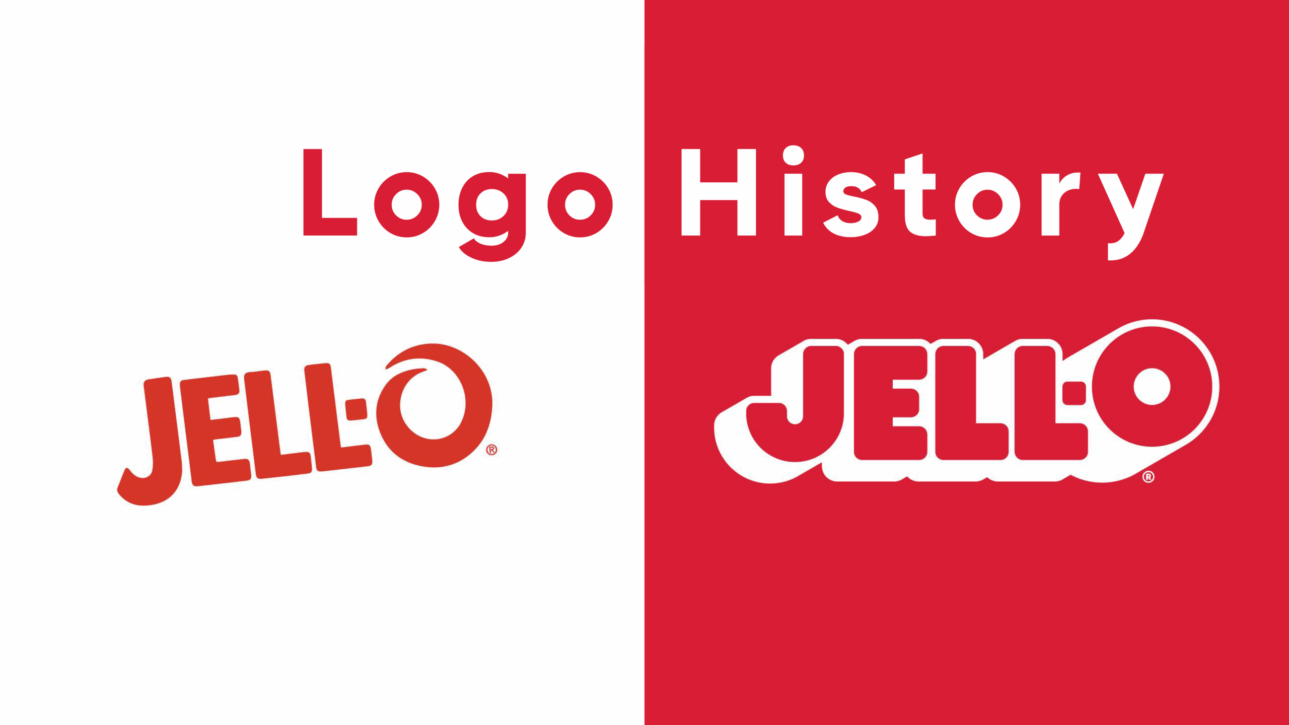
After using the same logo for almost 10 years, Jell-O updated its design in 2003 to make it feel lighter and fresher, reflecting the fun and unique qualities of the product. One clever change was transforming the last letter “O” into the shape of a glass jar, which connected the logo to the jelly and reminded people of its main product.
The new logo also featured swirls that looked like a spoon stirring the jelly, symbolizing how the dessert is made. These swirls added a playful touch, making the logo feel dynamic and fun while showing how easy it is to prepare Jell-O.

The bold red color was chosen to represent the exciting, vibrant flavor of the jelly. It helped grab attention and gave the logo a sense of quality, highlighting the delicious taste that Jell-O is known for.
2023-Today

In 2023, Jell-O’s iconic logo got a fresh update, thanks to the creative team at BrandOpus. The goal was simple: to change the brand’s image from something often seen as hospital food into a fun, party-ready symbol. The new design is bright, bold, and filled with playful energy, perfectly reflecting Jell-O’s mission to bring joy to people’s lives.
The updated logo features the brand name in bright red with thick white borders around the letters. This design doesn’t just help Jell-O stand out on store shelves or in ads—it’s all about making a statement and grabbing attention in the best way possible.
The most fun part? The “O” in “Jell-O” is slightly lifted, giving it a playful bounce. This small but cheerful detail adds fun and celebration to the design. It feels like the “O” is jumping for joy, inviting everyone to join in on the fun Jell-O brings to parties and special moments.
With this redesign, BrandOpus has successfully turned the Jell-O logo into a symbol of happiness and excitement. The bold colors, clear outlines, vintage-inspired shadows, and the lively “jumping” “O” all send a message: Jell-O isn’t just a treat—it’s a call to celebrate life’s sweet moments.
Key Takeaways for Small Business Branding
There’s much to learn from Jell-O’s logo evolution when it comes to small business branding. Over the years, Jell-O has successfully balanced tradition with innovation, and here are a few key lessons you can apply to your brand.
Balancing tradition with innovation
Jell-O’s logo has undergone many transformations but has kept the brand’s essence intact. The colorful, playful nature of the product has remained, while each new design reflects the changing times and consumer preferences.
This is a great reminder for small businesses that while their logo should evolve over time, they should maintain the core elements that people associate with their brand.
Whether it’s a specific color, font, or symbol, consistency in key features will keep your identity recognizable while allowing creative updates.
Consistency in color and typography for brand recognition
One of the strongest points in Jell-O’s logo history is its consistent use of colors and fonts. Red has always been dominant, symbolizing energy, passion, and flavor. This consistency in color helps make the brand instantly recognizable, whether on a shelf or in an ad.
The fonts have evolved but remain bold and clear, ensuring the brand name stands out. For small businesses, using consistent colors and typography across all branding materials—such as your logo, website, and marketing materials—will help customers easily identify and remember your business.
How Small Businesses Can Apply These Principles to Their Own Logos
As a small business, applying these principles to your logo can give you a major advantage. Start by choosing a color palette that reflects your brand’s personality and values.
If you’re in the dessert business, for example, a fun and vibrant color like red, pink, or yellow can evoke a sense of excitement and joy, just like Jell-O does. Select a font that’s easy to read and reflects your brand’s tone—playful, professional, or elegant.
Remember, your logo is the first impression customers have of your business. Keep it simple, consistent, and aligned with your brand’s message. As your business grows, you can make small tweaks to keep your brand fresh and relevant, just as Jell-O has done for over a century.
Design Your Dessert Logo Today
Jell-O’s logo journey shows how the brand has evolved from a simple dessert to a fun symbol of celebration. With each logo update, Jell-O has kept its playful spirit alive while adapting to the times, constantly reminding us of its deliciousness and joy.
If you’re considering starting your own sweets or dessert business, creating a memorable logo is essential for standing out and building a strong brand. A great logo can help customers recognize and connect with your product immediately.
Need help with your logo? Visit BrandCrowd, where you can find simple tools and professional designs to help bring your idea to life. Start your brand today!