TikTok Logo: An Abstract Adventure
Get to know one of the most popular social media platforms: the TikTok logo. Get inspired by their technique and read the history of how they came up with the iconic logo.
Be inspired and use our logo maker to aid you in creating a famous logo too.
TikTok History as A Whole
At the young age of six years, TikTok has become one of the phenomenal social media platforms that individuals and businesses can use for better branding, recognition, and awareness.
TikTok started as an app called Douyin in 2016. The platform came to life through a Chinese company, ByteDance, allowing users to create short videos. It became a hit in China, garnering 100 million users who viewed 1 billion videos daily on the app.
And in the US, a popular app called Musical.ly thrived because of lip-synching videos that lasted for 15 seconds. It had similar features to Douyin but focused more on lip-synching videos.
Now, why did we mention the latter? Because ByteDance bought it in 2017 and combined the features to create what we now know as TikTok. The features include:
- 15-second videos ranging from duets, comedic videos, reactions, challenges, competitions, and more
- Various stickers, filters, visual effects, and thousands of audio for dubbing
- It gives you the freedom to create and view content using the screen of your choice (Monitor or Mobile).
So by 2018, TikTok became a household name for social media platforms that allows you to connect and create with fellow content creators around the globe. It became even more famous when the pandemic hit a whopping 2.6 billion download rate worldwide in 2022.
Logo Design Under Scrutiny
Now that we know how the company was created let’s dive into the design itself. Comparing TikTok’s logo with other brands like Coca-Cola, Starbucks, and Tesla is best.
They may not be in the same niche, but when it comes to logo history, mentioning the famous brands above are a MUST.
The two beverage companies have existed since the 19th (1886) and 20th centuries (1971). In contrast, TikTok and Tesla were only created in the 21st century. Since the first two companies have been around longer, they have changed and shifted to modern styles.
The latter two have little to no revisions since their brands blew up and have trendy styles. Let’s get into TikTok’s logo and determine how the design was made.
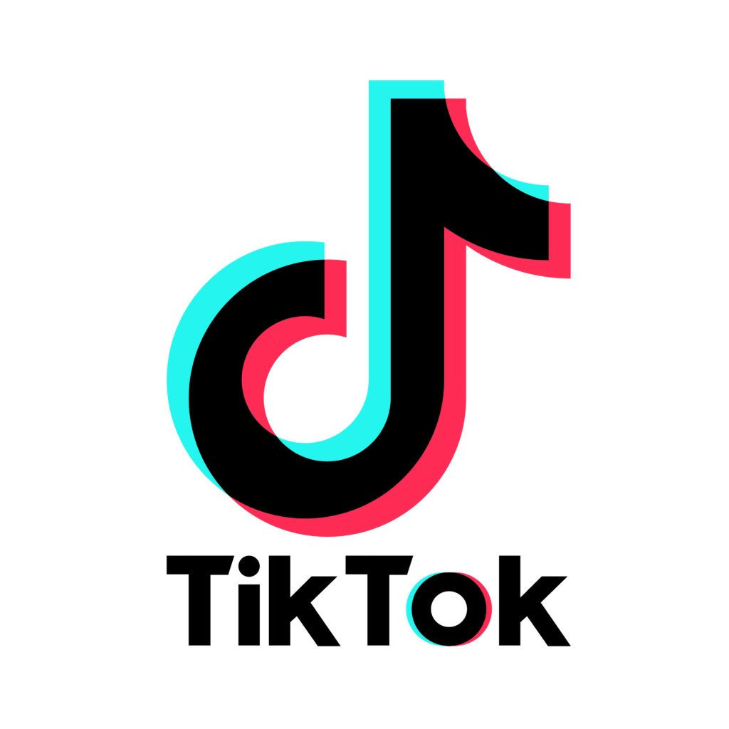
The logo’s centerpiece is a music-note-like shape in three colors (aqua, black, and pink). The color scheme looks like something that created an abstract effect, so the logo looks moving.
According to sources, the unnamed designer said that he felt inspired during his time at a concert. That’s why the logo looks like a music note because he emulated the feeling of looking at the bright stage and watching the performers in a dark arena.
Depending on the background, you have a white D for the dark background while black for the light background. Also, the logo looks like a lower case D which pays homage to the first name of the app, Douyin.
Technically, the logo only has minor revisions since its creation in 2016 as Douyin. The signature music note then, in 2017, they added Tik Tok under the D. Lastly, in 2018, the typeface thickened, and the word TikTok had no space. The letter O in Tok has the same 3D design as the letter D logo.


Create An Abstract Logo Too
And there you have it. The logo history of TikTok logo and how they created it. The key takeaways are:
- Meaning behind the logo matters.
- Add some kind of effect to your logo to stand out.
- Most 21st-century logo designs have little to no revisions.
Ensure that you are updated with logo trends, typography, and any other type of graphic design trends with us.
Don’t forget to check out our other services like business card design, letterhead design, email signatures, and more.
See you in our next blog!


