50 Famous Chocolate Logos
Updated 02 January 2026
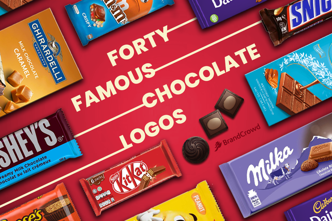
These 40 famous chocolate logos will have your sweet tooth craving for a box of delectable treats.
In 1500 BC, the Olmecs of Mexico discovered chocolate. This snack was referred to as the food of the gods and grew its popularity from there. It was even used as currency at one point. Today, its industry is worth $98.2 billion, as found by Statista.
This article will show you the leading brands that dominate the industry. From these sweets logos, you’ll find the inspiration you need to start your chocolate brand or simply ace a chocolate logos quiz.
The roundup features various brands, from artisan bean to bar brands to the ol’ reliable brands that you frequently grab from your local gas station.
Ferrero Rocher
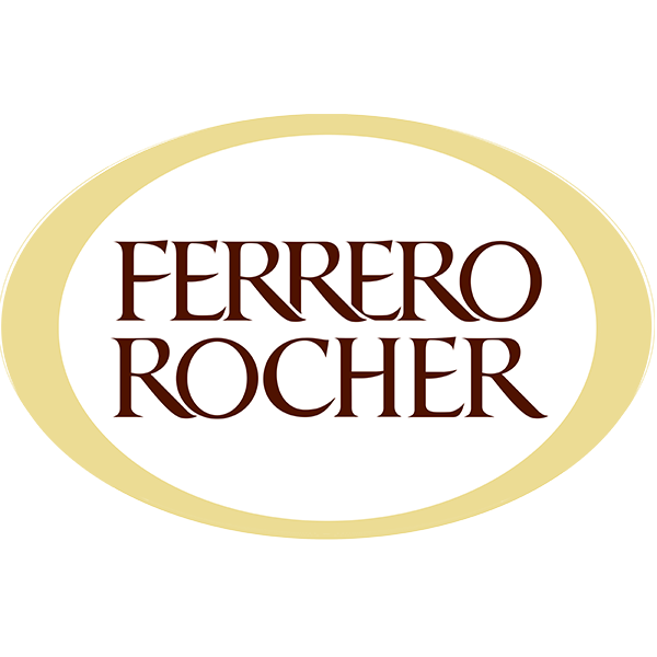
The Italian brand is known for its circular chocolate wrapped in gold foil. A serif font logo symbolizes its brand mark with a gold circular frame to give it emphasis. The metallic finish of the design gives it a luxurious touch.
Snickers
This is one of the most popular candy bar logos.
Snickers got its start in 1930. It has a rectangle-shaped design with angular and rounded corners. The logo features three different colors: red, blue, and white, giving it an athletic and patriotic appearance.
Cadbury
John Cadbury founded the chocolate company in 1824. The brand now has a golden text logo created with a cursive font. It gives it a feminine and liquid look which fits well with its smooth chocolate products. The Cadbury logo was redesigned to embody the founder’s warmth, humanity, and authenticity.
Hershey’s
Hershey’s is a chocolate brand founded in 1898 by Milton Hershey. Before that, the brand was known as National Chocolate Tablets when it began in 1890. The chocolate manufacturer has a simple logo consisting of a brown rectangular background and silver-colored typography.
Mars
The Mars bar is under a multinational manufacturer based in America.
Mars has redesigned its recognizable logo only twice in the past. A black oval shape stands as the backdrop of the brand name. The text is a red sans serif font outlined by a yellow border that makes it pop.
Ghirardelli
Ghirardelli is the second oldest chocolate brand in the US. The brand has a sophisticated logo featuring a bird in the upper part of the design and its brand name in a serif font. The text is all capitalized to give the brand name a dominant appearance to grab customers’ attention.
M&M‘s
M&Ms have been available to the public since 1941. The M&M logo image has changed minimally over the years. The current design features a slanted version of the original candy logo with a bold serif font. The brand has retained the lowercase typography that gives it a fun and laidback brand image.
Milka
This Swiss chocolate manufacturer is a member of the Mondelez Group. Lilac is the primary color the brand uses for its logo. The brand uses cursive typography for a flowy design. The current brand mark is a flat logo which makes it easy to use.
Lindt
Lindt is a Swiss confectionery company set up in 1845. A golden dragon rests on the upper right corner of the design to represent the family’s coat of arms. For its text, it consists of an italicized calligraphy that references flowing chocolate.
Kit-Kat
Kit-Kat is produced by Nestlé. The chocolate logo depicts the brand name using a sans serif font for a modern touch. Its typography pops thanks to the white and red circle that comes into contact with the letters K. Additionally, the glyphs also have a sheen to highlight the high points of the design.
More popular chocolate logos below
Toblerone
Toblerone’s latest logo features bold, all-caps lettering in a vibrant red hue with a thick black shadow for added depth. The serif typeface has strong geometric curves that echo the brand’s iconic triangular chocolate shape. Its clean, modernized look maintains the classic Toblerone identity while emphasizing clarity and boldness.
Tony’s Chocolonely
Tony’s Chocolonely uses bold, chunky block letters — “TONY’s” in red and “CHOCOLONELY” in blue — giving the logo a loud, playful, and attention-grabbing presence. The heavy typography, coupled with bright primary colors, reflects the brand’s mission-driven, rebellious spirit in its fight against injustice in the cocoa industry.
Toffifee
Toffifee is a German confection created in 1973. Its logo features rounded, caramel-toned lettering that reflects the brand’s hazelnut-caramel-chocolate combination. The playful serif typeface adds a friendly, family-oriented appeal. The warm palette mirrors the candy’s colors for instant recognition.
Meiji
Meiji is a Japanese confectionery brand established in 1916. Its logo uses a clean, rounded lowercase wordmark in red for a modern and approachable feel. The smooth letterforms reflect the brand’s simplicity and consistency. The minimalist design supports its reputation for quality chocolate and snacks.
Patchi
Patchi is a luxury chocolate brand from Lebanon. The logo features a minimalist geometric symbol paired with clean, modern typography. Its black-and-white palette emphasizes sophistication and premium craftsmanship. The sleek design aligns with the brand’s elegant gift-focused identity.
Dove
Dove Chocolate, introduced by Mars, uses a flowing cursive font for a silky, indulgent feel. The letters appear as though they’re melting, emphasizing smoothness. Warm brown tones highlight the chocolate theme. The overall design conveys comfort and richness.
Galaxy
Galaxy is a popular UK chocolate brand known for its creamy texture. Its logo uses a sweeping script font in warm gold and brown hues. The flowing typography mirrors its smooth, silky product identity. The gentle curves create a premium and inviting impression.
Reese’s
Reese’s, known for its peanut butter cups, uses a signature bright orange background paired with bold yellow-and-brown lettering. The thick, rounded wordmark gives it a playful, high-energy appearance. The contrasting colors make it instantly recognizable. Its design communicates fun and bold flavor.
Wispa
Wispa is a bubbly chocolate bar introduced by Cadbury. Its logo features rounded, puff-like lettering with a red fill and blue outline. The playful typeface reflects the bar’s aerated, light texture. The vibrant colors enhance its fun, youthful identity.
Royce’
Royce’ is a premium Japanese chocolate brand established in 1983. Its logo uses a clean, all-caps serif wordmark in deep blue. The minimal design highlights elegance and quality. Its simplicity reflects the brand’s refined approach to chocolate craftsmanship.
Godiva
Godiva Chocolatier was founded in 1926 in Belgium. The logo depicts Lady Godiva riding a horse, positioned above an elegant serif wordmark. The imagery symbolizes luxury and European heritage. Gold tones reinforce its premium brand identity.
Maltesers
Maltesers, introduced in 1936, uses a bright red spherical logo with a curved white wordmark. The playful, bouncing design reflects the lightness of its malted centers. The bold colors make it stand out on shelves. Its dynamic layout gives it an upbeat, fun personality.
Amano Artisan Chocolate
Amano is an American bean-to-bar chocolate brand founded in 2006. Its logo uses a refined serif typeface that conveys craftsmanship and tradition. The minimalist emblem reflects its dedication to artisan methods. The overall design emphasizes quality and small-batch precision.
Mast Brothers
Mast Brothers is a Brooklyn-based chocolate maker known for design-driven packaging. Its logo features a clean, minimalist wordmark in uppercase letters. The simplicity gives it a modern, artisanal feel. The restrained design aligns with the brand’s minimalist aesthetic.
TCHO Chocolates
TCHO is a San Francisco chocolate brand founded in 2005. Its logo uses a bold, futuristic, block-style typeface. The sharp angles convey innovation and a tech-forward identity. The modern look reflects its experimental approach to chocolate-making.
Raaka Chocolate
Raaka is known for its unroasted bean-to-bar chocolate. Its logo features a hand-drawn, organic wordmark that reflects natural, raw ingredients. The imperfect strokes add authenticity and transparency. The design mirrors its focus on ethical, unprocessed chocolate.
Vosges Haut-Chocolat
Vosges Haut-Chocolat is a Chicago-based luxury chocolatier. Its logo features elegant, ornate typography often paired with deep purple tones. The design communicates a sense of global inspiration and exotic flavors. The decorative elements enhance its premium identity.
Jacques Torres Chocolate
Jacques Torres, also known as “Mr. Chocolate,” operates artisan chocolate shops in New York. His logo uses a playful handwritten script paired with cacao imagery. The warm tones give it a friendly, gourmet feel. The design reflects his approachable, handcrafted style.
Scharffen Berger Chocolate Maker
Scharffen Berger is a pioneering American artisan chocolate brand founded in 1996. Its logo features a cacao pod illustration above a serif wordmark. The traditional design highlights authenticity and small-batch craft. Earthy colors reinforce its bean-to-bar roots.
Valrhona
Valrhona is a French chocolate company established in 1922. Its logo uses a sharp serif font paired with a stylized cacao flower motif. Black, gold, and red tones create a luxurious, refined look. The design emphasizes precision and premium chocolate expertise.
Richart
Richart is a French chocolatier known for geometric chocolate designs. Its logo is minimalist with clean serif typography and wide spacing. The refined look conveys modern luxury and artistic craftsmanship. The understated design matches its sleek, design-focused packaging.
Puccini Bomboni
Puccini Bomboni is a Dutch artisanal chocolatier. Its logo features a classic serif wordmark with a simple, elegant layout. The understated design mirrors its handmade, minimalist chocolate style. Earthy tones enhance its boutique identity.
Bon Bon Bon
Bon Bon Bon is a Detroit-based chocolate company known for quirky, handcrafted treats. Its logo uses a bold, cut-out letter style with playful angles. The unconventional typography reflects its fun, youthful brand personality. The handmade aesthetic matches its creative chocolate packaging.
Fran’s Chocolates
Fran’s is a Seattle-based chocolatier founded in 1982. Its logo features an elegant script that feels personal and handcrafted. The soft curves give it a warm, inviting look. The design emphasizes artisanal quality and fine ingredients.
See’s Candies
See’s Candies is a classic American brand founded in 1921. Its black-and-white block-style wordmark reflects an old-fashioned, timeless feel. The simple typography reinforces tradition and trust. The design has remained largely unchanged, preserving its nostalgic charm.
EHChocolatier
EHChocolatier is a small-batch chocolate brand from Boston. Its logo uses clean, modern sans-serif typography with generous spacing. The minimalist design communicates precision and craftsmanship. The simplicity reflects its handmade, boutique production style.
Ritter Sport
Ritter Sport is a German chocolate brand known for its square bars. Its logo features a crisp blue wordmark inside a white square, referencing its iconic product shape. The structured design emphasizes German efficiency and consistency. The bold outline enhances its strong shelf presence.
Teuscher
Teuscher is a historic Swiss chocolatier founded in the 1940s. Its logo uses classic serif typography paired with ornate flourishes. The old-world design communicates tradition and European craftsmanship. The vintage look highlights its reputation for handmade truffles.
Taza Chocolate
Taza Chocolate is an American bean-to-bar company inspired by Mexican stone-ground chocolate. Its circular logo features a traditional grinding stone graphic. The hand-drawn style emphasizes rustic authenticity. Earthy tones reinforce its minimally processed approach.
Alter Eco
Alter Eco is an ethical chocolate brand focused on sustainability. Its logo features bold, modern typography inside a circular badge design. Earthy colors highlight its eco-friendly identity. The clean layout communicates transparency and responsible sourcing.
Auro Chocolate
Auro Chocolate is a Filipino bean-to-bar brand. Its logo uses refined serif typography paired with a gold emblem inspired by indigenous Filipino patterns. The design communicates luxury, local heritage, and craftsmanship. Gold accents reinforce its premium positioning.
Choko La
Choko La is an Indian luxury chocolate brand known for indulgence and sophistication. Its logo features bold, rounded serif typography in a warm orange hue, conveying richness, warmth, and approachability. The clean wordmark is paired with the tagline “Deeply Divine Chocolates,” reinforcing a sense of luxury, pleasure, and artisanal quality while keeping the overall identity modern and minimal.
Theo Chocolate
Theo Chocolate is the first organic, fair-trade chocolate maker in the U.S. Its handwritten-style wordmark includes a cacao bean incorporated into the lettering. The casual, natural look reflects its commitment to ethical sourcing. Earthy tones reinforce its organic identity.
Hotel Chocolat
Hotel Chocolat is a British chocolatier known for its premium boutiques. Its logo is a minimalist black-and-white serif wordmark. The clean, contemporary style conveys luxury and modern craftsmanship. The monochrome palette enhances its refined brand identity.
Terry’s Chocolate Orange
Terry’s is famous for its chocolate orange treat. Its logo features a curved, friendly script in brown and orange. The rounded lettering reflects the spherical shape of its signature product. The bright colors emphasize playfulness and tradition.
Amul
Amul is one of India’s most iconic dairy cooperative brands, known for butter, milk, cheese, ice cream, and other dairy products. Its logo features a bold red box with white lettering in a distinctive blackletter/Gothic style font with ornate flourishes. The strong red and white contrast highlights accessibility and reliability. Below the brand name, a green band displays the tagline “The Taste of India.” The decorative typography and simple color scheme reflect the brand’s long-standing heritage since 1946.
Haigh’s Chocolates
Haigh’s is Australia’s oldest family-owned chocolatier, established in 1915. Its logo features a classic serif wordmark with elegant vintage detailing. Deep brown and gold tones reinforce tradition and premium quality. The design communicates heritage and meticulous craftsmanship.
Darrell Lea
Darrell Lea is an Australian confectionery brand founded in 1927. Its logo showcases a flowing script housed inside an oval frame. The handwritten style gives it a warm, nostalgic quality. The black-and-white color scheme adds a timeless appeal.
Guylian
Guylian is a Belgian chocolate brand best known for its seashell pralines. The logo features an elegant serif wordmark with soft, flowing curves. A subtle swirl in the “G” references its marbled chocolate shapes. Warm chocolate tones enhance its premium European feel.
Whittaker’s
Whittaker’s is a New Zealand chocolate brand established in 1896. Its logo features a vintage-inspired script with gold embossed lettering. The ornate design reflects handcrafted tradition and long-standing quality. The gold palette emphasizes richness and heritage.
Beryl’s Chocolate
Beryl’s is a Malaysian chocolate brand known across Asia. Its logo features a clean serif typeface usually in deep red or maroon. The refined design highlights warmth and premium craftsmanship. The simple layout underscores its commitment to high-quality cocoa.
Conclusion
A brand needs to possess a logo that symbolizes its service and unique traits at the same time. You want to create a design people can connect with. Like the logos above and with the help of the best image opimization software, you can turn your brand into a household name as well.
Start your search for the best chocolate logo with a custom design. DesignCrowd is a crowdsourcing platform that you can use to work with a community of freelance graphic designers. You can also run contests for web designs and flyer designs, among others.
BrandCrowd logo maker is an excellent alternative for brands that want to generate a design in minutes. The logo maker has a library of customizable designs. It includes some of the best pastry logos and artisan logos that you can personalize with your brand colors, fonts, and more. Try it right here.