60 Famous University Logos
Education is a right. The moment a child enrolls in kindergarten, they take a journey to learn everything they can until high school.
Then, the subjects become specialized as they enter college. The question is, do you know the institutions that provide secondary education?
Get to know them with us through our collated catalog of famous university logos.
Famous University Logos To Get To Know
Let’s look through the logos and dissect what makes each effective. Most of the designs below either have an emblem or a letter logo.
Emblem logos are what you mostly see in institutions of higher education. That’s because the style embodies the values and or origin of where the institution is.
The other style is a letter logo. That’s right. It’s either one or the university’s initials seen in the type itself.
But some universities still have a pictorial mark representing who they are as a school. Since those are the prominent logotypes, we divided all 60 logos between the three categories.
Emblem Logos
Under this, we have logos that have shields paired with crest logos for their respective institutions. Their designs reflect who they are as a school or the history that made the establishment possible.
Browse through thousands of emblem symbols with our AI logo generator and choose the best one for your business.
Get to know the whole emblem bunch here.
Auckland University Logo
Auckland University’s logo embodies New Zealand as a whole. The emblem has kiwis that represent NZ’s national bird. The wavy silver chief symbolizes Auckland being near the coast.
The banner below says, “Ingenio et Labore,” meaning natural ability and hard work, the school’s motto. It works as a logo because it tells the story of where the university’s location and what kind of education they promote.
Brown Unversity Logo
Another attractive emblem is a sun atop a shield with a red cross. The red cross represents St. George’s cross, while the four books represent learning. Brown University did a good job with its yellow and red color combination. It’s striking while also being simple and eye-relaxing.
And the sun is shining through the clouds of ignorance. Lastly, the scroll below says In Deo Speramus, which means In God We Hope.
Boston University Logo
The central building of the logo tells you the city’s location from the sea. Around it is the institution’s name with the Roman numerals of its first establishment. Also, if you notice, the city’s location is inside a Methodist cross. The logo works since it traces back to the school’s roots and place.
Cairo University Logo
For Cairo University, their logo is a hieroglyph bird person writing something on a tablet. It’s a distinct mark that is truly unique to Egypt itself.
Chicago University Logo
The exciting aspect of this logo is that it has a mythological creature on its logo: a Phoenix. Some people say it may refer to the “rebirth” of the old school from 1857 to 1886. Others say that it may pertain to healing from the Great Chicago Fire.
Either way, it works as an emblem logo since the elements of the Phoenix, books, and their motto: Crescat scientia; vita excolatur. It means, “Let knowledge grow from more to more, and so be human life enriched.” Thus, it embodies what education at Chicago University exemplifies.
Columbia University Logo
For Columbia, its logo is an ode to its old name, King’s College. Thus, the three crowns in the shield represent that. Their motto is In Lumine Tuo Videbimis Lumen, which means In your light we see the light. It traces back to their Christian roots as well.
Cornell University Logo
Like most schools established in the 18th century, they have a shield inside a circle. Their name and founding year surround the shield containing a book and two more shields.
A shield with stripes on the left, while the other depicts the sun shining over the mountain. The flag on the left pays homage to the US flag, while the one on the right represents the Hudson river.
The logo truly pays to respect the geographical history and the sentiment of the founding father, Ezra Cornell, “I would found an institution where any person can find instruction in any study.”
Duke University Logo
Some universities pay homage to their historical and or geographical roots. For Duke University, they pay homage to its religious roots.
Aside from the castle-like shield with its initials, the cross in the middle is a Christian cross. Their motto under the shield backs up their view of education: Eruditio et Religio, which means Knowledge and Faith.
Georgetown University Logo
Like Chicago Uni, Georgetown has a creature as the center of its logo—an eagle akin to the seal of the United States President. The eagle of Georgetown is grasping a globe and a cross on its talons.
Those two visuals stand for rational knowledge and Christian faith. And the eagle has a scroll in its beak saying, Utraque Unum, which means Both are One. Thus, the education of Georgetown exemplifies just that.
Harvard University Logo
As the oldest school in America, its logo reflects that. Surrounding their motto, VE, RI, TAS (meaning truth) is a wreath. It pays homage to their historical roots of knighthood.
Melbourne University Logo
We have another mythological figure as a logo. Nike, the goddess of victory, is the lone figure in the emblem of Melbourne University.
Under the shield containing Nike is the banner saying Postera Crescam Laude. It means growing in the esteem of future generations.
Moscow State University Logo
MSU is known for being the first Russian university established in 1755. Their emblem is their building with a wreath around it and the year of the establishment below.
National University of Singapore Logo
NUS logo is a bit of everything. From their values as an institution to their alignment with the nation, the emblem summarizes it. The lion symbolizes Singapore, while the book and three rings symbolize NUS as a portal to knowledge and how they apply that knowledge to the world.
Northeastern University Logo
The torch is a powerful symbol that denotes the kind of values their institution has about their education. Their motto, which is in the middle of the emblem, states Lux, Veritas, Virtus. It means Light, Truth, Courage. They want their students to have these values.
Northwestern University Logo
Compared to Northeastern University’s logo, Northwestern has a book with its motto, Quaecumque Sunt Vera, surrounding it. The statement means Whatsoever things are true. A reflection of the kind of education the institution advocates.
Oregon State University Logo
The state’s mascot, a beaver, sits on top of the crest. Inside the four elements (a tree, a book, the sun, and a piece of land with three stars on it), the tree and book represent knowledge, while the rest represent Oregon, the 33 states, and the university’s three campuses.
Otago University Logo
Lord Lyon, King of Arms (Scotland’s premier officer of arms), gave the logo to the university on 21 January 1948. Otago Uni’s motto Sapere Aude translates to either dare to be wise or have the courage to be wise.
Pennsylvania University Logo
A combination of Benjamin Franklin and William Penn’s coat-of-arms, the Pennsylvania University logo came to life. The dolphin on the red chief is Franklin’s, while the three silver plates on the blue chevron are Penn’s.
They add the books to represent their purpose as an institution. And under that is their motto Leges Sine Moribus Vane, which means laws without morals are useless (in vain).
Pittsburgh University Logo
The university’s logo is that of William Pitt’s family seal combined with the motto Veritas and Virtus. Veritas means truth, while Virtus means virtue—the ideals of Pittsburgh education.
Pretoria University Logo
Pretoria uni’s logo revolves around three symbols, an ox wagon, three bees cand honeycombs, and three annulets inside a shield. The bees and honeycomb represent the gathering and archiving of information. And their motto is Ad Destinatum Persequor which means With zeal and perseverance, strive towards the goal.
Rice University Logo
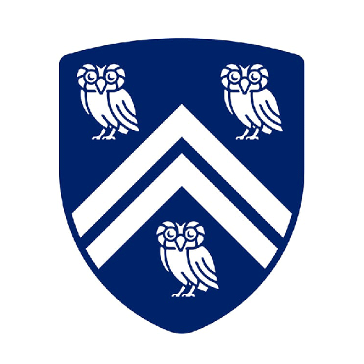
Rice University has a shield with three Athenian owls on each corner the shield and inverted V vectors that divide it. The owl stands for honor, influence, and wisdom, and chevrons represent the coat of arms of the families Rice and Houston.
Seol National University Logo
The university’s logo has four distinct visuals that embody its principles as a school: laurel wreath, pen and torch, motto, and the front gate symbol. The Laurel wreath represents victory and glory. The pen and torch represent SNU’s determination to create a path for the future through academic research.
The front gate symbol is the combination of the initials of Seoul National University. Lastly, their motto Veritas Lux Mea means Truth is My Light—their number one principle in educating their students to help pave the future.
Texas University Logo
Texas Uni emblem is a divided shield inside a circle with their name and year of establishment around the shield. The top half is a book that pertains to learning, while the star below is the great seal of the state of Texas—a homage to location.
University of the Philippines Logo
The logo of UP has a bird a top of a shield that contains three icons that represent their specialized fields. The bird has outstretched wings to represent who UP wants to be, a beacon of academic freedom, and the three icons represent engineering, agriculture, and medicine.
Thus, on February 25, 1913, the Board of Regents approved the logo you see today.
Washington University Logo
Like Pittsburgh and Pennsylvania Uni, Washington university patterned its logo to George Washington’s seal—the two bars and stars. Under those two are three fleur de lis, King Louis IX of France’s symbol. And in the middle of everything is a book with their motto: Per Veritatem Vis, which means Strength through Truth. Thus, that’s what their education promotes.
Yale University Logo
Like most emblem logos above, Yale uni sports a book inside a shield with an inscription. It’s Hebrew which means Urim ve’Thummim, which means Light and Truth. Acknowledging Yale’s religious roots, it incorporated that in its design.
Aside from that, it’s a deviation from what Harvard has as a logo. Aside from that, the banner below is the Latin translation of the inscription in the book: Lux et veritas. Their education reflects those principles today.
Letter Logos
Sometimes, a letter is quicker to identify than a whole word. Thus, the initials of these institutions become the letter logo that makes them memorable to parents and students alike.
Do you attend any of these universities?
Alabama University
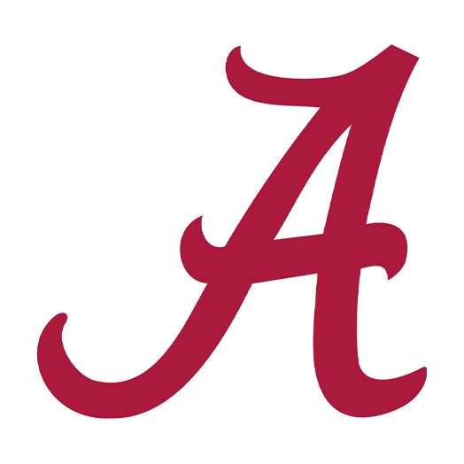
Doesn’t their A look like a particular novel you might’ve read for school? The Scarlet Letter. No relation, just an observation. The font they use is Minion Pro and Trade Gothic with a red color.
As you may know, they are known as the Crimson tide. The establishment of the name was through a football game. Stories say that during a game in 1907, the soil in Birmingham was iron-rich which turned red.
And since the ground was soggy during the game, it stained the white jerseys of the players, and people said they were playing like a Crimson Tide. Thus, red became their school’s color.
Arizona University Logo
Arizona university is known for two fields: academics and sports. Thus, we see two A’s in different fonts, an outer one that looks like a varsity font and AU’s font on the inside A.
Arizona State University Logo
The logo of ASU is a simple one with its initials A S U in red with the sun incorporated into them. It symbolizes innovation and research, which is the core of ASU education.
Auburn University Logo
A sophomore at Auburn year 1965, Fritz Siler created the logo while being featured in their paper. He realized there had to be a more memorable sign for the school. Thus, he came across Indiana University’s logo, overlapping I and U.
Siler decided that the interlocking A and U would be the symbol that represents the college. It’s been the school’s logo with its blue and orange color scheme ever since.
Baylor University Logo
Like Auburn, Baylor has an overlapping logo of B over U with their signature green color. Goudy Oldstyle typeface is the lettering for the monogram logo, much like the font we see on varsity jackets.
Cincinnati University Logo
Here is another interlocked monogram with U and C chained together. It has that divided in the middle effect like the letter is parting, but it’s just the style. The font used is Gentium Book Basic in their signature red look.
Delaware University Logo
Delaware has the letters U and D interlocked together like the three universities above. It looks like a Times New Roman in the color blue, but it’s Delaware’s in-house typeface.
Florida University Logo
Florida is a simple letter logo with U and F beside each other. It’s a Gentona font with their signature blue shade.
Houston University Logo
Houston Uni’s logo is another interlocked monogram. It’s in a League Gothic font and their signature red. Any alumnus would know that they’re part of the “Cougar Family” when they see this logo.
Illinois University Logo
Illinois Uni planned this style as their logo with the goal that when people see it around the world, they know it’s them. They use the Adobe Garamond Bold for their iconic orange I with a blue outline.
Iowa University Logo
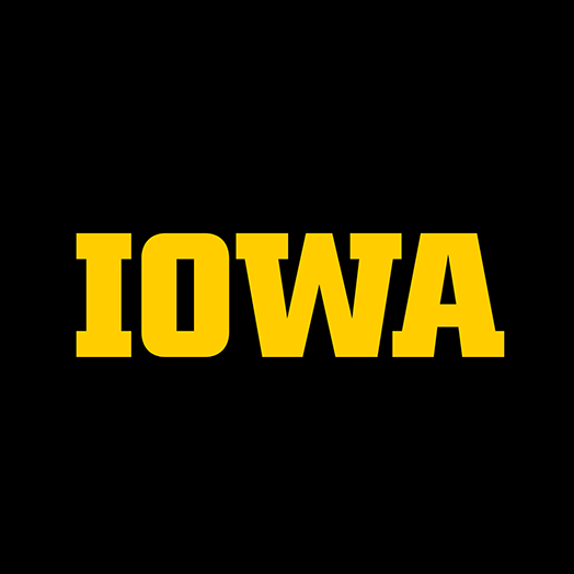
The university chose this logo because it reflects their pride and strength upon looking at it. When paired with black and gold, their Roboto font exudes who they are as a school.
Kentucky University Logo
We have another overlapping letter logo here. The letter K overlaps the letter U with their signature blue color. Have you noticed that most designers under letter logos have this kind of design?
Liberty University Logo
Like its predecessor, this Christian college has an interlocked logo that connects the letters L and U. Blue outlines the letters, and it’s red inside, with small portions delineated by white. The logo is a bit slanted, which looks like it’s moving forward, like when a card is speeding.
Ludwig Maximilian University of Munich Logo
LMU is one of the logos here that isn’t interlocked and has two kinds of font width, with the L being thinner than M and U. It gives off that quirky feel that befits a research-focused institute.
Miami University Logo
Instead of a letter M, Miami Uni went with a U. At the time. Their Athletic Federation was looking for a way to raise funds for the athletic department. They noticed that most universities had a UM as their logo. Thus, Bill Bodenhamer, designer, suggested the U for their logo.
The design worked well, especially with slogans like U Gotta Belive and U Is Great. They divided the U to better suit their visual identity and world well with their school’s color scheme. It’s the color of the Florida tree, with orange representing the tree’s fruit, green being the leaves, and white representing the blossoms.
Michigan University Logo
For Michigan Uni, during a 1907 football match, students raised flags to create their block letter M in their color scheme of blue outline and yellow for the letter M.
They modified this design in 2012 with their yellow M on top of the University of Michigan wordmark. Also, it’s excellent to note that they use their font for their design.
Minnesota University Logo
Block M is the signature look of Minnesota University Twin Cities.
Ohio State University Logo
Ohio State is the third-largest university in the USA. Their logo is an O with cut corners that almost looks like an octagon. It has white and gray edging, and the O itself is red.
Oregon University Logo
In 1990, Oregon Uni’s all green logo came to life. From the O with a duck walking through to an interlocked U and O, we finally see the minimalist O logo we know today.
Purdue University Logo
Purdue Uni chooses to use the Motion P as their logo. It’s a way to connect emotionally and become nationally recognized with one glance at the logo itself.
Stellenbosch University Logo
Stellenbosch changed its logo last year from its S with a leaf logo (created in 2000). Now, it’s a modern, streamlined look that still looks classical and elegant. After all, a school’s branding is essential to ranking, funds, and reputation.
Since Stellenbosch wants to be Africa’s leading research-intensive university by 2040, its logo shows precisely that.
Syracuse University Logo
For Syracuse, their block S design is a way to respect the past and represent the future, as SU Athletic Director Daryl Gross said in an interview. It’s a symbol that connects the athletic programs and the Syracuse community.
Tampa University Logo
The interlocked U and T is the signature look of Tampa Uni with their signature red color.
Temple University Logo
The T initial of Temple represents the strength and positive character of the institution. The open-ended tips of the T represent the free exchange of ideas that the university stands for.
Tennessee University Logo
The white space initial of Tennessee Uni’s logo uses Goudy Old Style, much like Baylor university. But what makes it distinct from the rest is that it uses negative space. Even from afar, you can identify it.
Utah University Logo
Utah Uni has its logo as the letter U in its signature red color. The University prefers its in-house font for marketing purposes and used Vitesse for that signature U initial.
Pictorial Logos
For some universities, a symbol is what represents them the most. After all, our brain processes image 60,000 times faster than text.
But that doesn’t mean that letter logos or wordmarks are ineffective. It depends on who your target audience is.
Check out the pictorial marks below for your university:
Georgia University Logo
Georgia Uni created its logo as an homage to the Seal of the State of Georgia. Aside from that, it’s the arch leading to the main entrance to the North Campus.
Howard University Logo
Like Moscow State, Howard University has a clock tower as its logo. And the year of their establishment is under that building.
Indiana University Logo
If you’re a psychology major, you’d think it’s the letter Psi, which is the symbol representing the field. But in actuality, it’s the logo of Indiana University. It’s an interlocking between I and A with Hoosier Bold’s font in crimson.
Maryland University Logo
Paying homage to their state, Maryland university has its flag in a ball surrounded by its name and year. George Calvert’s coat of arms inspired the color of the flag (red, white, black, and gold). He’s the original colonial proprietor of Maryland and the first Lord Baltimore.
Ohio University Logo
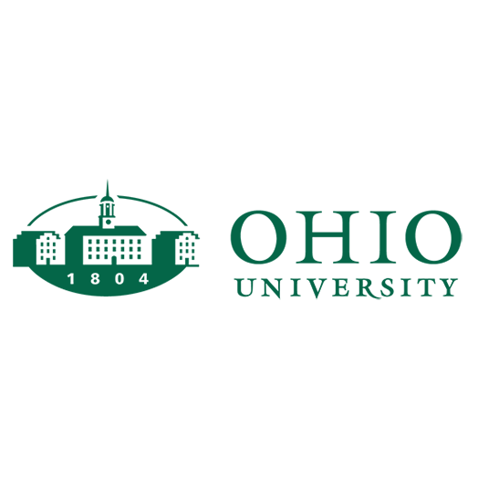
Like Howard and Moscow State Universities, Ohio has its building as its logo. The year of the establishment below and the wordmark beside it is their primary logo.
South Carolina University Logo
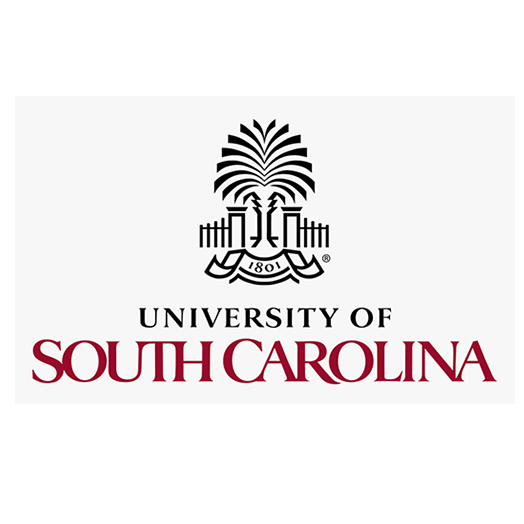
South Carolina Uni takes inspiration from its state’s flag for its logo. Combine the minimalist palmetto tree with gates, and you have the logo of UofSC. The palmetto tree represents the efforts of Colonel Moultrie’s defense against the British on June 28, 1776, at the palmetto-fog port in Sullivan.
Stanford University Logo
Like UofSC, Stanford has a tree in its logo. Placed in the middle of the S, the tree Coast Redwood, or Sequoia sempervirens, is one of the symbols of Standford’s location, Palo Alto, CA.
Tohoku University Logo
On their 10th anniversary of founding (2007), they created the logo we see today. Sendai’s native color bush, Hagi (Japanese), grows in a circular motion. They chose this design because it embodies who they want to be as an institution: creativity, globalization, and tradition.
The bush embodies tradition, while the circular form represents the globalization of Tohoku Uni. Lastly, they chose purple and black as their distinct color since the former express creativity and intelligence while black embodies their spirit of diligence.
Create Your University’s Logo Today!
And there you have it, 60 famous university logos around the world. Did you get inspired by any of them? Did you also notice that if it’s not a shield, it’s an interlocked letter logo that makes up the institution’s logo? In modern times, we see a pictorial logo represent a body of the higher institutions.
Either way, you deserve a design that truly embodies who you are as an institution. We can help you through our online logo maker tool.
Just type your business name and choose which template suits you best. Edit it the way you want, and ta-da! You now have the self-edited logo you can be proud to show off.
You’ll do great in your design process!

