Healing Designs: 49 Inspiring Hospital Logos for Your Healthcare Brand
Picture a hospital. It’s a world awash in white: gears, tiles, uniforms, beds, and gowns. Even the pills, the surgery rooms, and the materials — they all share this white color. Now, envision a hospital logo. You might imagine it replicates this palette: a white coat, lab equipment, and the outline of a hospital building.
Yet, a hospital logo transcends this monochromatic scheme. Hospital logos can be beautiful, colorful, vivid, and modern. Yes, some hospital logo designs that you will see below can cut through the clinical coldness. In healthcare, where the environment is as crucial as the care provided, a logo design does more than identify — it communicates.
A well-crafted logo bridges the gap between a hospital’s sterility and an art piece’s warmth. Remember, logos are a visual shorthand for a story, marketing, and branding. It’s a crucial piece in the healthcare industry, where saturation and congestion mean you need to stand out — otherwise, you lose.
What a Hospital Logo is Essential?
Before going into details about the different types of hospital logos, it’s crucial to understand the importance of logos for healthcare brands.
Hospitals are a monolithic corporation, too big to be grasped and understood. A logo helps to encapsulate and box their identity using a small image. From the outside, it is just an image, but for hospitals that have already built their reputation, their logo conveys trust and professionalism.
Hospital logos are easy to understand
Since hospital icons such as buildings, ambulances, crosses, and lab gowns are present everywhere, they are all universally understood. That means, your icons will easily communicate with your target audience and other groups. It is also culturally sensitive and can be used in other countries with different cultures.
Hospital logos are diverse
There are so many options to choose from. You can go the building images route or you can opt for the hospital equipment such as surgery tools. Another aspect to play around is the emergency icons where you can have the ambulance, nurses, stethoscopes, wheelchair, and many more.
Hospital Logos Foster Emotional Connection
Hospital logos can evoke emotions and forge a deeper connection with their audience. They can include brand elements that symbolize care, healing, and hope. This emotional resonance is vital in healthcare, where patients and their families seek not only expertise but also empathy and understanding.
Plus, the emotional aspect of hospital logos extends beyond patient care. They also play a critical role in fundraising, volunteer efforts, and community engagement. An emotionally resonating logo can inspire more people to support the hospital’s mission, whether through donations, volunteering, or advocacy.
Hospital Logos to Consider
There are so many ways to style a hospital logo. You can incorporate so many styles, icons, fonts, and colors. Here, we categorize hospital logos into three major styles and industries so you can narrow down your choices and the design process will be a lot easier.
Medical Logos
Medical logos embody the essence of precision and professionalism — crucial characteristics in healthcare. These logos typically blend traditional medical symbols with modern design elements to create an impactful identity.
For instance, the Caduceus and the Rod of Asclepius are time-honored symbols of medicine and healing. You can see them often found in medicine, pharmacy, and related industries. These classical icons are sometimes combined with more contemporary imagery, such as stylized human figures or heartbeat lines, to convey a sense of patient care and life vitality.
Take the Johns Hopkins Medicine logo as an example. It skillfully merges text with an abstract image of a human figure, symbolizing the institution’s commitment to human care and medical excellence. This design choice effectively communicates the balance between advanced medical practices and the importance of compassionate patient care.
Similarly, the Mayo Clinic’s logo demonstrates the power of simplicity in design. Its clever use of negative space forms both the letter ‘M’ and a human figure, reflecting the clinic’s sophisticated and patient-centered approach. This logo subtly emphasizes that at the core of healthcare is the individual – the patient.
The emotional resonance of these logos is also key. They often evoke feelings of trust, safety, and hope, with color combination choices playing a significant role. The prevalent use of blue conveys a sense of professionalism and calm, while green may represent growth and healing. The typography in these logos, typically clean and uncluttered, mirrors the clarity and precision inherent in the medical field. Fonts are chosen for their readability and modernity, though some institutions may opt for traditional serif fonts to convey a sense of established reliability.
Medical Modern Minimal Logo Design BY Raihan Chowdhury
EMR Talent Medical Logo Design l Health care Logo BY Afzaluzzaman Saju
Medical Logo BY Sudipta Bhuinya
medical leaf combination logo design BY Ml Rakib Naj
Medical healthcare clinic logo design BY Amadul | Logo Designer
Cloudy Dental – Dental Logo BY Hafizur Rahman
Medical Check Logo BY CodeGrape
MEDICAL & HEALTH LOGO BY Hasib Rana
Lowcountry NextCare Logo BY Christopher Hock
Medical Pharmacy Medicine by SimplePixelSL
Medical Emergency Kit by SimplePixelSL

Medical Stethoscope Clinic by AMCstudio
Medical Vaccination Syringe by SimplePixelSL

Blue Medical Syringe by marcololstudio

Medical Cross Dextrose by shen02

Medical Doctor Stethoscope by realdreams

Medical Stethoscope App by ions

Blue Medical Stethoscope by SimplePixelSL
Pharmacy Logos
Pharmacy logos play a pivotal role in shaping the public’s perception of a pharmacy brand. These logos often blend accessibility and trust, key factors in a sector where consumer confidence and clarity are paramount. Unlike the broader medical logos, pharmacy logos tend to focus more on simple elements of pills and vitamins.
One of the defining features of pharmacy logos is their use of familiar and comforting symbols. Icons such as mortar and pestle, pills, or the universally recognized green cross are often employed. A notable example is the CVS Health logo. Its design is straightforward yet impactful, with a heart symbol that instantly conveys care and health. The use of a clear and readable font in the CVS wordmark is for transparency.
Another example is the Walgreens logo. The simplicity of its design with a bold and recognizable ‘W’, combined with the famous color red signals passion and life. This aligns perfectly with their commitment to customer health and well-being.
It’s good to remember that pharmacies aim to forge trust among consumers. Their designs should form safety and trust, which is essential in a field where consumers are making decisions about their health. Typography in pharmacy logos also tends to be clear and straightforward, reflecting the direct and honest communication valued in the pharmacy sector. Sans-serif fonts are popular for their modern look and ease of reading, which is essential in a field where clarity is crucial.
Pharmacy Logo BY 24 Colours Creations

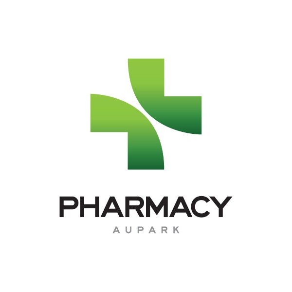
Pharmacy Aupark BY Peter Androvics
Pharmacy Logo Design BYGoody Adekpe
Pharmacy logo design for medical business BY MD Yeasin Sohel
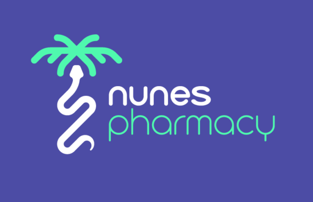
Nunes Pharmacy BY João Augusto
Pharmacy Logo BY Sari Bounazef
Apollo Pharmacy logo BY Al JIhad
Natural Pharmacy Pestle by SimplePixelSL
Medical Pill Pharmacy Chemist by SimplePixelSL
Green Natural Pharmacy by SimplePixelSL


Caduceus Staff Pharmacy by yhinna
Medical Caduceus Pharmacy by Dessy

Capsule Pharmacy Medical by shen02
Medical Pharmacy Caduceus by Riri
Medical Pharmacy Pharmacy by SimplePixelSL
Emergency Logos
Emergency logos hold a unique and vital position within the healthcare branding spectrum. These logos speak urgency and reliability. They are often the first symbol someone looks for in times of crisis, making their main design a critical aspect of their services.
Bold colors like red and blue are frequently used. Red, in particular, is a color that denotes emergency and quick response, which is why it’s a common choice in these logos. Blue, on the other hand, conveys reliability and professionalism, also favorable traits in emergency services.
Symbols in emergency care logos are often straightforward. The Star of Life, for example, is a widely known emblem in emergency medical services. It typically features a blue six-pointed star with a rod of Asclepius in the center, representing the different aspects of emergency medical care. Another common symbol is the red cross, universally associated with medical help and emergency care.
A well-known example of an emergency logo is that of the American Red Cross. Its simple yet powerful design—a red cross on a white background—is immediately recognizable and evokes a strong sense of trust and rapid response. This logo is synonymous with emergency aid, not just in healthcare, but in a variety of crisis situations.
We have another sample: Emergency Medical Services (EMS). The presence of the Star of Life says a lot about their stylistic choice.
In terms of texts, the use of bold, clear typefaces in emergency logos is essential for readability and immediate recognition. The typography is often sans-serif, chosen for its clarity and modernity, which aligns with the need for clear communication in emergencies.

Red Emergency Kit by SimplePixelSL

Emergency Kit Hand Cross by BryanPF
Emergency Kit Question by SimplePixelSL

Emergency Ambulance Chat by marcololstudio
Medical Emergency Ambulance by SimplePixelSL
Medical Heart Emergency by realdreams
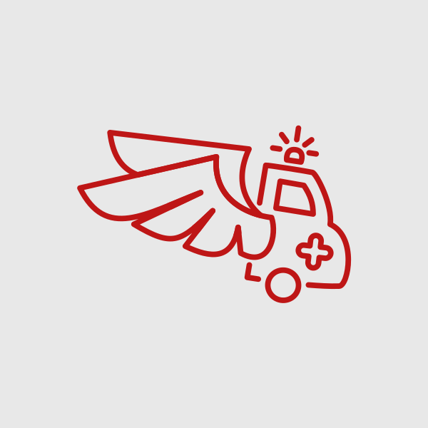
Winged Emergency Ambulance by marcololstudio
Red Medical Emergency Kit by SimplePixelSL
Design Your Own Hospital Logos
Crafting a hospital logo requires a deep understanding of what the brand represents and what message it aims to convey. Talk about blending the right artistry and strategy. Consider color psychology, simplicity, and symbolism.
Ultimately, a hospital logo should be more than a beautiful design. It should communicate, tell a story, instill confidence, and forge trust. Luckily, BrandCrowd’s host of design tools such as the business card maker and the flyer maker are here for you. You don’t have to navigate the design world alone.