10 Logo Color Combinations That Always Work (and Why)
Stuck staring at a blank screen, wondering what colors will make your logo pop? You’re not alone. The right color choices can make or break your first impression with potential customers. This goes beyond what simply looks good. It’s about what actually works.
Getting it right can feel impossible. Understanding why specific color combinations work gives you the power to create a lasting brand. A great logo maker lets you test these insights with different palettes instantly.
This article reveals ten color combinations that consistently deliver results. We’ll explain the simple science behind each so you can design a logo that builds trust and helps your business thrive.
Why Logo Color Combinations Matter
The perfect colors for your logo can make or break your brand’s success. A great color combination tells your brand’s story, creates genuine customer connections, and helps you stand out in crowded markets.
The psychology of color in branding

Colors speak louder than words in branding. Each color triggers specific emotions in your audience before they even read your company name. For example, blue builds trust, red creates urgency, and green suggests growth and health.
When you strategically combine colors, you’re programming how customers feel about your brand within seconds of seeing your logo. A well-chosen palette quickly communicates your brand’s values without saying a word.
Building trust and recognition through consistent color use
Consistent color use across all brand touchpoints creates instant recognition. Think of Coca-Cola‘s famous red or Tiffany’s distinctive blue. When people see those colors, they immediately think of the brand.
Using a consistent palette also builds credibility. It shows you have a professional, well-thought-out brand. A great color combination helps you stand out from competitors and become memorable in your industry.
How Many Colors Should a Logo Have?
The most memorable logos use one to three colors at most. This isn’t just about aesthetics but also about practicality. A simple color count helps your logo stand out and gain easy recognition on business cards, websites, merchandise, and social media.
Monochrome logos vs. multicolor logos

Monochrome logos using one color plus black or white work best for luxury brands, legal firms, and companies wanting to appear sophisticated and timeless. Nike uses just black and white for their famous swoosh. Apple’s iconic bitten apple logo is instantly recognizable in monochrome.
Multicolor logos suit creative industries, children’s brands, and businesses wanting to appear fun and approachable. They communicate playfulness and energy. However, they require careful management to maintain consistency across all marketing materials.
10 Logo Color Combinations That Always Work
Now that you understand how colors influence brands, let’s examine palettes proven to work. Here are ten classic logo color combinations and why they’re effective for different businesses.
1. Black and white: Timeless and professional

This classic combination never goes out of style. Black and white logos look sophisticated on everything from luxury handbags to startup websites. High contrast ensures readability at any size, making it perfect for social media profiles and billboard advertising.
Luxury, finance, legal, and editorial industries rely on monochrome to convey exclusivity and professionalism. Famous examples include Chanel, The New York Times, and Adidas.
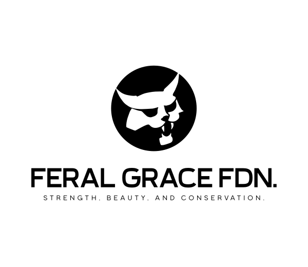
Black Wild Bobcat by BrandCrowd

Blob Brand Agency by BrandCrowd
Panda Animal Bear by Design.com
Rounded Radial Flower by Design.com
Simple Minimalist Geometric by Design.com
2. Blue and white: Trustworthy and corporate
Blue represents reliability and trustworthiness. Paired with white, it creates a clean, corporate look perfect for technology companies, healthcare providers, and financial services. This combination suggests competence without intimidation.
Blue and white logos work well for businesses handling sensitive information or needing to establish credibility quickly with new customers. Famous examples include Facebook, LinkedIn, and IBM.
Avian Pigeon Bird by Design.com
Blue Coastal Marine Lighthouse by BrandCrowd

Blue Eiffel Tower by BrandCrowd
White House Cleaning by BrandCrowd
3. Green and brown: Natural and eco-friendly
This earthy combination immediately signals environmental consciousness and natural products. Green represents growth, health, and sustainability, while brown adds warmth and stability. This makes the palette perfect for organic food brands, outdoor gear companies, and wellness firms.
Whole Foods and REI use variations of this palette to communicate their commitment to natural, sustainable products. This combination resonates strongly with environmentally conscious consumers who value corporate responsibility.
Brown Couple Tree by BrandCrowd
Forest Tree House by Design.com
Green Avocado Cannabis by BrandCrowd

Natural Eco Park by Design.com
4. Red and yellow: Bold, energetic, food brands
This high-energy combination creates excitement and urgency. Red stimulates and increases heart rate, while yellow makes people feel happy. It’s perfect for fast food, entertainment, and brands targeting younger audiences.
This psychological effect works perfectly for fast casual dining, where quick turnover is essential. Brands like McDonald’s and In-N-Out Burger have proven the effectiveness of this bold color pairing.

Eagle Hawk Crest by BrandCrowd
Magnet Thunder Voltage by BrandCrowd
Red Mountain Liquor by Design.com
Rooster Head Lightning by Design.com
5. Purple and gold: Luxurious and premium
Purple has long been associated with royalty and luxury, while gold adds richness and premium quality. This combination immediately elevates brand perception and justifies higher prices, making it great for high-end services, beauty products, and luxury goods.
Brands like Crown Royal and Hallmark use this palette to communicate exclusivity and sophistication. It’s particularly effective for targeting affluent customers and making a brand feel special.
Gold Diamond Wedding Ring by Design.com
New Hampshire Purple Aster Flower by Design.com
6. Navy and orange: Modern and approachable
Navy blue provides trustworthiness with more sophistication, while orange adds energy and friendliness. This combination feels both professional and approachable. It’s ideal for consulting firms, tech startups, and service-based businesses that want to appear competent but not stuffy.
This palette works well for companies needing to balance authority with approachability, like financial advisors or business consultants. It shows you’re trustworthy while being modern.
Coastal Lighthouse Tower by Design.com
Lighthouse Tower Beacon by BrandCrowd
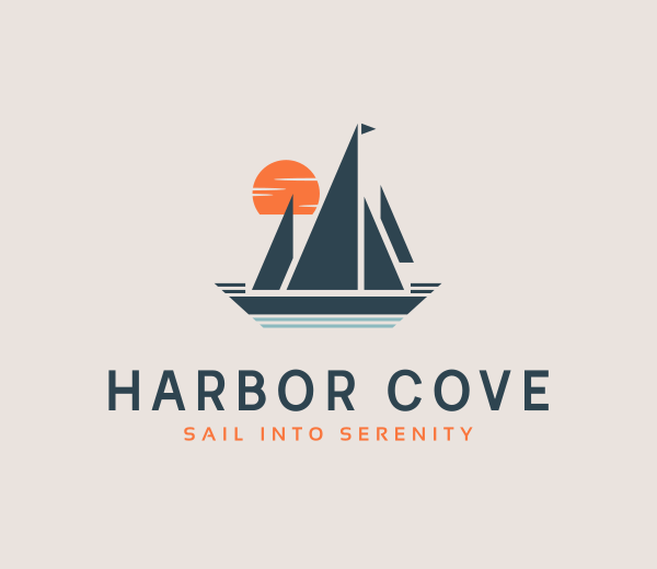
Sunset Yacht Sail by BrandCrowd
7. Teal and gray: Calm and professional
Teal combines blue’s calming qualities with green‘s refreshing aspects. Paired with gray, it creates a modern, professional look that is less common than blue and white combinations. This palette works well for healthcare, technology, and professional services.
It’s particularly effective for businesses in crowded markets where differentiation matters. Teal’s uniqueness helps brands stand out while maintaining professionalism.

3D Universal Planet by BrandCrowd
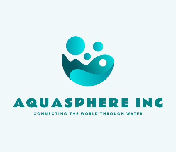
Aqua Water Cleaning by Design.com

Wrench Shield Protection by Design.com
8. Pink and black: Trendy and playful
Pink brings warmth, creativity, and approachability, while black adds sophistication and edge. This combination works perfectly for fashion brands, beauty products, and businesses targeting younger demographics or creative industries. It’s bold enough to grab attention while feeling professional.
Brands like T-Mobile have successfully used variations of this palette to differentiate themselves from traditional competitors. The combination is memorable and fun while communicating authority.
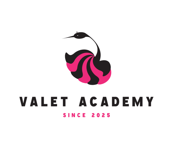
Floral Swan Bird by BrandCrowd
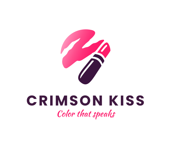
Pink Beauty Lipstick by BrandCrowd
Pink Cargo Truck by Design.com
Pink Monster Photography by BrandCrowd
Yoga Cat Meditation by Design.com
9. Blue and green: Health and sustainability
This natural combination suggests both trustworthiness and environmental responsibility. Blue brings credibility while green adds nature’s freshness. This palette perfectly fits healthcare companies, sustainable technology, and wellness brands.
This palette communicates that your business cares about both people and the planet. It resonates strongly with modern consumers who value corporate responsibility and eco-friendly practices.
Blue Green Plus Sign Circle by BrandCrowd

Green Apple Hummingbird by Design.com

Medical Appointment Calendar by BrandCrowd

Urban Real Estate by Design.com
10. Yellow and brown: Warm and approachable
This combination of earthy tones feels warm, stable, and approachable. Yellow brings energy and happiness, while brown adds reliability and comfort. This palette works great for food industry brands, home goods, or any business wanting to feel cozy and friendly.
The yellow and brown combination strongly communicates warmth and a grounded personality. This offers a great alternative to more common red and yellow food palettes with a softer and inviting feel. UPS uses this palette to convey reliability and warmth to customers.
Brown Coffee Bird by Design.com

Mobile Home Moving by BrandCrowd
Stained Glass Eye by BrandCrowd
Yellow Halloween Candlelight by Design.com

Yellow Lobster Origami by BrandCrowd
Professional Logo Color Guidelines
When selecting colors for your professional logo, consider these key factors to ensure your choice works across all applications and supports your business objectives.
Choose based on your industry and audience
Different industries have specific color expectations that have evolved over decades of consumer conditioning. For example:
- Financial services typically use blue, green, or gray to communicate stability and trustworthiness. These colors have become so associated with financial reliability that using them can immediately signal credibility to potential customers.
- Fashion brands often choose black and white or bold accent colors. The fashion industry values creativity and trendsetting, making color choices more experimental. However, luxury fashion brands tend toward monochrome palettes that suggest exclusivity and timelessness.
- Healthcare companies gravitate toward blue and green combinations. These colors suggest cleanliness, health, and natural healing. Red is generally avoided in healthcare because it can mean danger or emergencies.
- Technology companies have embraced blue as the dominant color in their industry. Blue suggests innovation, reliability, and forward-thinking. However, some tech companies have differentiated themselves by choosing unexpected colors like orange (Firefox) or purple (Yahoo).
Understanding your audience demographics is crucial. Younger audiences prefer brighter, more vibrant colors, while older demographics often prefer more conservative, muted tones. Income levels influence color preferences, with luxury markets responding well to sophisticated, subtle palettes.
Research your industry’s color trends, then decide whether to follow conventions to build trust or break them to stand out.
Test for versatility
Great logos work in both color and black and white. Your logo must pass several essential tests to ensure it works across all applications.
- The grayscale test involves printing your logo in black and white to ensure it remains clear and impactful without color. Your logo might appear this way on fax documents, newspaper ads, or single-color promotional items.
- Size testing is significant in our mobile-first world. Your logo must remain legible when displayed as a small favicon in browser tabs or as a tiny profile picture on social media platforms. Colors that work well at large sizes might blend together at smaller scales.
- Background testing reveals potential problems before they become expensive mistakes. A logo that looks perfect on a white background might disappear entirely on a light-colored surface. Test your logo on white, black, and colored backgrounds to ensure versatility.
- Lighting considerations matter because colors can appear dramatically different under fluorescent lighting, natural sunlight, or LED displays. A vibrant color combination on your computer monitor might appear dull when printed on physical materials.
Maintain consistency across all platforms
Color consistency becomes more challenging as your brand grows and more people work with your materials.
- Create a comprehensive brand bible that specifies exact color codes for print and digital use. Document your color choices with specific codes so anyone working on your brand materials can reproduce them accurately.
- Establish clear usage rules defining which colors can be used together, what backgrounds are acceptable, and how much color should appear in typical applications.
- Conduct regular brand audits by periodically reviewing your website, social media profiles, printed materials like flyers or posters, and other brand touchpoints. Slight color variations might seem insignificant, but they accumulate over time and can dilute your brand’s visual impact.
Tools and Testing Your Logo Colors
Modern technology offers many tools to help you create and choose your logo colors, eliminating the guesswork by providing curated palettes that work well together.
Online logo makers like BrandCrowd simplify color selection by instantly showing your logo in different color combinations. You can experiment with other palettes, preview your logo’s appearance on various backgrounds, and test dozens of combinations in minutes rather than hours.
Look for platforms that provide color codes for print and digital use, ensuring your colors look the same on a website or business card. The right tools help you create complete brand kits that ensure consistency across all touchpoints.
Common Mistakes to Avoid
Even with the best tools and intentions, making simple mistakes when choosing logo colors is easy. Being aware of these common pitfalls can save you from headaches later.
Using too many colors
More colors don’t make a stronger logo, but a confusing one. Stick to your chosen palette and resist adding “just one more” color. Every additional color increases complexity and cost when reproducing your logo.
The cost factor alone should make you reconsider complex color schemes. Each additional color in print materials increases production costs. Screen printing, embroidery, and promotional items become more expensive with each color added to your design.
Ignoring cultural associations
Colors mean different things in different cultures. Red symbolizes luck in China, but can mean danger in Western countries. White represents purity in Western cultures, but is a color of mourning in some Asian cultures.
Consider your target market when selecting colors. If you plan to expand internationally, research how your chosen colors are perceived in those markets.
Green has different meanings across cultures, too. In Western cultures, it often represents nature, money, or growth. In some Middle Eastern cultures, green has strong religious significance. Understanding these nuances prevents unintended cultural misunderstandings.
Choosing trendy combinations that don’t age well
Trendy colors can date your brand and might require expensive rebranding sooner than you’d like. Choose colors that reflect your brand’s personality rather than current design trends. Classic combinations have staying power that trendy ones lack.
Consider the long-term implications of your color choice. Will these colors still represent your brand effectively in five or ten years? Rebranding is expensive and can confuse existing customers who have learned to associate specific colors with your business.
Failing to consider accessibility
Color accessibility is both a legal and practical concern. According to the National Eye Institute (NEI), approximately 8% of men and 0.5% of women have some form of color blindness. Your logo should remain distinguishable and readable for people with various color vision deficiencies.
Red-green color blindness is the most common form, affecting about 6% of men. If your logo relies heavily on red and green distinctions, a significant portion of your audience may be unable to distinguish these colors effectively.
High contrast between colors ensures better accessibility. This benefits people with color vision deficiencies and improves readability in various lighting conditions and on different devices.
FAQs on Logo Colors
1. How many colors should a logo have?
Most effective logos use one to three colors maximum. This ensures they’re versatile across different uses and easier to remember and reproduce.
2. What are the best color combinations for a professional logo?
Professional palettes include blue and white for trustworthiness, black and white for sophistication, or navy and gray for a corporate look. You can also use industry-specific combinations like green for environmental brands or red for food companies.
3. Do logo colors really affect customer perception?
Yes, colors trigger emotional responses within seconds. Color has been shown to influence brand recognition and purchasing decisions significantly.
4. What tools can help me generate brand color schemes with my logo?
Professional logo makers like BrandCrowd offer instant color scheme testing, while color palette generators help you explore different combinations. Look for tools that show your logo in various contexts.
5. Should I follow industry color conventions or break them?
Following conventions builds trust and meets customer expectations. Breaking them can help you stand out, but it requires careful consideration of your audience and market position.
Start Designing Your Logo for Free
Pick the Perfect Colors for Your Logo
Your logo colors represent one of your brand’s most powerful assets. The combinations we’ve covered are proven to work because they tap into design principles and psychology. They’re more than just colors, but a visual statement about your business.
It’s time to see how these color combinations look with your brand. BrandCrowd lets you experiment with professional color palettes instantly, helping you find the perfect combination that makes your brand unforgettable. You can create your logo, test different color schemes, and build a complete brand identity across all platforms.
After all, the best logo color combination is the one that tells your story at a glance.
Hannah Suroy suroy brings clarity to complex topics across entertainment, business, and creative industries. She specializes in translating industry trends and innovations into engaging content that helps readers understand the creative process behind the work they love.
Artwork by Khim Blazo