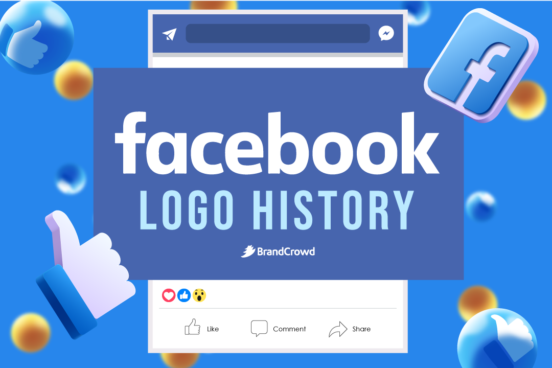
Facebook Logo History
As the world’s most famous social networking site, Facebook has changed the face of social communication since its launch.
From a simple networking platform to helping brands build their online presence, Facebook has come a long way.
Like other social networking logos, a massive part of the brand’s success lies in its clean, simple logo design that’s easy to remember.
Let’s look at the evolution of the Facebook logo and how everything started.
A Brief Overview of Facebook
With over 2.91 billion active monthly users, there’s no doubt that Facebook is the most widely used social media network in the world.
From a local website started in Harvard’s college dorm room to a social media giant, the history of Facebook has one of the most exciting stories to boast.
In 2003, its founder, Mark Zuckerberg, was in his second year at one of the most prestigious university logos: Harvard University. He created a website called “FaceMash: where Harvard students could see photos of fellow students and vote on which one is more attractive.
The university quickly took down the website. But in 2004, Mark created an online directory of Harvard students called “TheFacebook.” Six days after the site was launched, Zuckerberg ran into a controversy where fellow students accused him of using their ideas to build a competing website instead of working with them.
Despite the controversy, TheFacebook was a big success on the Harvard campus. Half of all the undergraduate students at the university had accounts on the website.
Facebook was initially limited to Harvard students, but Zuckerberg later opened up the site to other universities such as Stanford, Yale, and Columbia – and eventually to the public worldwide.
Facebook Logo Evolution
In 2005, the “The” was dropped from the website’s name, and the company purchased the domain facebook.com for $200,000. Can you think of other business name ideas that Zuckerberg could have used instead of Facebook? Drop them in the comments below!
Since its launch, the Facebook logo has mostly stayed the same except for minor modifications. If you’re curious about how Facebook’s logo has changed over time, check out the complete timeline of the Facebook logo evolution.
- 2003-2004
- 2004-2005
- 2005-2015
- 2015-2020
- 2021-Present
2003-2004
Initially called Facemash in 2003, the Facebook logo has mostly stayed the same. The first official logo of the brand is a wordmark containing the name “FACEMASH,” which was written in white capital letters against a maroon background.
According to color psychology, white represents minimalism, purity, simplicity, and perfection. Pair it with the maroon color, which exudes force, depth, and passion, and you’ll have a powerful logo.
When deciding on colors for your logo, experiment with a different color palette to check which fits your design perfectly.
2004-2005
The new logo, which replaced the previous one, is somewhat unusual. The logo consists of the wordmark “thefacebook” between two square brackets and is in light blue over the dark blue background.
What do you think of this design version? Well, it’s not aesthetically pleasing, and thankfully, this logo design only lasted for a year.
2005-2015
The logo saw a significant change in 2005. Compared to the previous versions, this version lasted for 10 years. Both brackets and the “the” from the business name was dropped, and the color of the wordmark shifted from light blue to white.
The new version resulted in a clean logo and a more legible Facebook logo. The wordmark Facebook is written in lowercase white letters on a blue background and in Klavika font.
2015-2019
The 2015 logo might look like the previous version at first glance but there’s a slight difference; can you spot the minor change in the logo?
Look closely and notice how the letter “a” and “b” has completely changed: minus an upper segment and with better clarity. The size of the letters “f,” “b,” and “k” was left intact.
Nothing much changed in this version, and it was received well by the people. However, Facebook changed the logo again in the following years.
2019-2021
The 2019 version bid goodbye to the iconic blue background. The brand retained the wordmark, but it’s now written in blue color against a white background – it’s the opposite of the previous version, which is in white font against a blue background.
The redesigned logo looked terrific and was a massive hit among its audience, who hadn’t seen any significant change.
The Facebook icons used on various digital platforms now feature a circular background instead of a square.
2021-Present

It seemed like yesterday when the news consisted of Facebook changing its name to Meta. It was in 2021 that Facebook introduced the new Meta Logo to make things simpler in favor of the company’s practical values.
Facebook changed its name to Meta and switched over to a significant change in the logo. From the clean wordmark logo, the Meta logo now consists of an infinity loop logo that looks like the letter M.
Aside from its aesthetically pleasing look, this new logo exudes a sense of innovation and minimalist design appeal, which is ideally in sync with modern design trends.
Facebook Logo Design Elements
Color: The brand logo initially featured a solid wordmark in light blue against a dark blue background. This color combination is one of the most exciting features of the logo. Did you know that Mark Zuckerberg suffered from deuteranopia, a type of color blindness where one cannot differentiate between red and green color pigments? However, it’s been a debate whether Zuckerberg’s vision impairment caused him to choose the blue font and blue background.
Font: The typeface used in the Facebook wordmark and icon is a customized, sans-serif font. But the wordmark in the current league features a modified version of Klavika Bold font. Just like colors, font plays a crucial role as it can influence a customer’s purchasing decision.
Design Your Social Media Logo Today
Facebook’s simple yet effective logo design is a reflection of the brand’s attitude towards creating its brand identity. Just like Twitter, these two brands are perfect examples of the fact that you don’t need anything flashy or extravagant designs to drive potential customers and turn them into loyal consumers.
Planning to start your own social media brand? Try our logo maker today! All you have to do is fill in your business name and enjoy browsing through thousands of customizable templates. We offer other templates for your other design needs such as Facebook covers, Facebook Ads, Twitter Posts, and many more!
Design your social media logo today and who knows, your brand might just be the next giant in this industry!
