Netflix Logo History
What is your favorite pastime?
For many of us, the popular Netflix is one of the best ways to relax our tired brains and take a break from reality. Whatever movie genre you are into, there’s a perfect movie on this website for you.
Aside from its high-quality movies and fast streaming qualities, Netflix is popular because of its logo design and the heart-thumping “tuddumm!” it comes with.
Like other movie logos, did you know that the first Netflix logo is far from what it looks like today? You heard that right! So sit back and join us as we get to know the Netflix logo throughout the years!
A Brief History of Netflix
Nowadays, streaming your favorite movies has never been more accessible! Thanks to the most famous streaming platform service, Netflix, gone are the days of downloading pirated copies and laggy websites to watch movies.
Started by two business associates, Marc Bernays Randolph and Wilmot Reed Hastings Jr., in 1997, Netflix quickly became one of the most accessible and popular platforms for watching some of your favorite shows worldwide.
Many factors contribute to this brand’s success. Aside from the easy-to-remember name, no ads, and user-friendly UI design, there’s nothing as catchy and memorable as the Netflix logo.
Since its launch, the company has made several significant changes to its logo. Would you believe it if we told you that you wouldn’t recognize Netflix’s first logo from 25 years ago?
Netflix Design Evolution
The Netflix logo is everywhere – from the brand’s official website to your phone screen. With the perfect mix of text and visual elements, the logo perfectly represents the company’s mission to become the world’s top streaming service.
Netflix has indeed come a long way with its logo rebranding. Its evolution can be divided into four major stages.
1997-2000

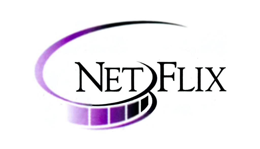
When you try and imagine the first-ever Netflix logo, there’s a good chance that it’s far from the image above. With its dark, basic ringlet of celluloid film and some black and purple gradient – many agree that this version was seemingly dull.
Unlike its current logo, this version featured the brand’s name. The ringlet separates the wordmark into two – Net and Flix.
Using a wordmark logo in this version allowed people to memorize their company name quickly. Meanwhile, the celluloid film showed that the company is in line with the media content.
What do you think of its overall design? In our opinion, this version of Netflix carries the typical 90’s vibe with its gradient movie reel.
As iconic as it may be, the company immediately replaced this version in the following years.
2000-2001

The company quickly released a new version of its logo. This time, it was completely different from the first logo.
Starting with the color palette used, the company switched from black and purple to black and yellow. The company retained the wordmark but is now surrounded by a solid black emblem enclosed by two thick yellow brackets.
Aside from the black and yellow combination being aesthetically appealing, according to color psychology, yellow represents happiness, optimism, hope, and spontaneity. The color yellow inspires the mind to think curiously, so we agree that the chosen color scheme for this version certainly attracts attention.
The wordmark is in lowercase and is featured in thin white lines of a sans-serif font. If you look closely at the company name, you’ll notice that the dot in the letter ‘I’ is different. Instead of a plain dot, it is a yellow square with curved angles, which resembles a television screen. Pretty clever, right?
Like the first logo, this version lasted only a short time and was replaced in the same year it was released.
2001-2014

Unlike the Harley Davidson Logo, the variations of the Netflix logo evolution are nowhere near similar. If you look at this version of the brand’s logo, it’s different from the first two versions – except that the wordmark is retained.
This version featured the brand name in a sans-serif font on a red background. If you want people to notice your logo through its color, you can never go wrong with the color red. Aside from its blazing appearance, red represents power, courage, passion, and energy.
The word “Netflix” is slightly arched, and it’s no surprise that the designers borrowed this idea from the classic CinemaScope. The font type is “Graphique” and consists of a thick black shadow on the right side of the letters, giving it a 3D logo effect.
Among the three versions, the company used this design the longest. However, it bid goodbye in 2014, and the world welcomed a new Netflix logo again.
2014-Present

Did you know that the company also launched its new website and introduced this logo? The Netflix logo you know today was designed by Gretel – a New York-based design firm.
It seems like the company wanted to create a new brand identity, and they preferred to go with a simple yet impactful one. And we’re thankful they pushed through with this plan because this version kickstarted the company’s success and is well-loved by millions worldwide today.
You might think that the wordmark in this version of the logo is quite similar to the previous versions, but if you look closely, there’s a difference. The drop shadowing was removed and now consists of a modern font and bolder letters.
The color palette also shifted – from a white wordmark on a red background to a red wordmark on a white background. As mentioned earlier, red signifies power and passion, while white represents perfection, minimalism, and simplicity.
Like the Apple logo, a white background is a great way to showcase your brand’s symbol at the center.
Netflix Font and Colors
The typography and colors are essential elements your logo must have. The famous streaming media company uses the red and white combination for its logo and uses two major font types throughout its evolution: Graphique and sans serif fonts. The current logo uses Bebas Neue – a sans serif font family.
Aside from the logo design, did you know that Netflix was originally called Kibble before its launch? They also considered other business names, such as ‘Webflix,’ ‘NetPix,’ and ‘TakeOne’ before deciding to go with Netflix. Is it just us, or do those names sound like the perfect name for a gaming logo?
After choosing a catchy name, make sure to use the proper typography and colors to capture the attention of your audience and make them engage with your business.
Design Your Movie Logo Today
To keep up with the growing industry trends, companies need to adapt to the changes in their surroundings. After going through the evolution of Netflix above, it’s no wonder why the company is famous worldwide.
We hope you are inspired by Netflix’s road to success story and create your movie logo design today! Are you interested in making one but have no design skills or experience? We’re here to save the day.
You must visit our website and fill out your business name in our logo maker! Get ready to browse through the thousands of customizable templates – be it flyer design, thank you cards, or invitation – we have creative designs just for you.
Bring your ideas to reality today; your business might be the next favorite streaming website worldwide!

